Statement Pendant Lighting in 2026: Make Colour Feel Intentional in a Neutral Room
A colourful pendant can feel calm, sophisticated and long-lasting in a neutral kitchen or dining room. The secret is not to make the room more colourful everywhere. It is to give one strong hue a clear job, then support it with proportion, useful light and a few quiet visual echoes. In 2026, the most convincing statement pendant lighting is less about chasing a dramatic “look” and more about creating a focal point that still works on an ordinary Tuesday evening.
Start With the Room’s Undertone, Not a Trend Colour
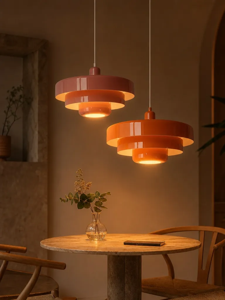
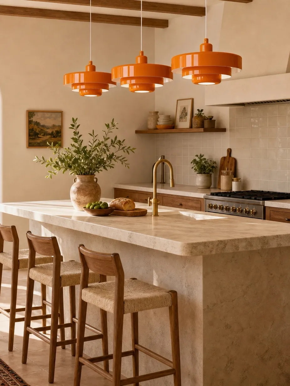
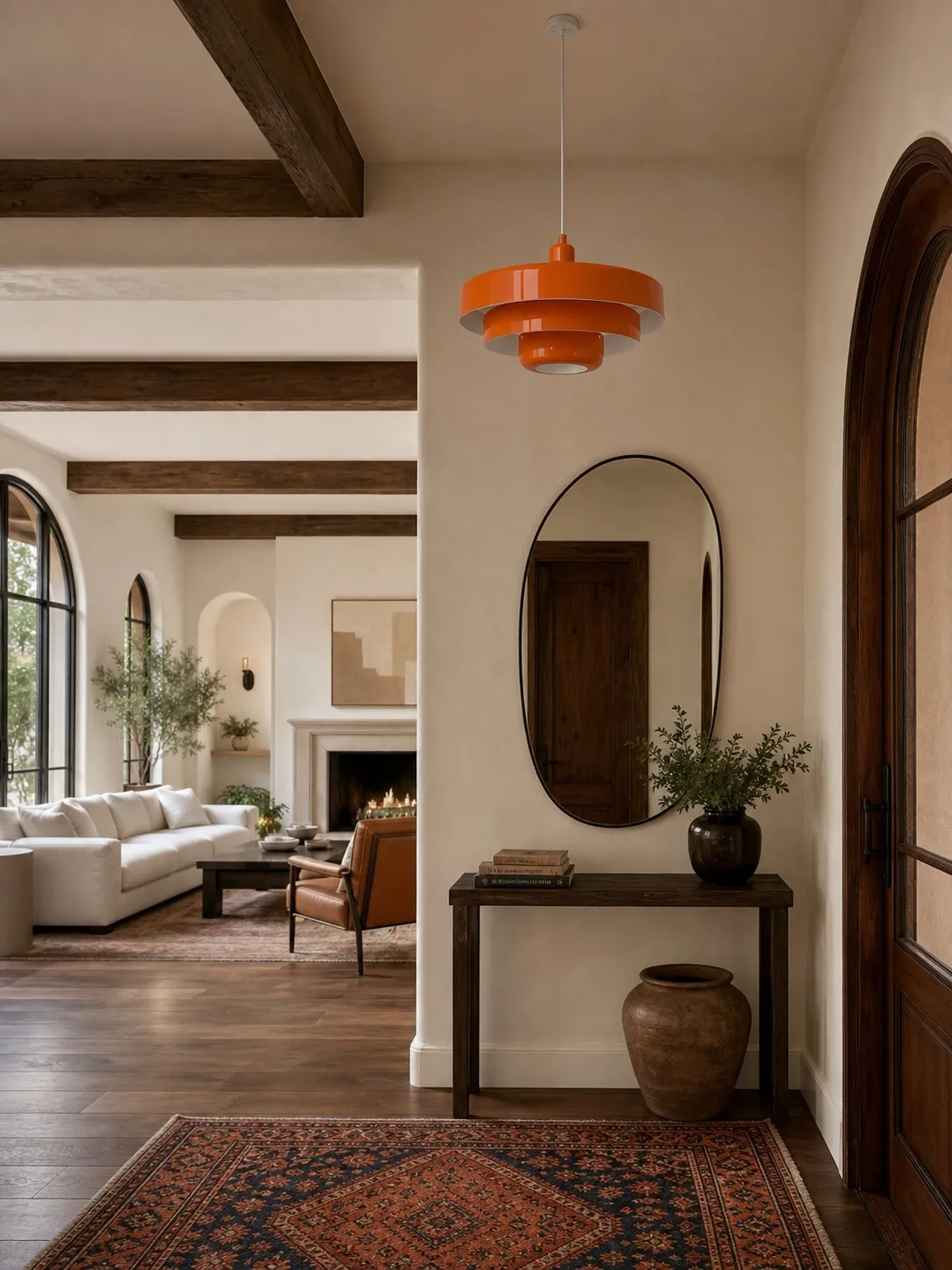
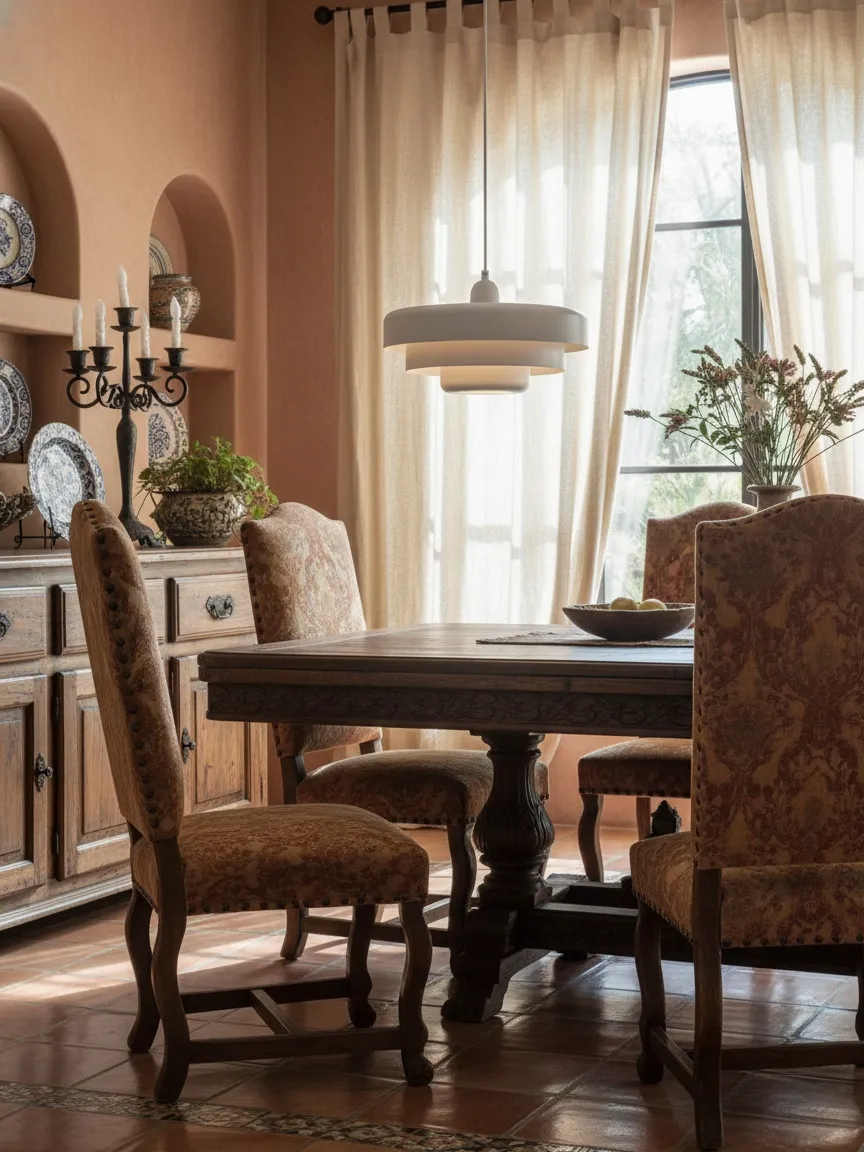
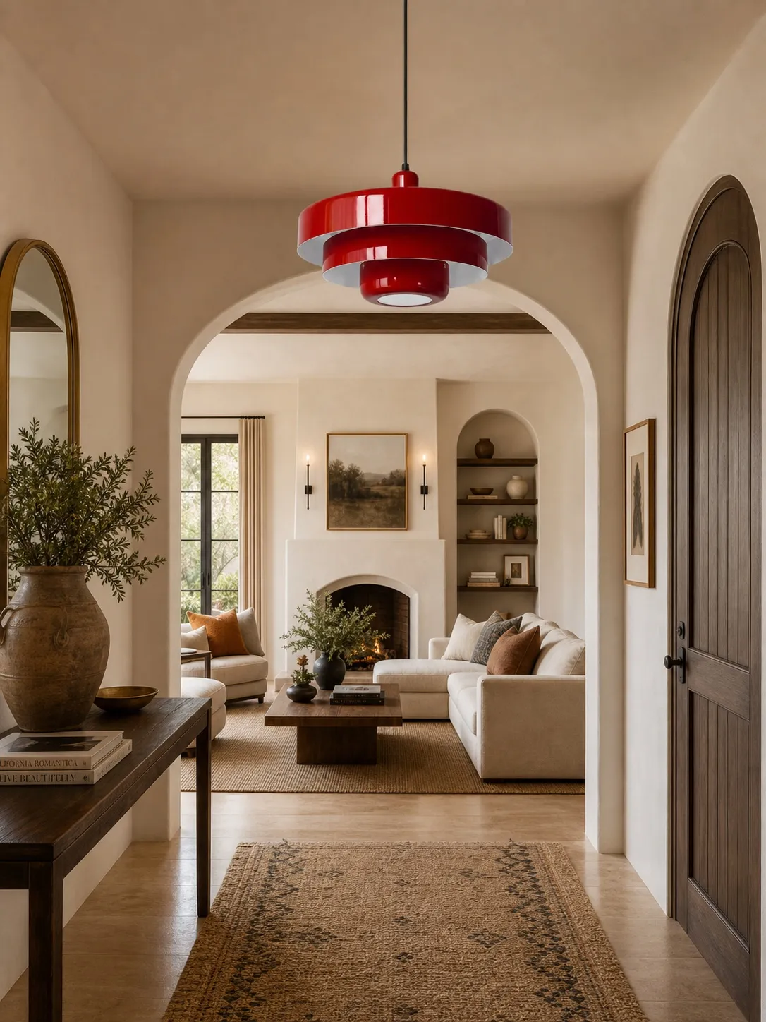
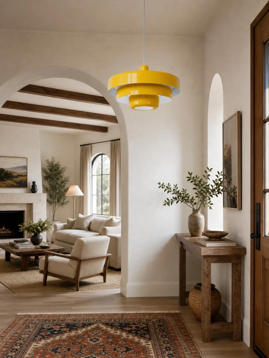
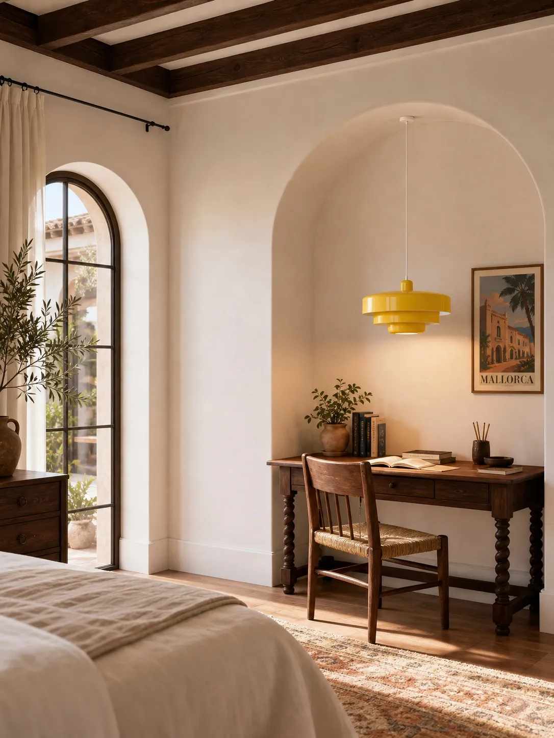
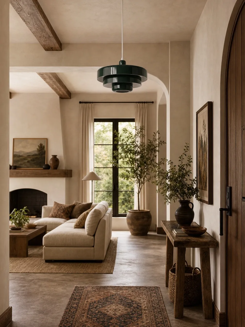
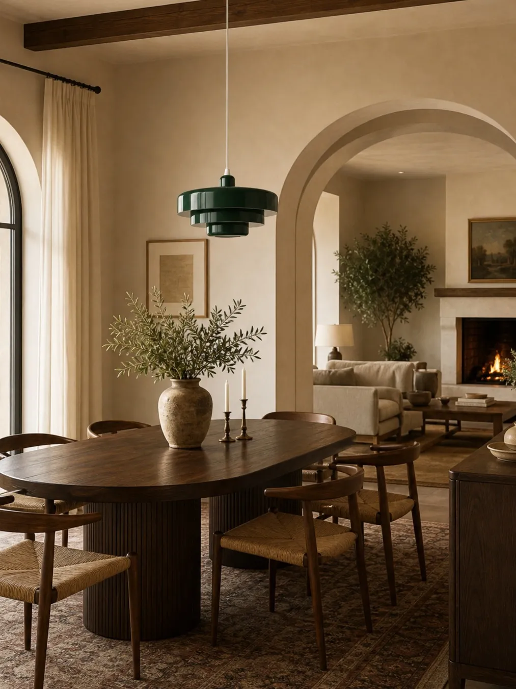
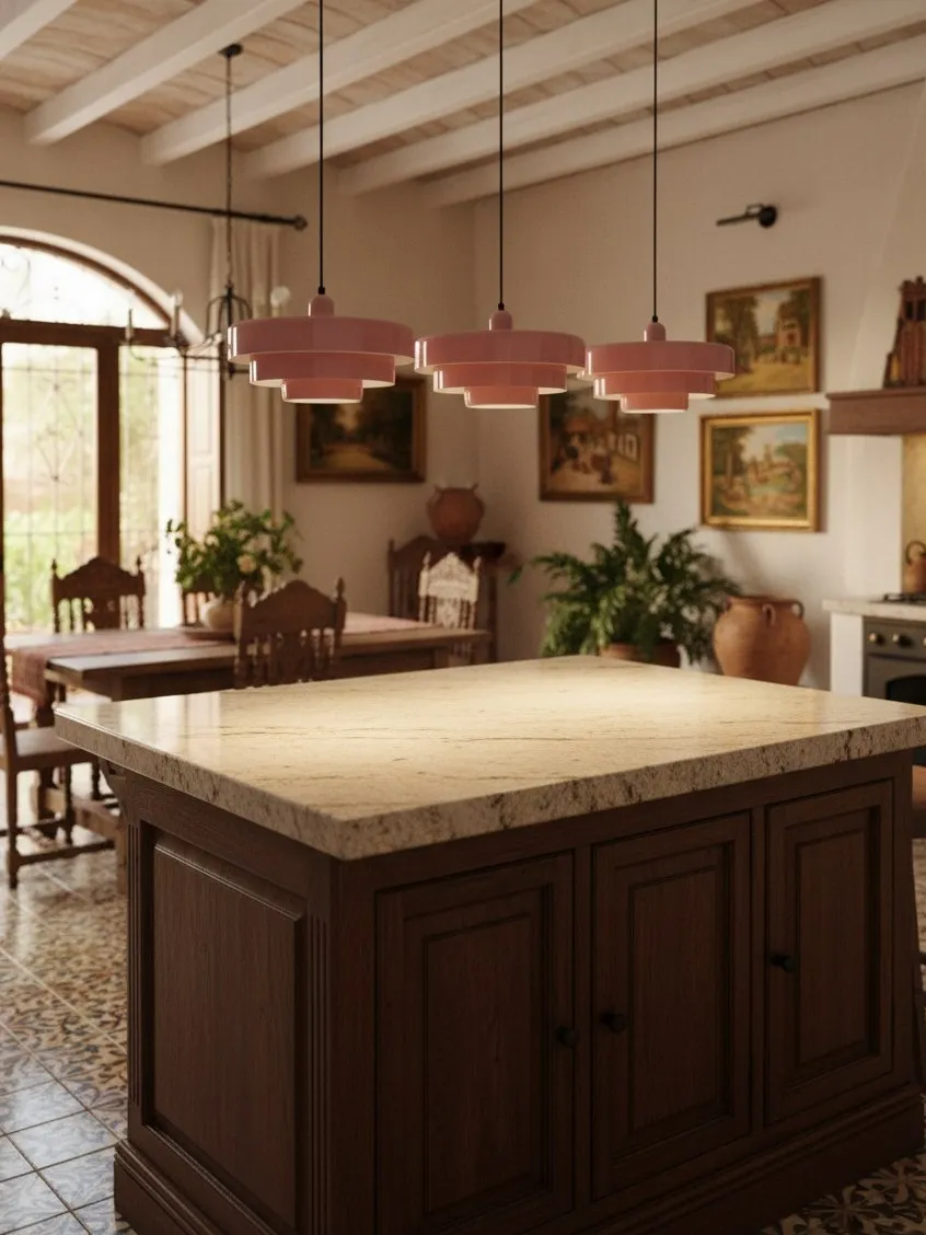
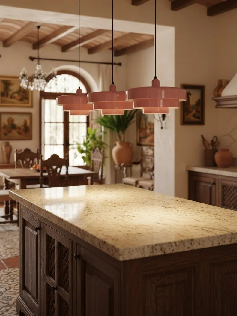
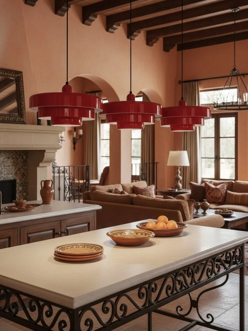
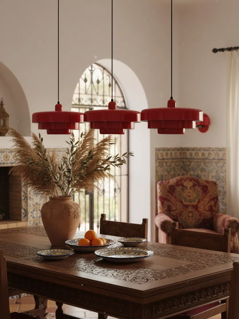
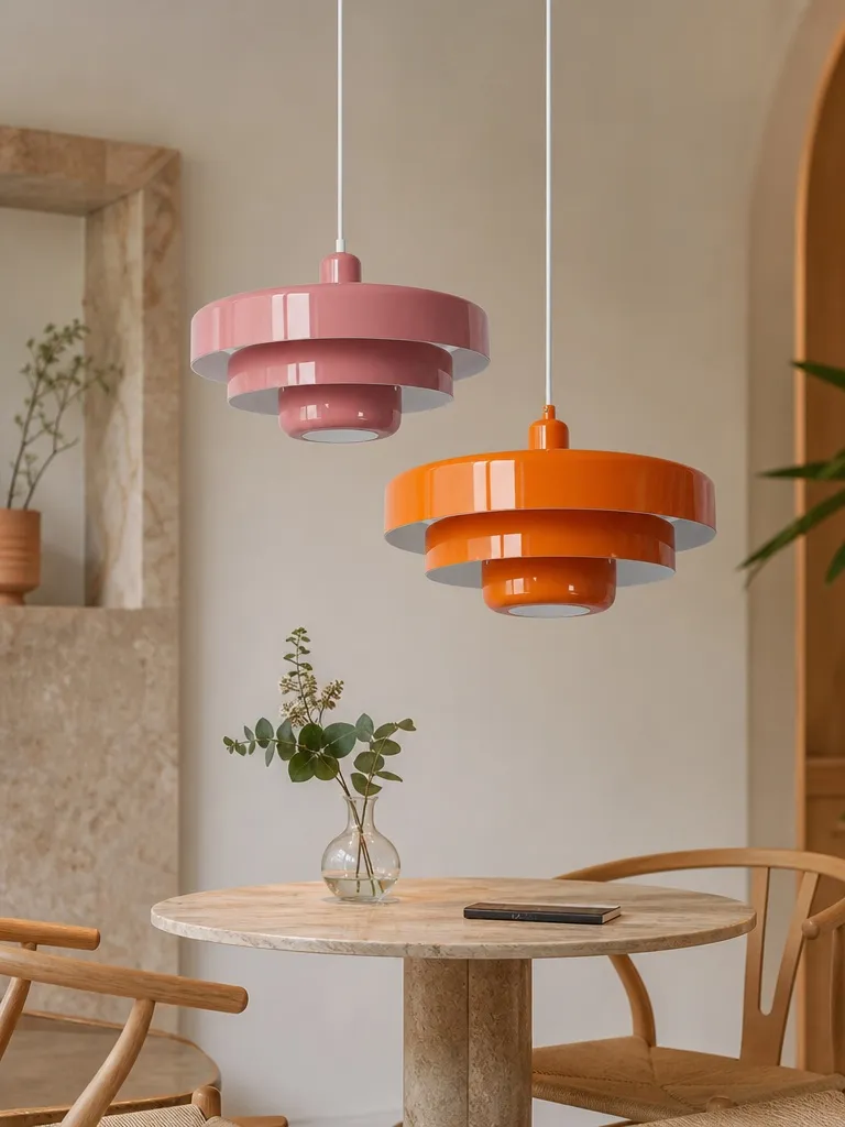
Neutral rooms are never truly colourless. Cream, ivory and honey-toned timber lean warm; bright white, pale grey and blue-veined stone lean cool; greige and natural oak often sit between the two. A pendant should either harmonise with that undertone or contrast with it on purpose. Muted orange, terracotta and warm red feel connected to cream and oak. Deep green can cool a warm room without looking harsh. White creates the lowest-contrast result, while a saturated primary colour creates the strongest visual break.
If choosing the exact finish is your current decision, How to Choose the Best Pendant Light Color for a Neutral Kitchen uses a practical sample-and-sightline method rather than relying on a colour chart alone.
Build a Colour Bridge With Repetition—Then Stop
A statement colour feels isolated when it appears once and accidental when it appears everywhere. The useful middle ground is a small “colour bridge”: repeat the pendant hue in two modest elements that sit at different heights. One might be a framed print; another could be a bowl, seat cushion or linen napkin. These supporting notes should be smaller and less saturated than the light itself.
Avoid matching every accessory. A green pendant does not require green stools, green crockery, green curtains and green wall art. That turns a focal point into a theme. Keep the architecture and major furniture neutral so the pendant retains visual authority.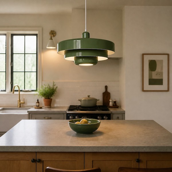
Scale Before Saturation
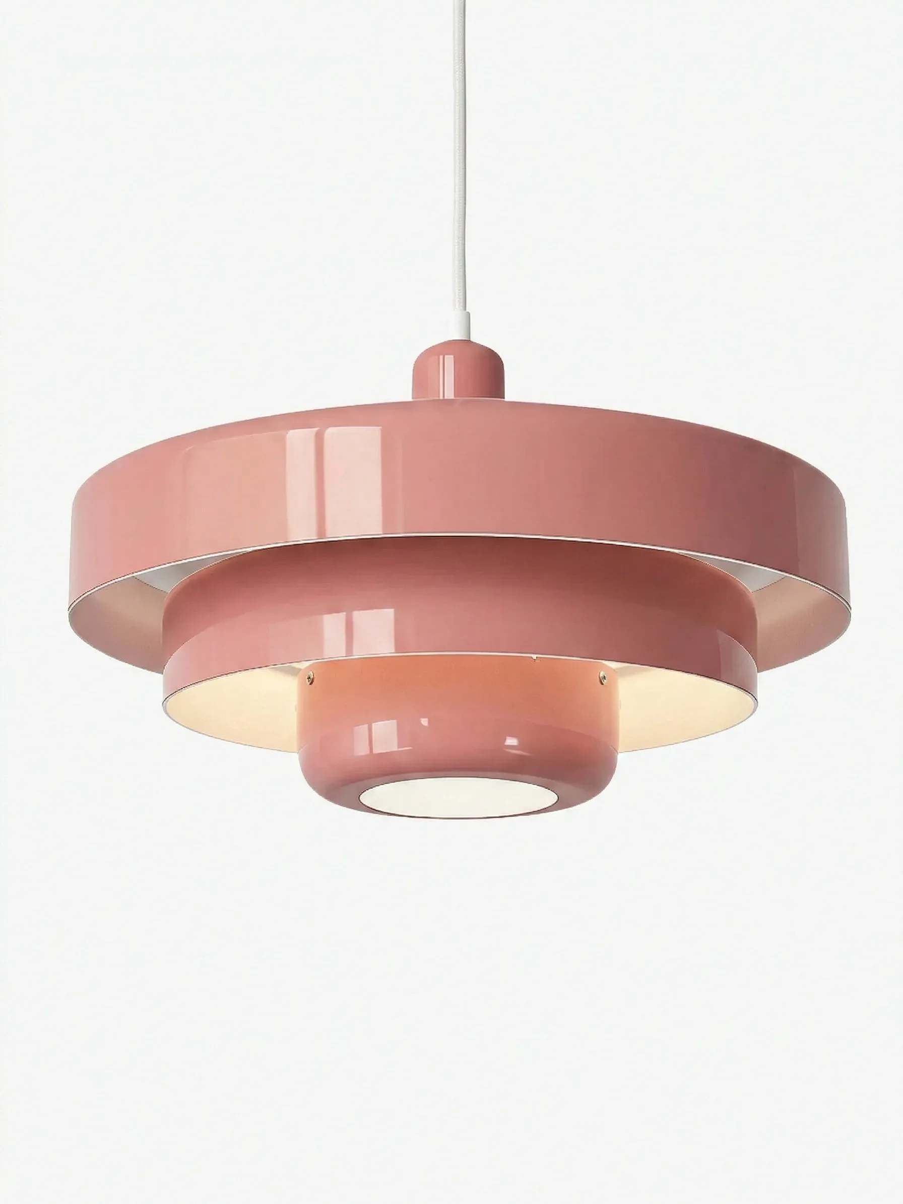
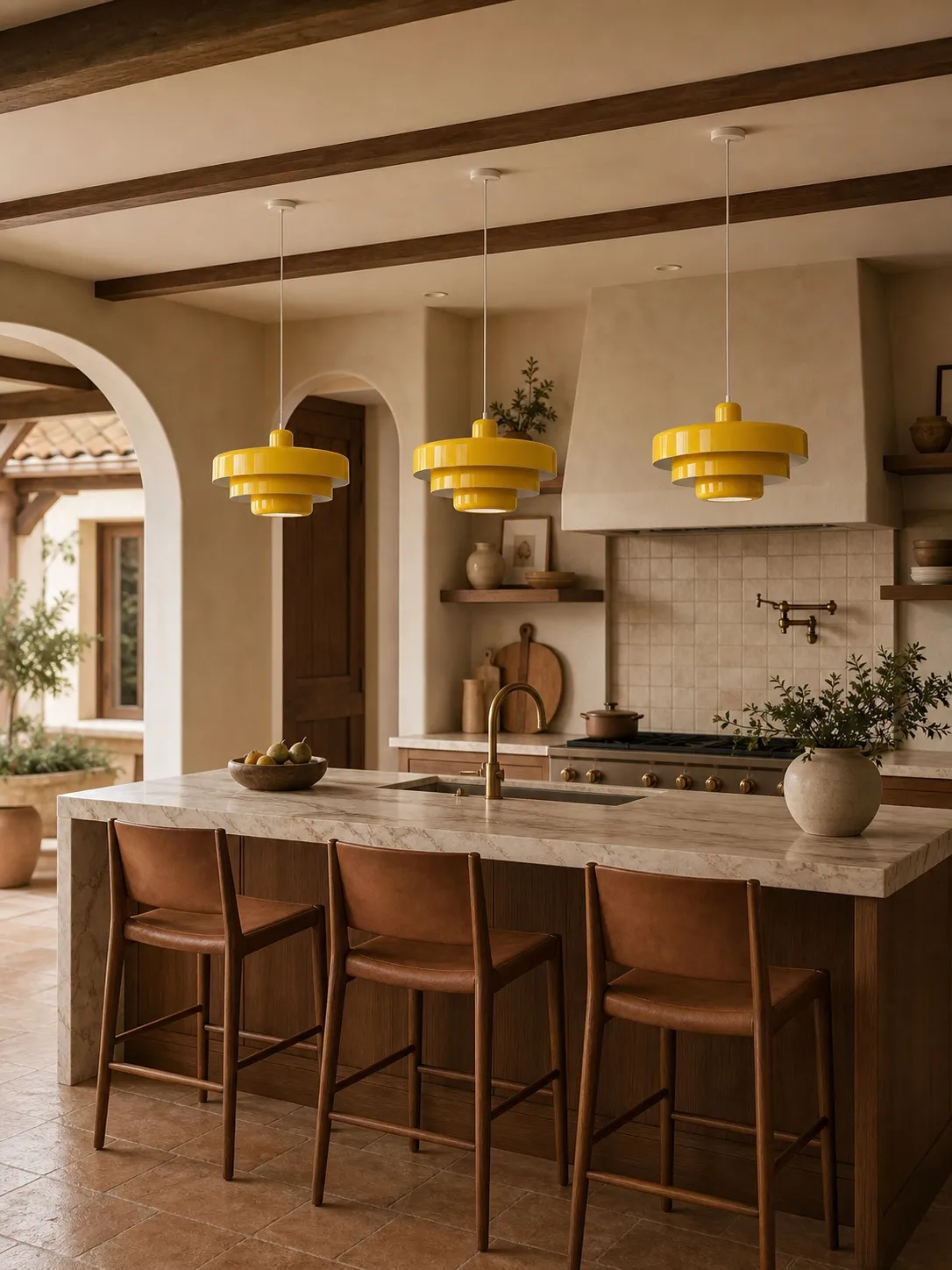
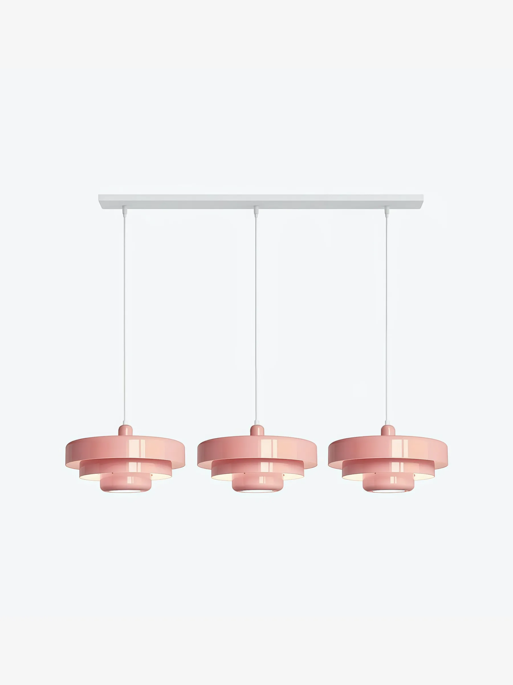
People often blame colour when the real problem is size. A shade that is too small looks like a coloured dot floating above the table; one that is too large blocks faces and compresses the room. Judge the silhouette from the doorway, from a seated position and from the main kitchen work zone. The pendant should clearly belong to the table or island beneath it, not to the ceiling in general.
Over a surface, a common starting point is roughly 76–91 cm (30–36 in) between the worktop or tabletop and the bottom of the pendant, then adjust for the shade’s depth, users’ sightlines and ceiling height. Treat that as a test range, not a universal command. Mock up the lowest edge with tape or a lightweight paper shape before installation.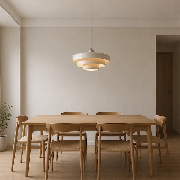
Let the Pendant Lead, but Do Not Make It Work Alone
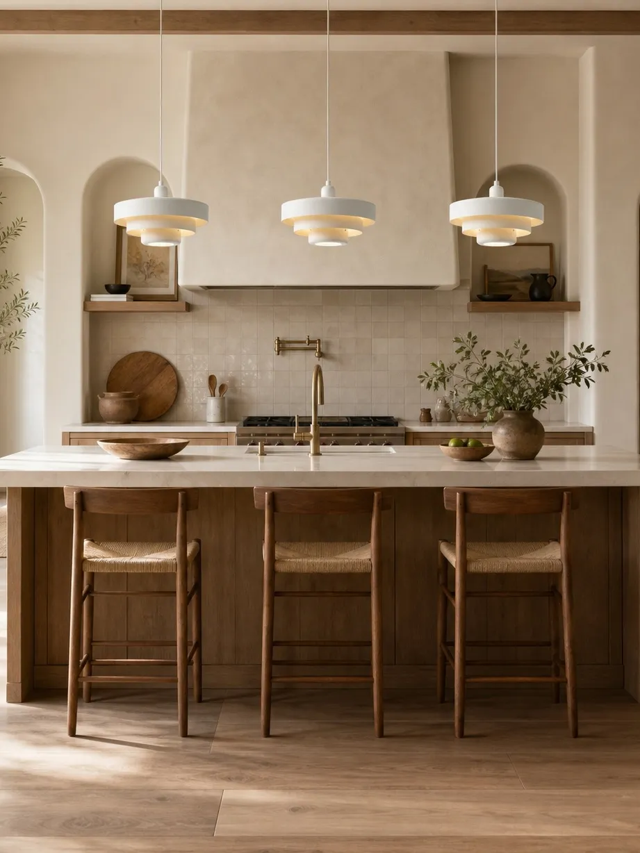
A sculptural metal shade can direct light downward and create atmosphere, but a kitchen still needs light on counters, inside work zones and across circulation paths. Use the pendant as the visual and social layer. Add under-cabinet lighting for preparation, discreet ceiling light for general visibility and perhaps a small wall or cabinet light for depth. The Illuminating Engineering Society describes layered lighting as an important route to better kitchen performance; the practical lesson is simple: one beautiful fitting should not have to solve every lighting task.
Choose bulb brightness by lumens rather than watts, and check the bulb’s colour appearance in kelvin. ENERGY STAR notes that lower kelvin values look warmer and higher values look cooler. In a warm neutral dining area, a warm-white source usually keeps wood and food inviting; in a work-focused kitchen, a slightly cleaner neutral-white source may feel crisper. Always follow the fixture and bulb labels.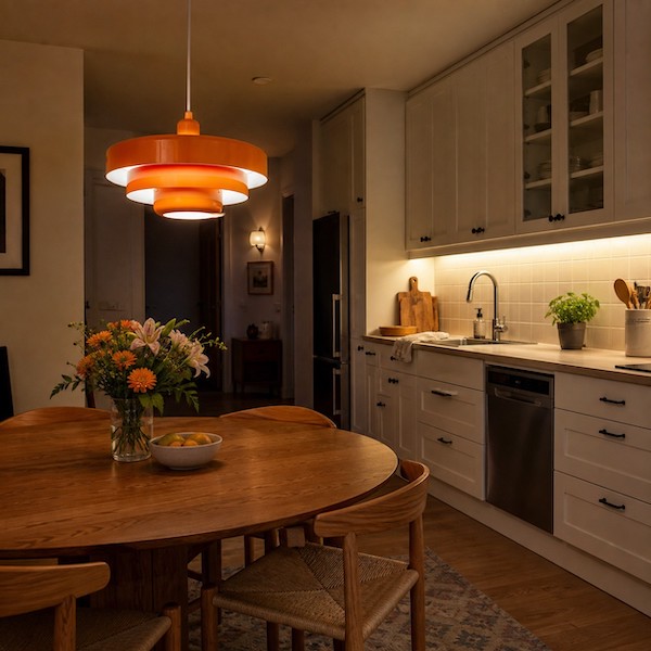
Four Styling Directions That Feel Current Without Feeling Temporary
Warm minimal
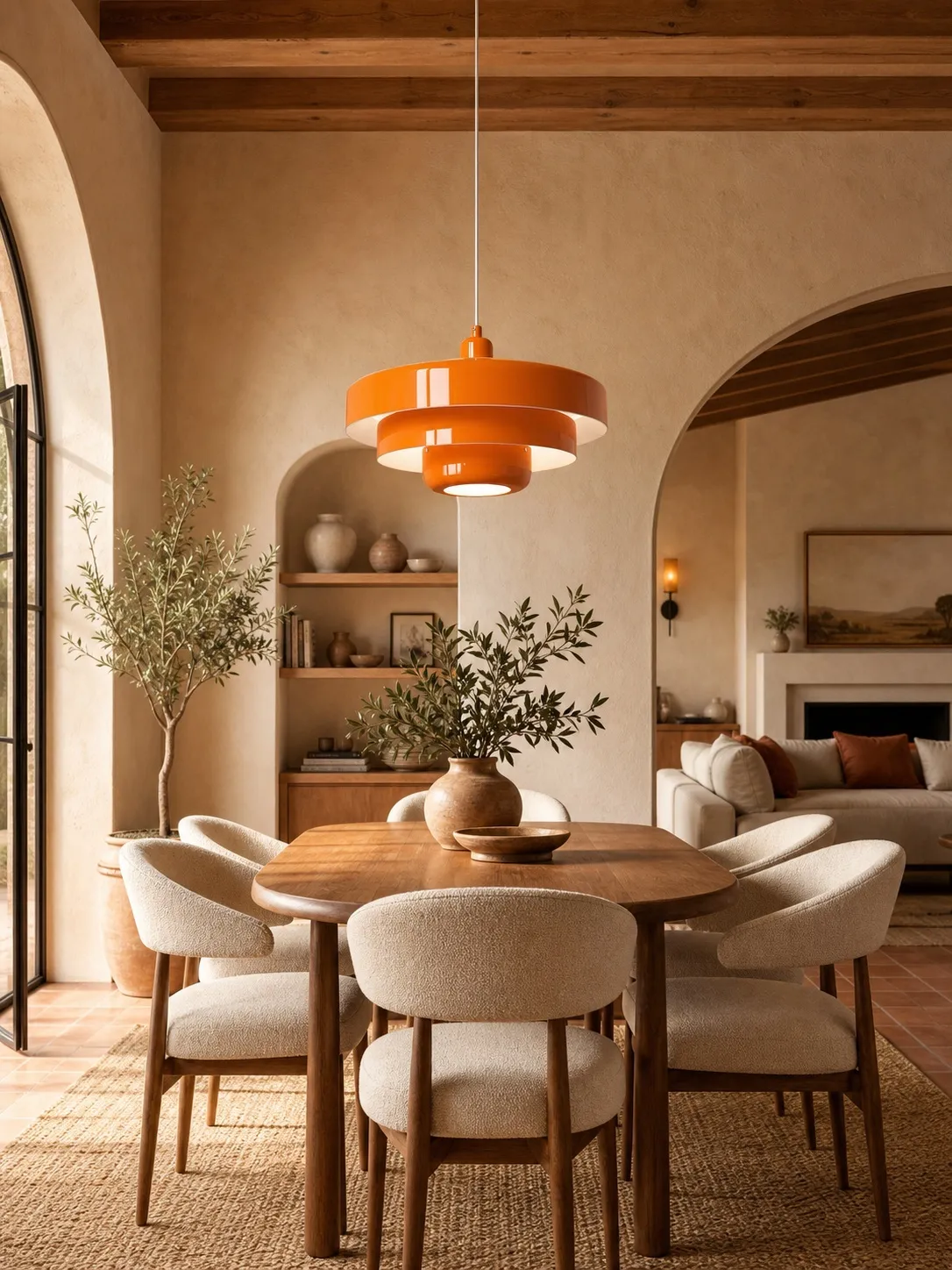
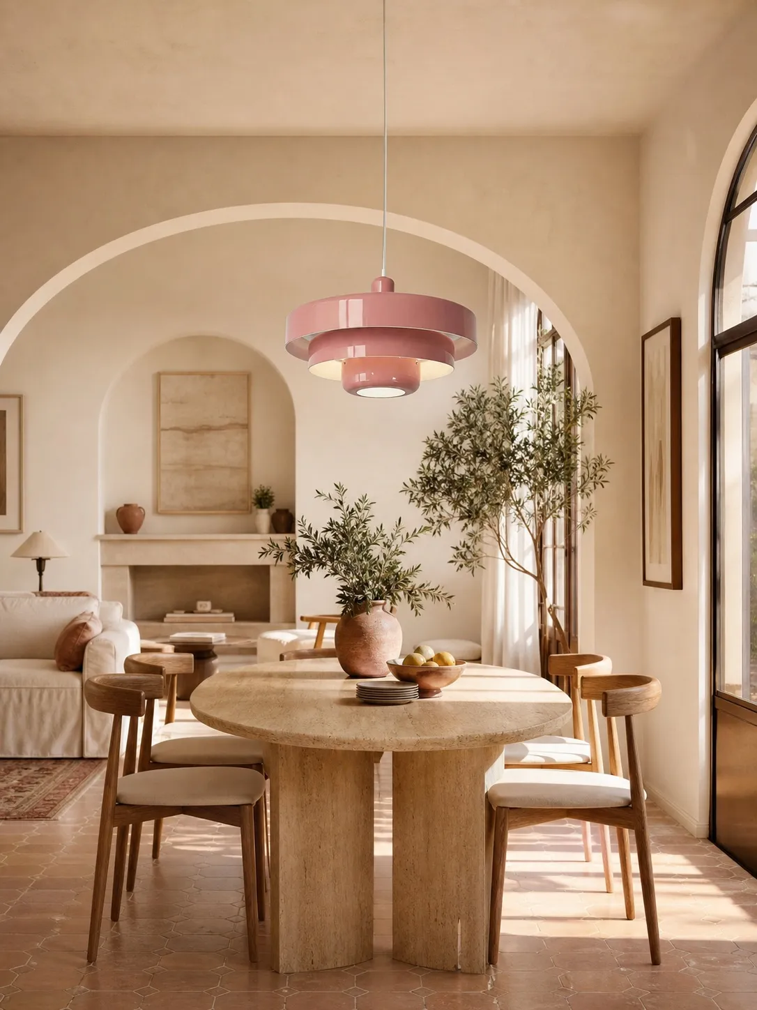
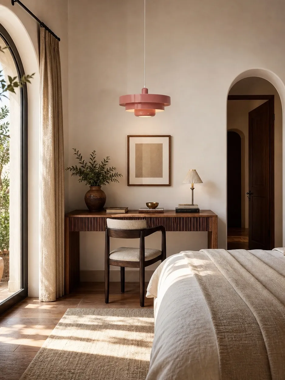
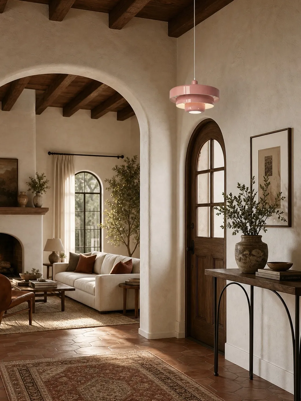
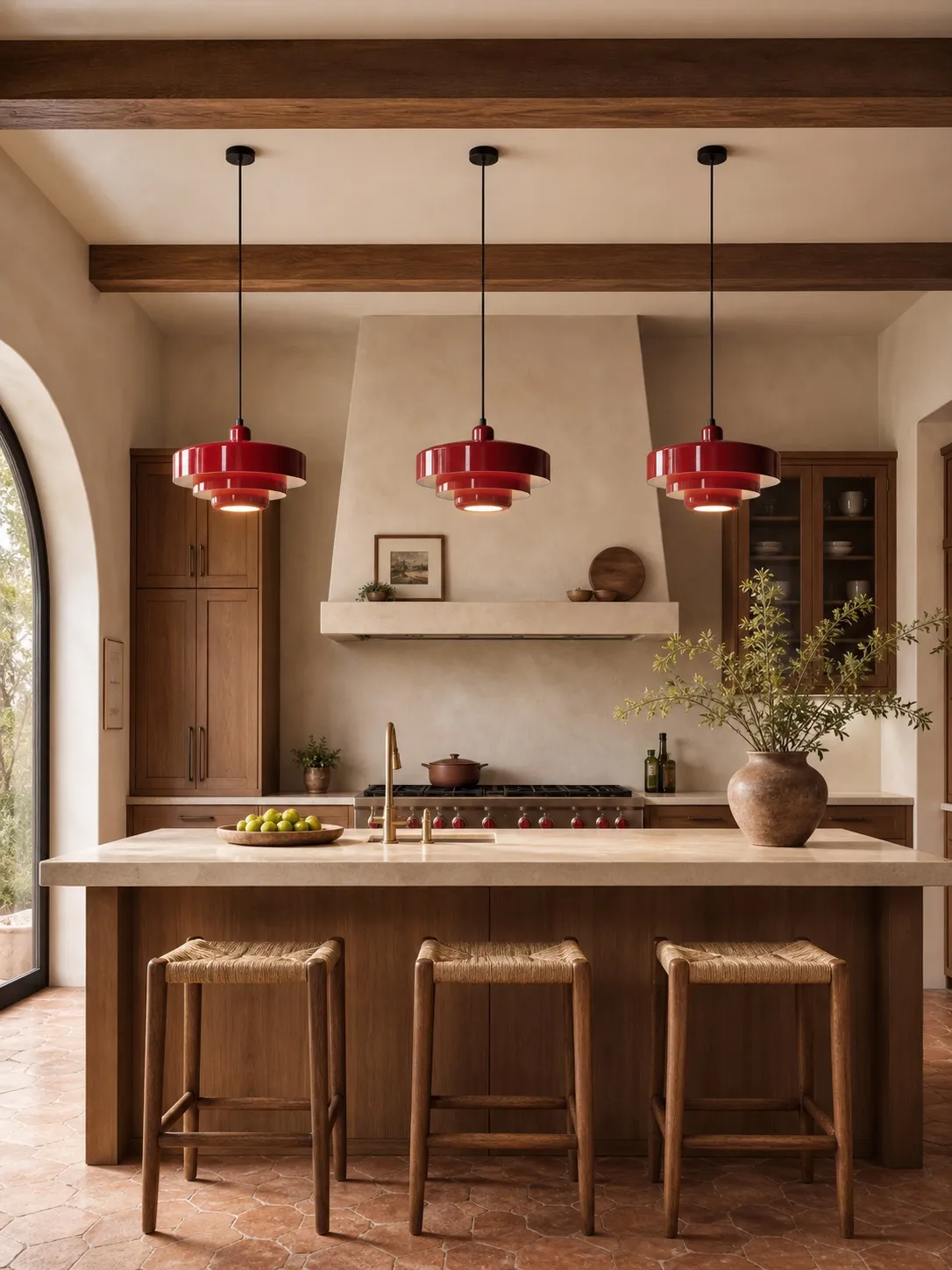
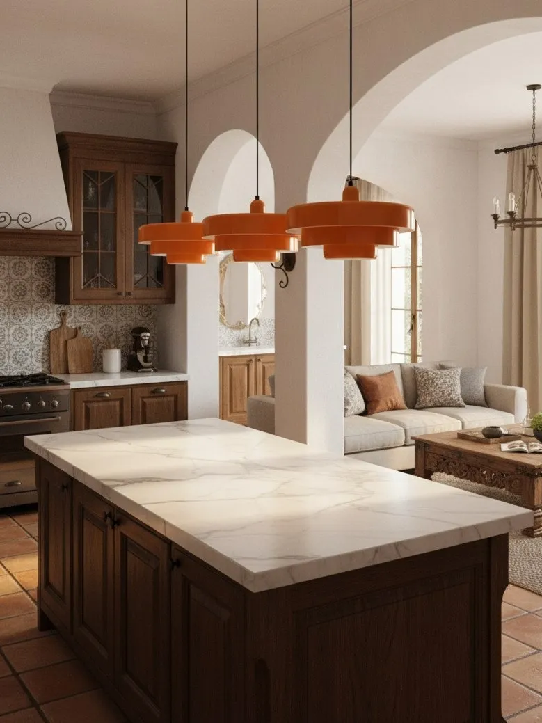
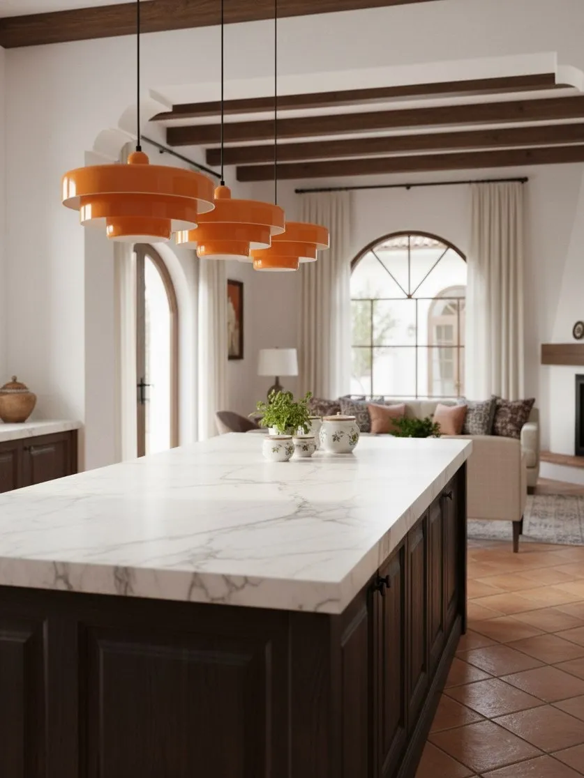
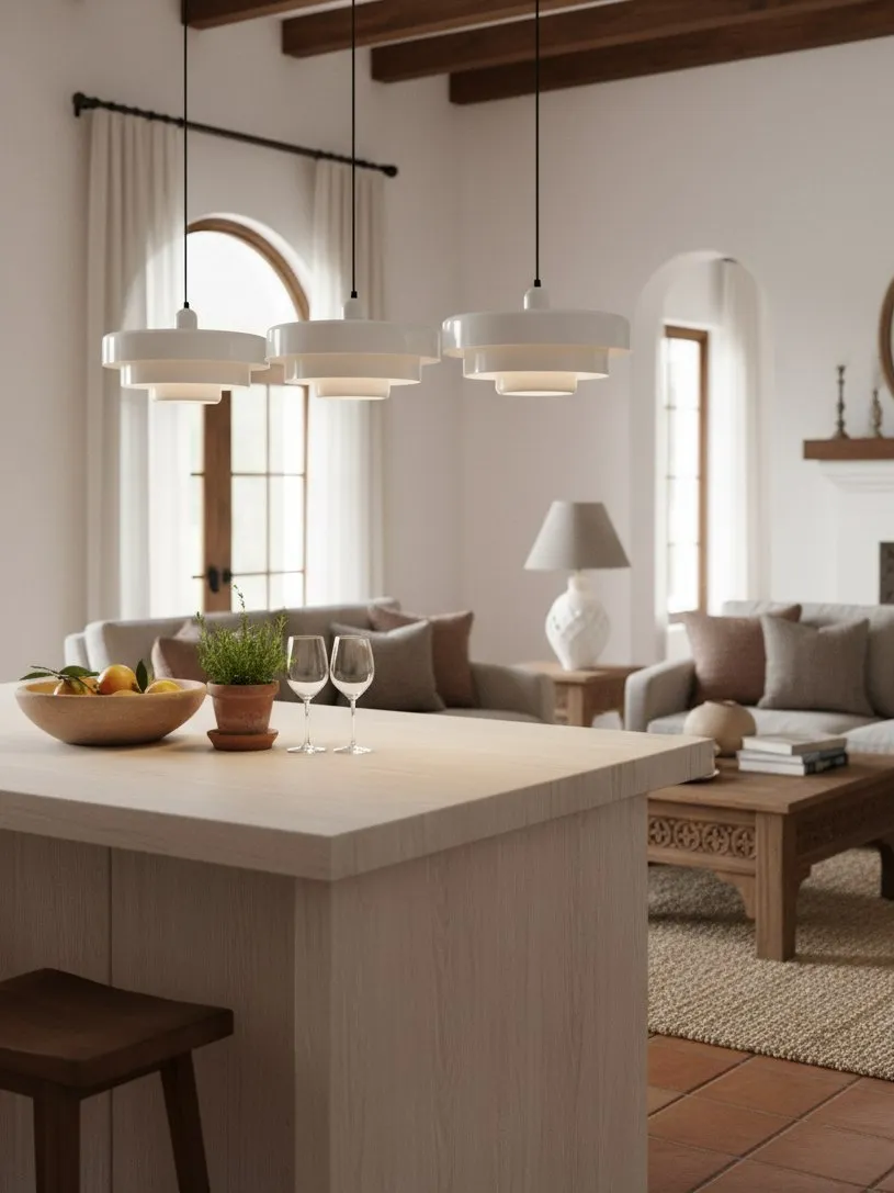
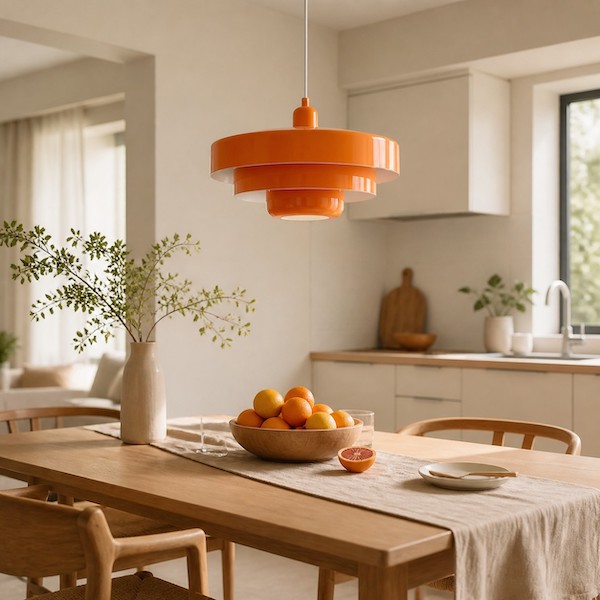
Pair a muted orange or red pendant with cream walls, pale oak and brushed warm metal. Keep textiles plain and let the curved layers soften straight cabinetry.
Quiet botanical
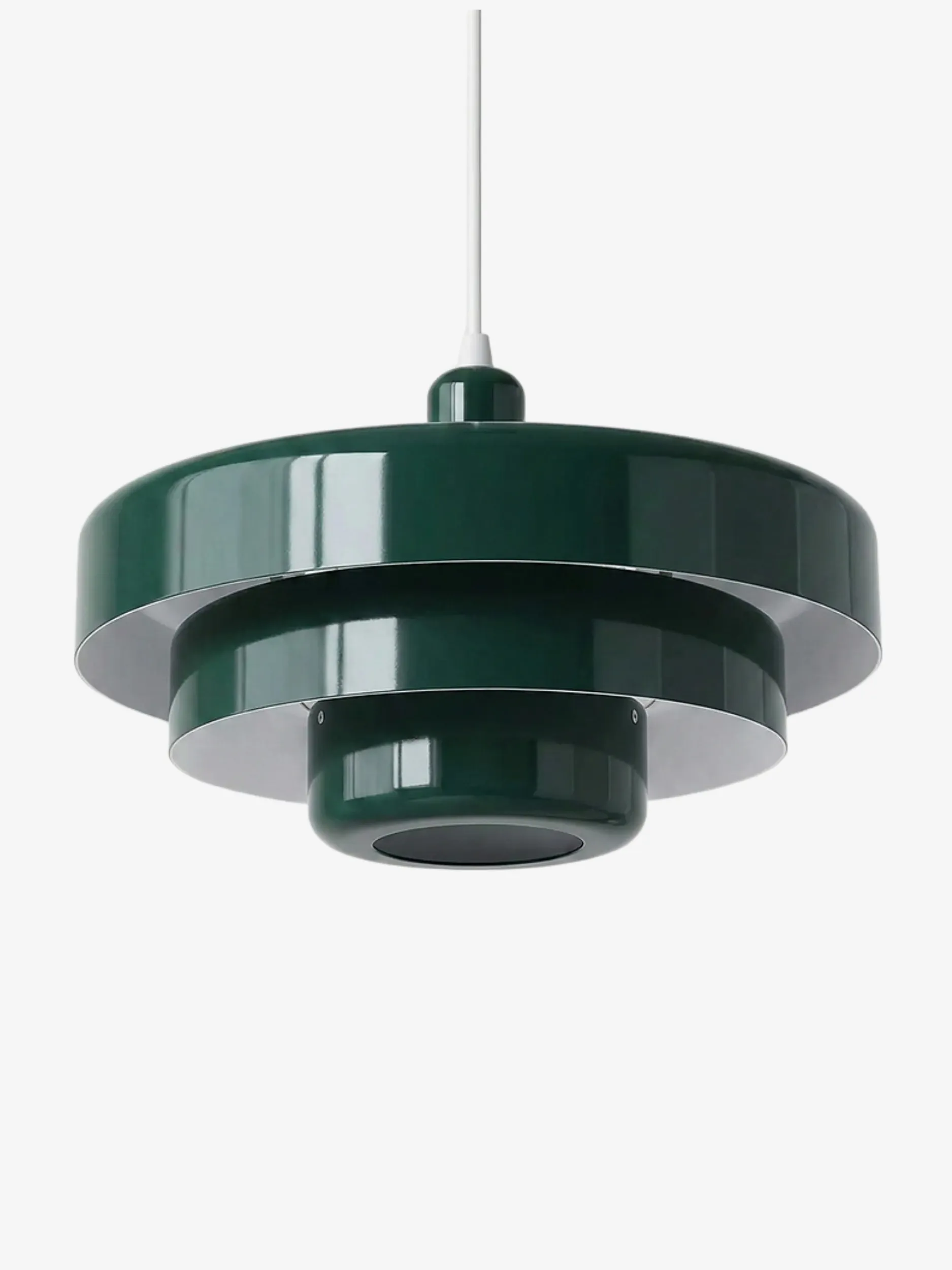
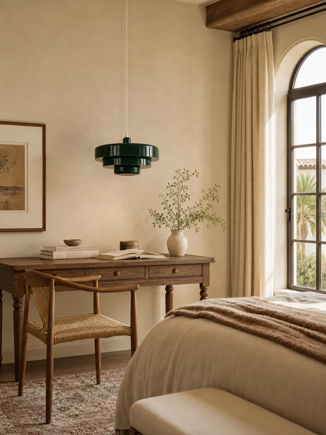
Use deep green with off-white, walnut and one restrained plant or landscape print. The effect is grounded, not themed.
Graphic Nordic
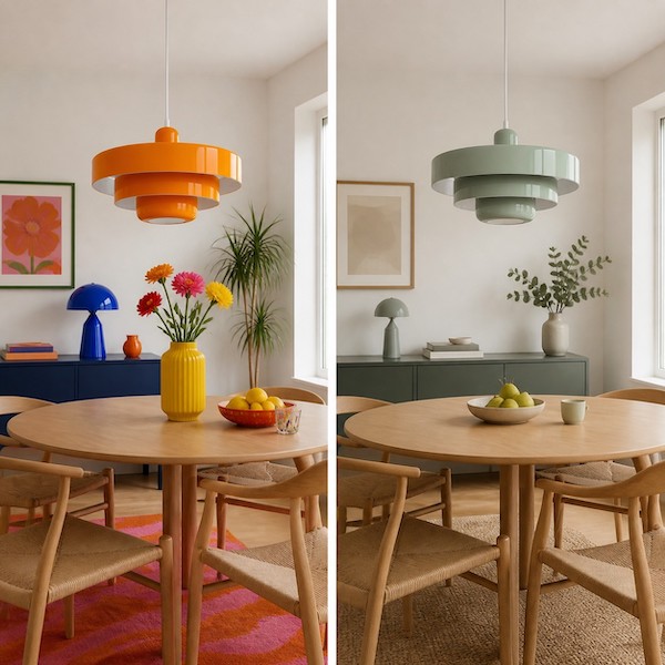
Set a coloured shade against bright white and light timber, then repeat the hue in one geometric artwork. Clean spacing matters more than extra accessories.
Soft tonal
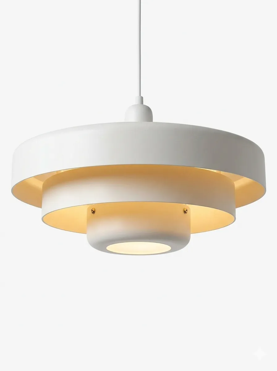
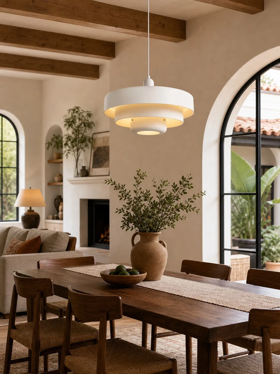
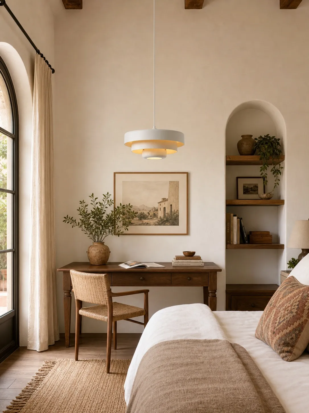
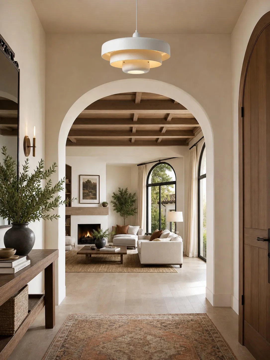
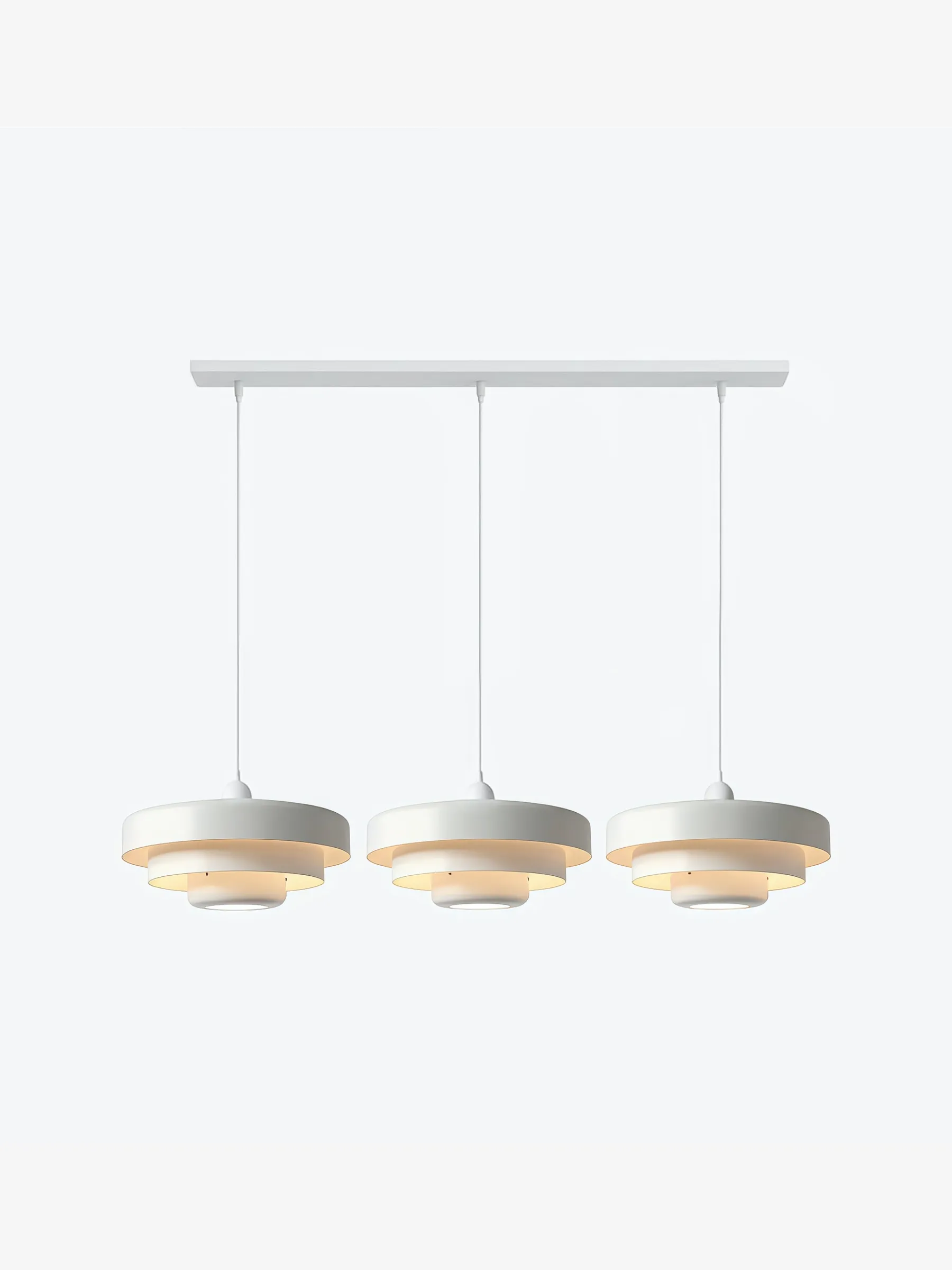
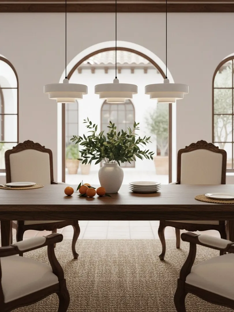
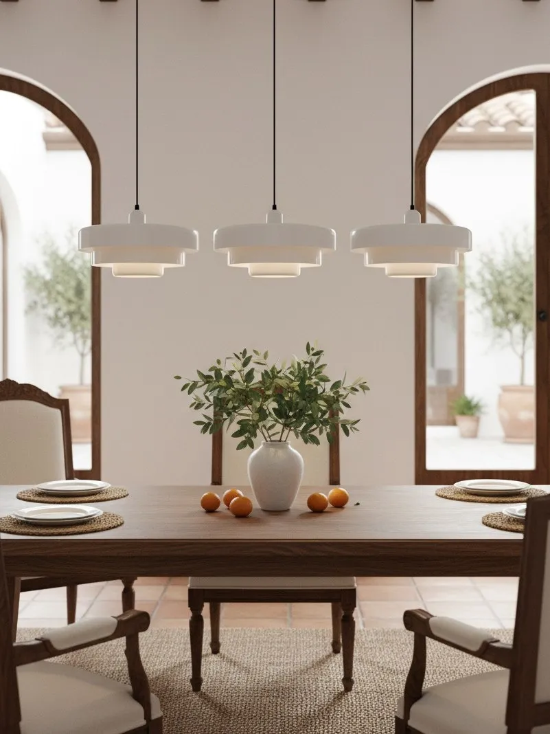
Choose white or a pale finish and let the tiered silhouette provide the statement. Contrast comes from shadow, texture and shape rather than hue.
For a tight room, the visual rules change slightly. Can a Colorful Pendant Light Work in a Small Neutral Kitchen? explains how to protect sightlines and avoid making a compact space feel crowded.
Dining Room Focal Point or Kitchen Accent?
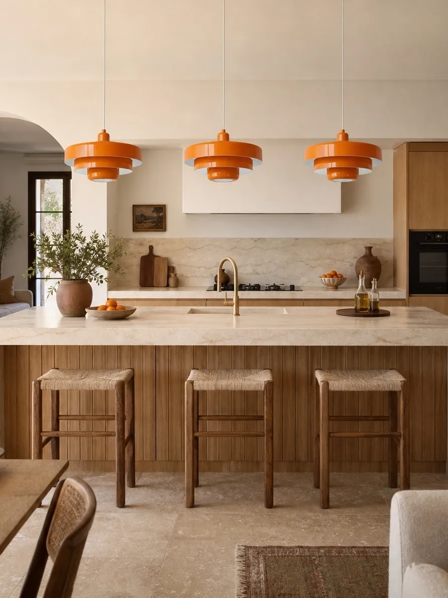
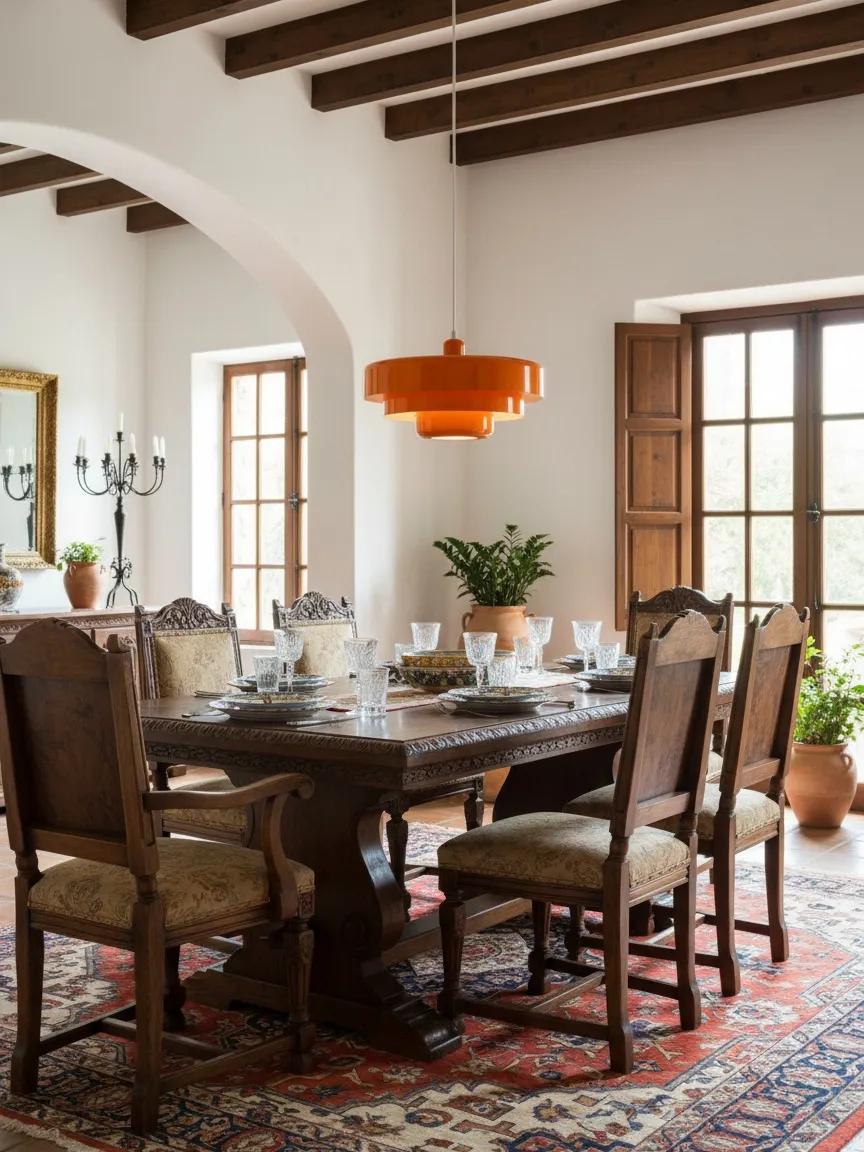
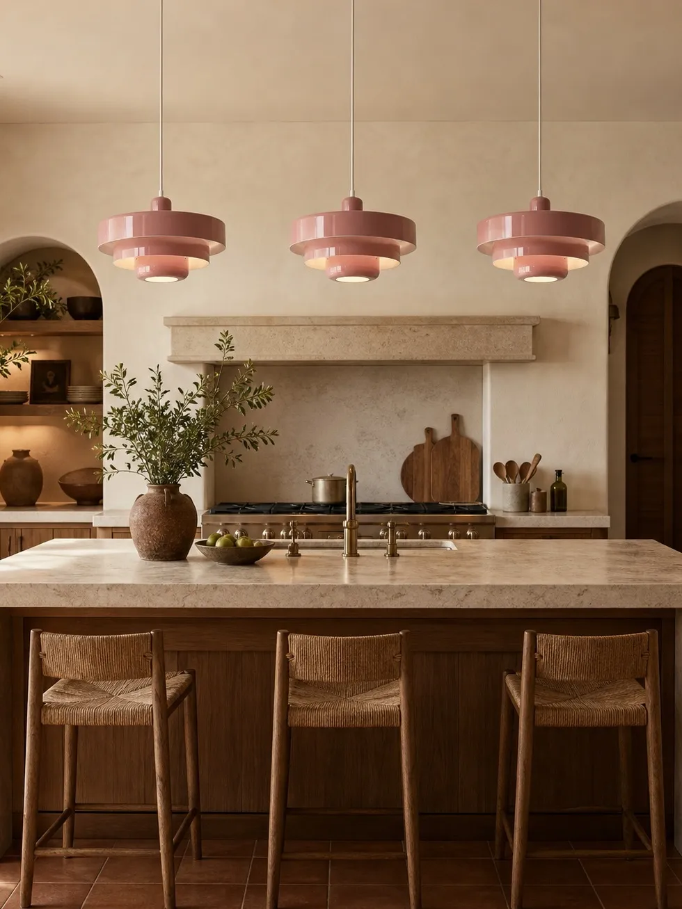
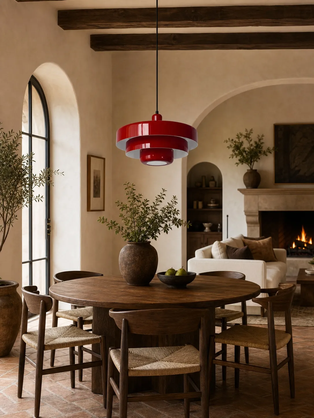
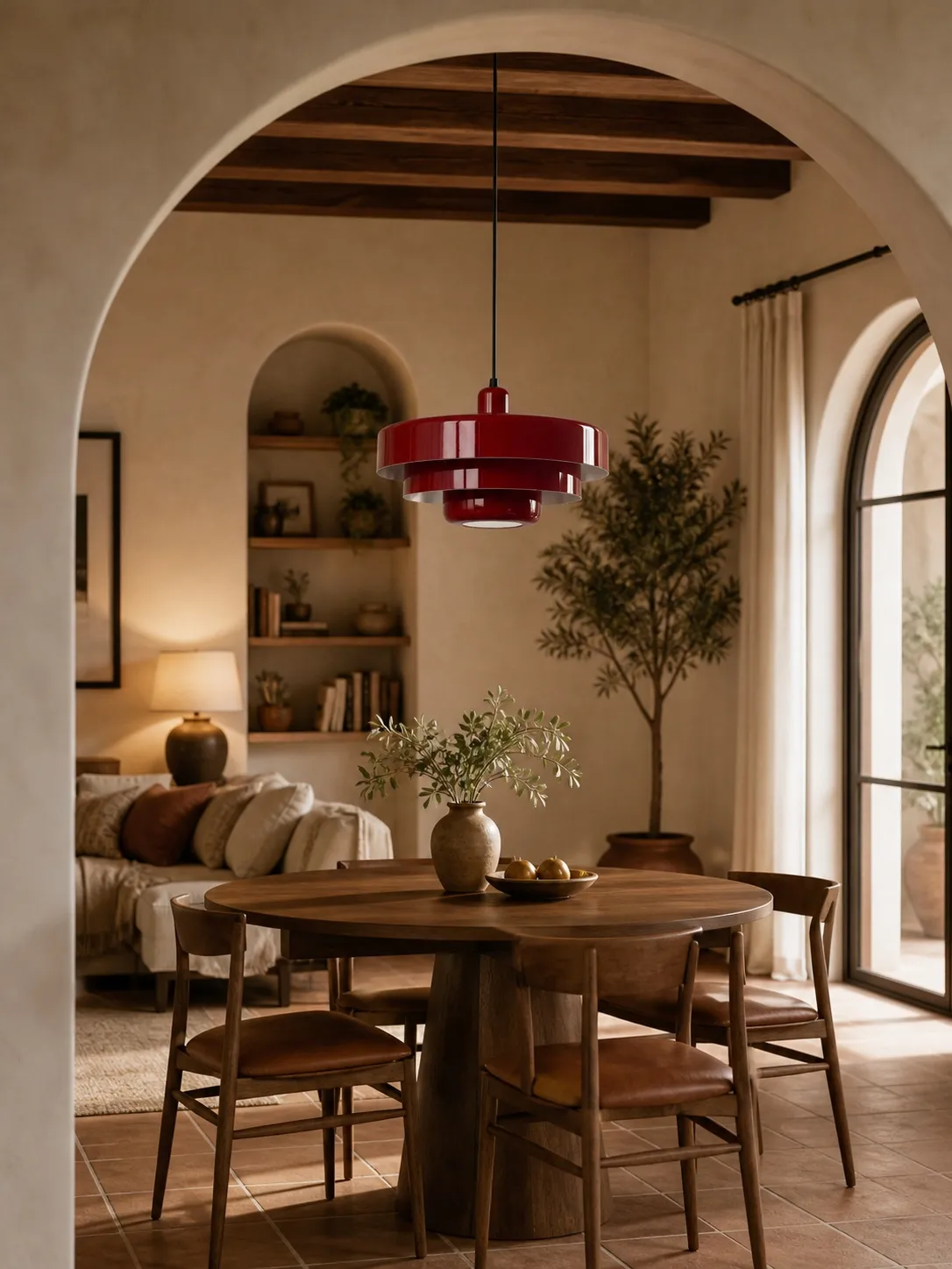
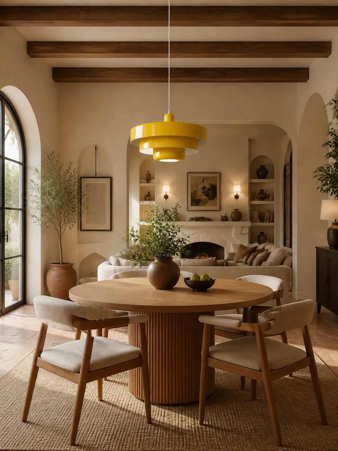
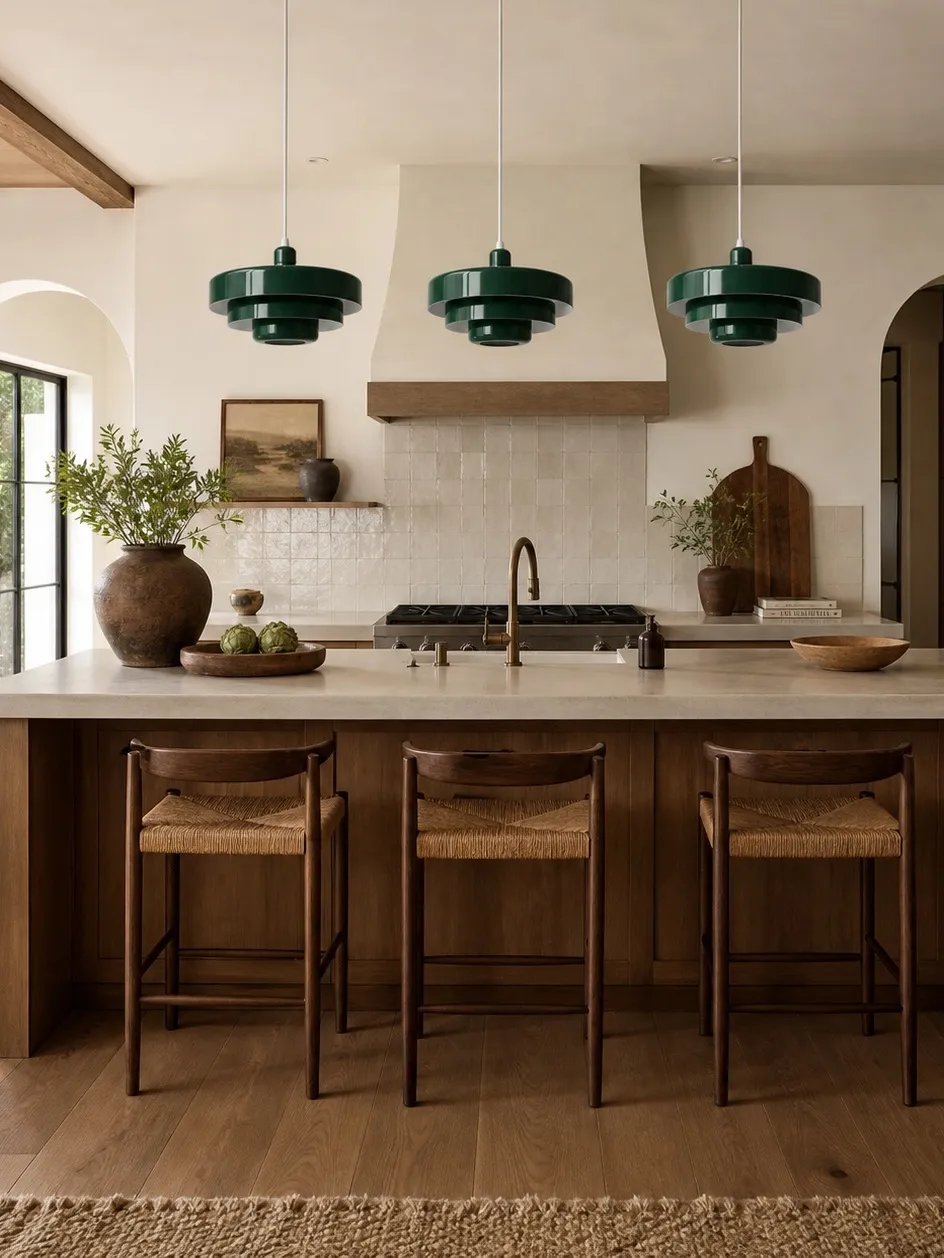
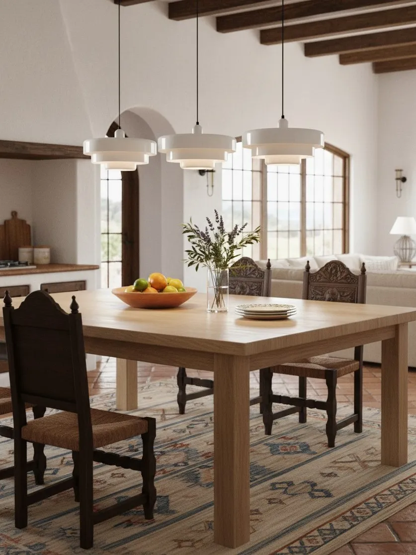
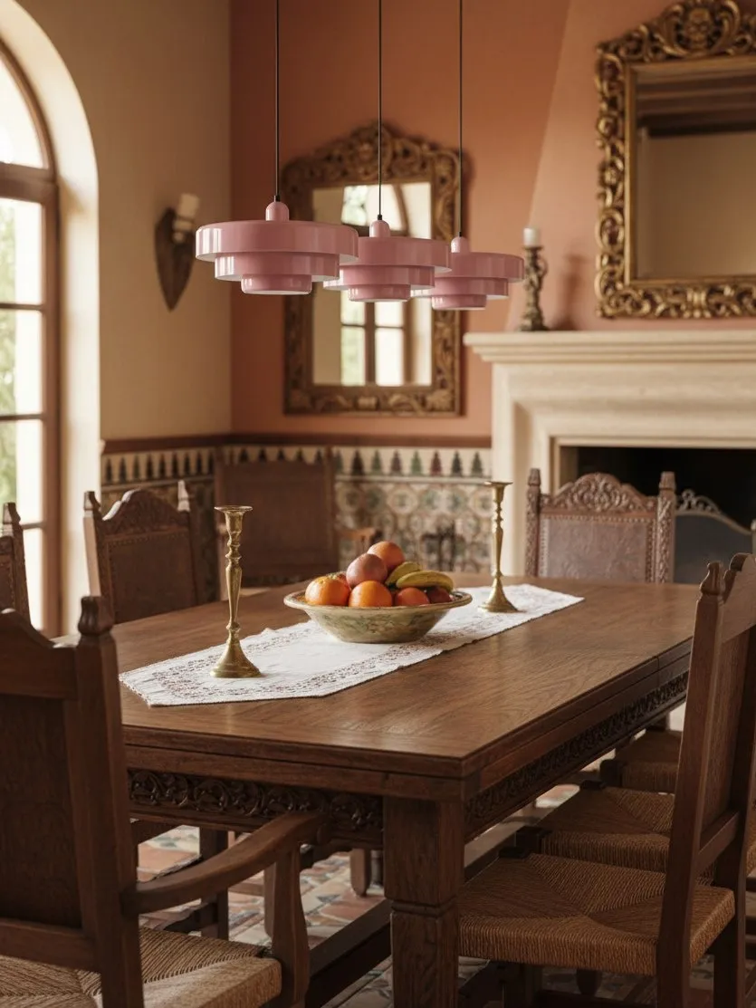
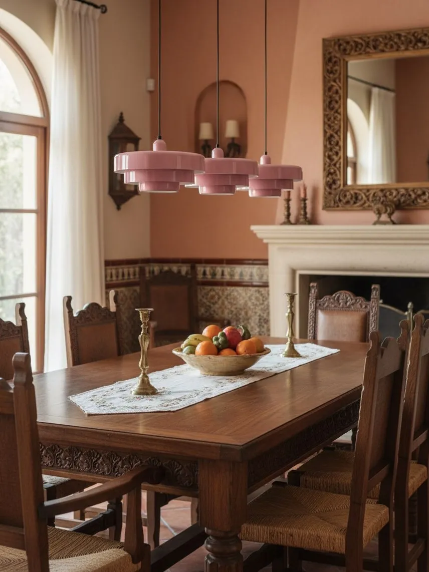
In a dining room, the pendant can be the strongest object because the table gives it a natural centre. In a kitchen, it must share attention with cabinets, appliances and worktops. Use stronger colour in a dining area when you want the table to feel like a destination. Use a quieter, earthier finish in an open kitchen when the fitting will be visible from several rooms.
If you are deciding whether colour itself should be the focal device, Colorful vs Neutral Pendant Lights: Which Makes a Better Dining Room Focal Point? compares flexibility, visual impact and long-term decorating effort.
Four Styling Mistakes That Make Colour Look Cheap
- Choosing from a phone screen: screen colour shifts. Compare a physical sample or a close material reference in morning and evening light.
- Ignoring the off-state: the pendant is furniture for the ceiling even when unlit. Judge its finish during the day.
- Using too many focal points: a bold splashback, colourful stools and a statement light may compete. Pick a hierarchy.
- Matching instead of relating: exact repetition feels staged. Use nearby tones and different textures.
A Statement Piece That Still Lives Well
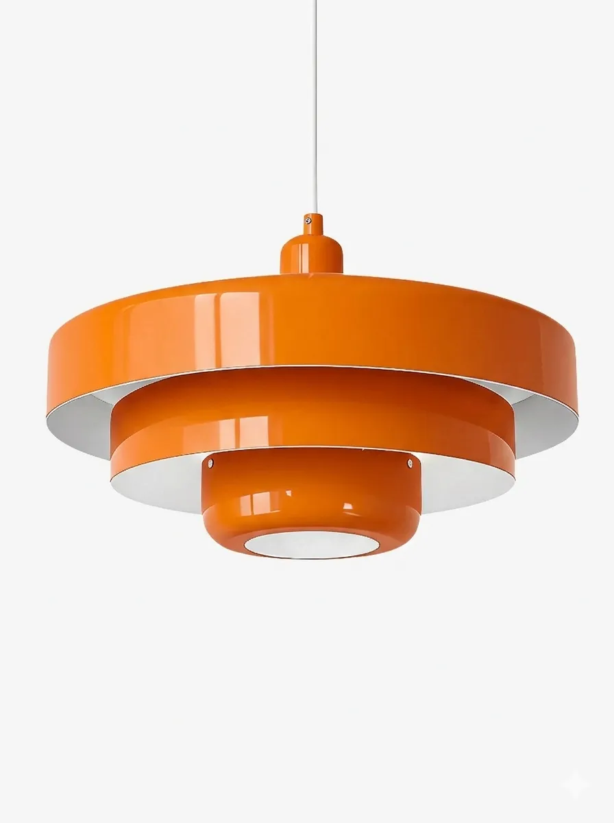
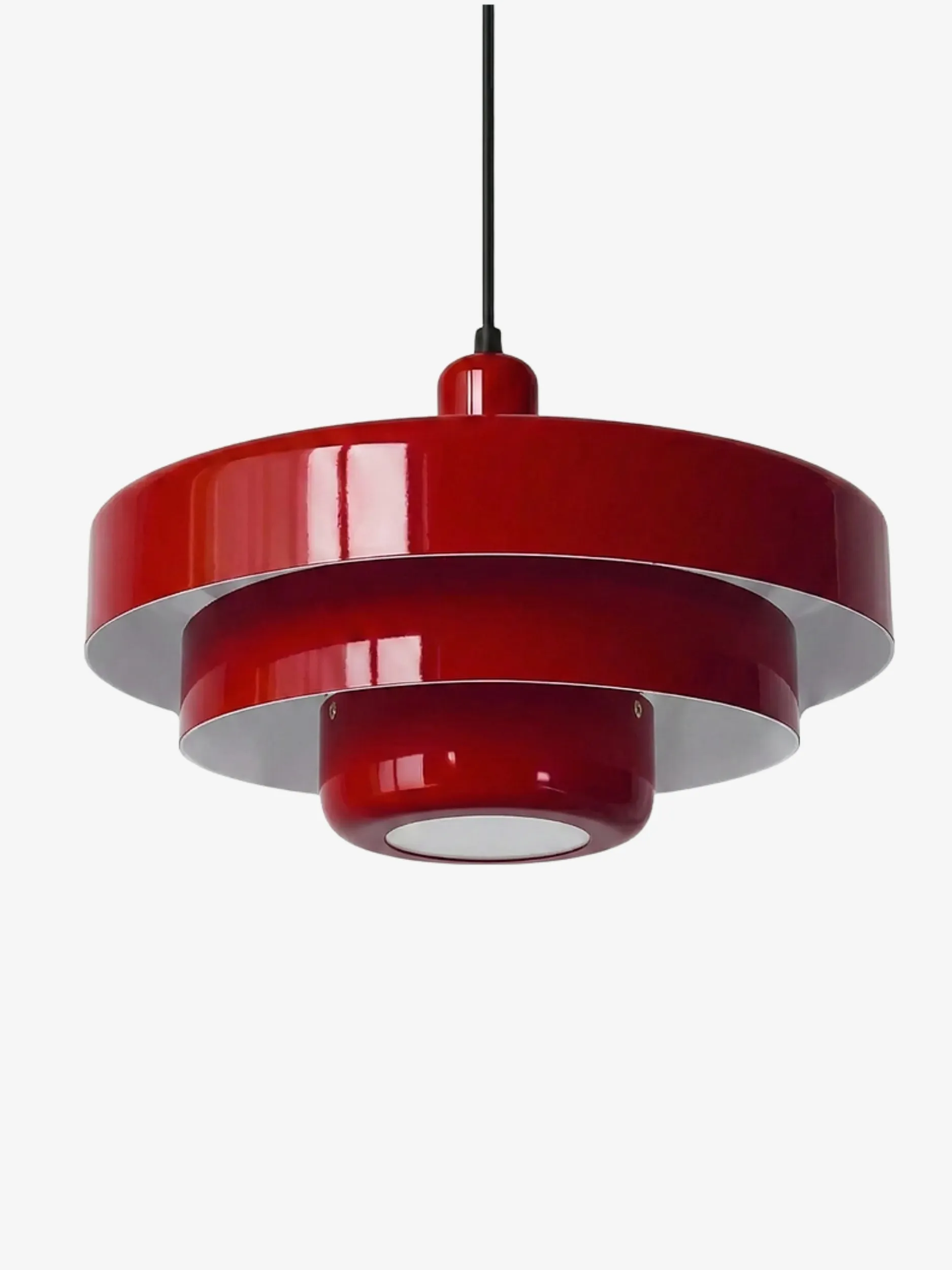
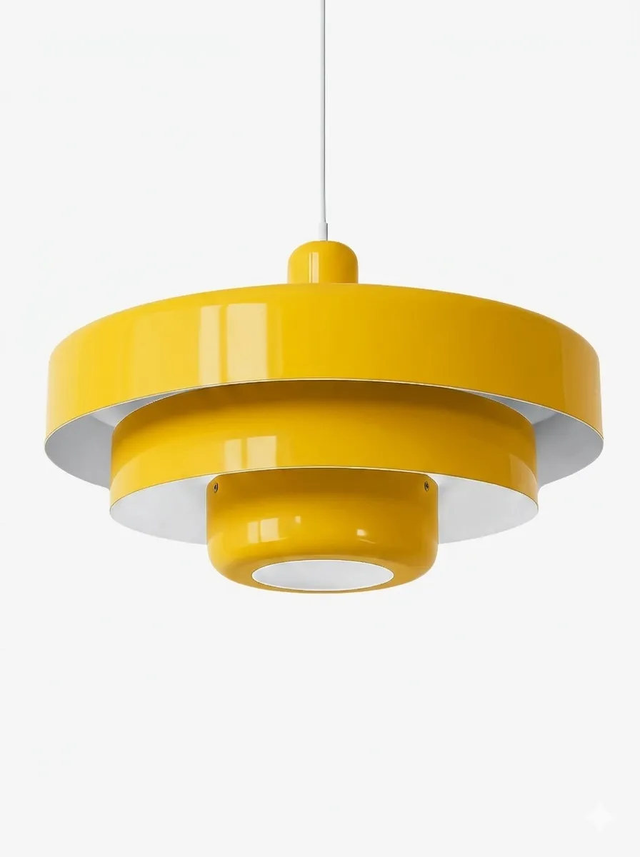
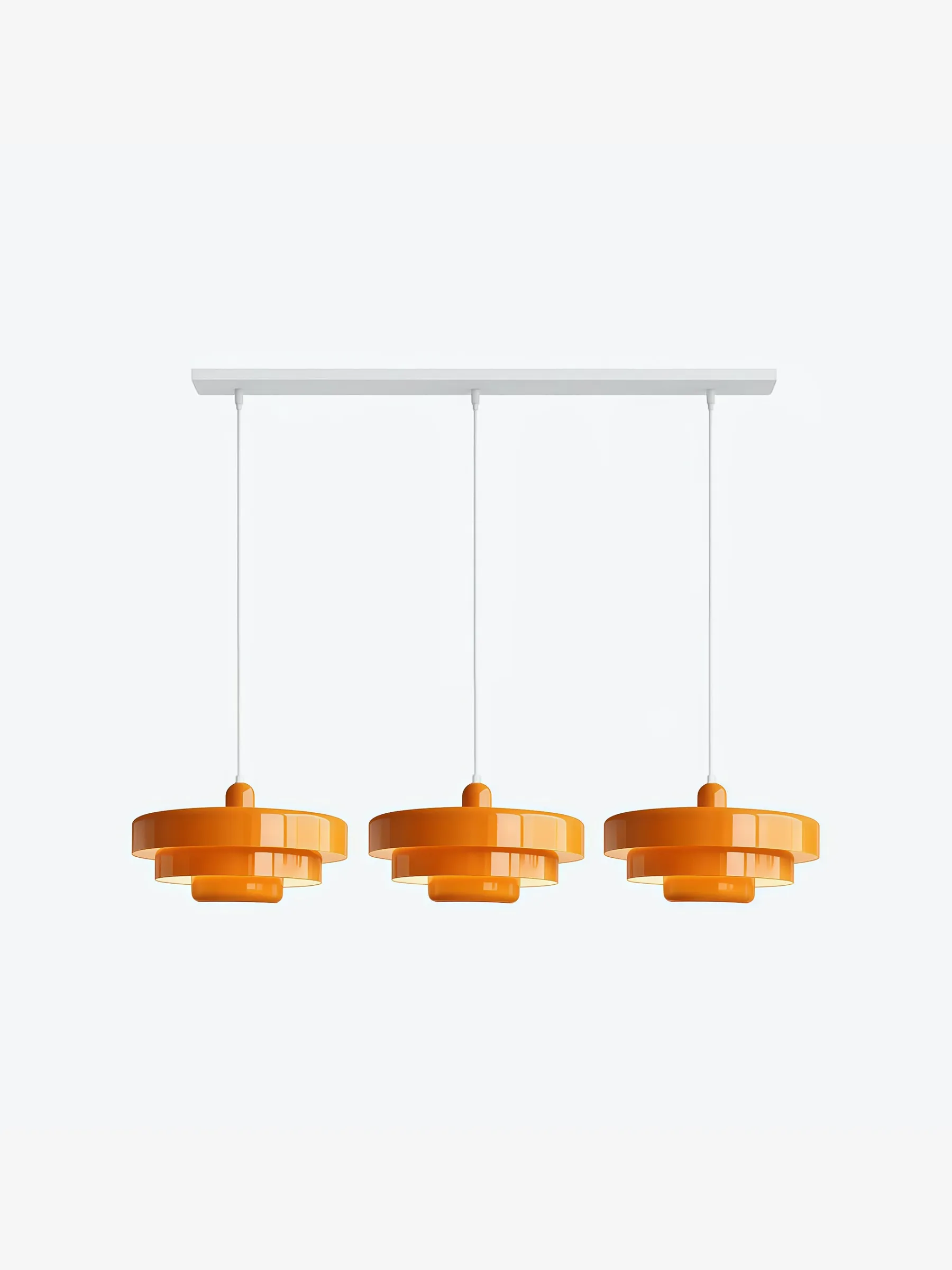
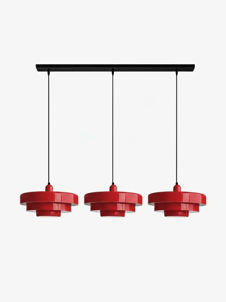
The most durable choice is not automatically the safest colour. It is the option whose relationship to the room is easy to explain: it connects to the timber, creates a deliberate contrast with the stone, marks the dining zone or balances an otherwise pale open plan. A multi-layer metal pendant is particularly useful because its silhouette remains interesting even if the chosen colour is restrained.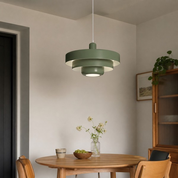
FAQ
Will a colourful pendant date quickly?
Not if the colour relates to permanent materials and the rest of the room stays flexible.
Should the pendant match kitchen hardware?
No. It can coordinate by warmth or contrast without matching the metal exactly.
Can I use two statement pendants?
Yes, when they read as one balanced group over a long fixed surface.
Is white still a statement colour?
Yes. A sculptural white shade creates impact through form, shadow and scale.
What should I check before ordering?
Confirm dimensions, suspension range, bulb requirements, finish and installation conditions on the current product page.