How to Choose a Pendant Light Colour Your Neutral Kitchen Will Not Outgrow
The best pendant light colour for a neutral kitchen is the one that connects to the room in daylight, remains pleasant at night and has a clear level of contrast. That might be warm white, muted orange, deep green or another controlled hue. Do not begin with “What colour is fashionable?” Begin with the surfaces you cannot easily change: cabinets, worktop, floor, timber and the view into adjoining rooms.
Before You Start: Record the Fixed Palette
Take one daylight photograph that includes the cabinet, worktop, floor and any large timber surface. Write each material as warm, cool or balanced. Cream, beige limestone and honey oak usually read warm. Blue-grey stone, crisp white and cool concrete tend to read cool. Greige, natural oak and some off-whites can shift with surrounding light, so test them at different times.
Also note what the pendant must do. Is it a visual marker over an island, useful downlight above a table, or the one expressive object in a plain rental kitchen? A colour can be attractive but wrong for the job.
Step 1: Match the Undertone—or Contrast It Deliberately
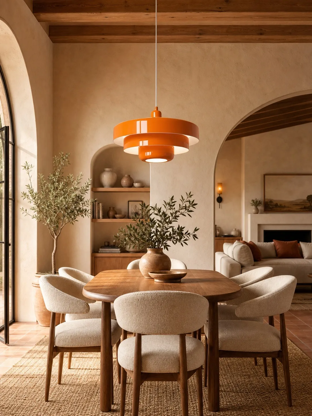
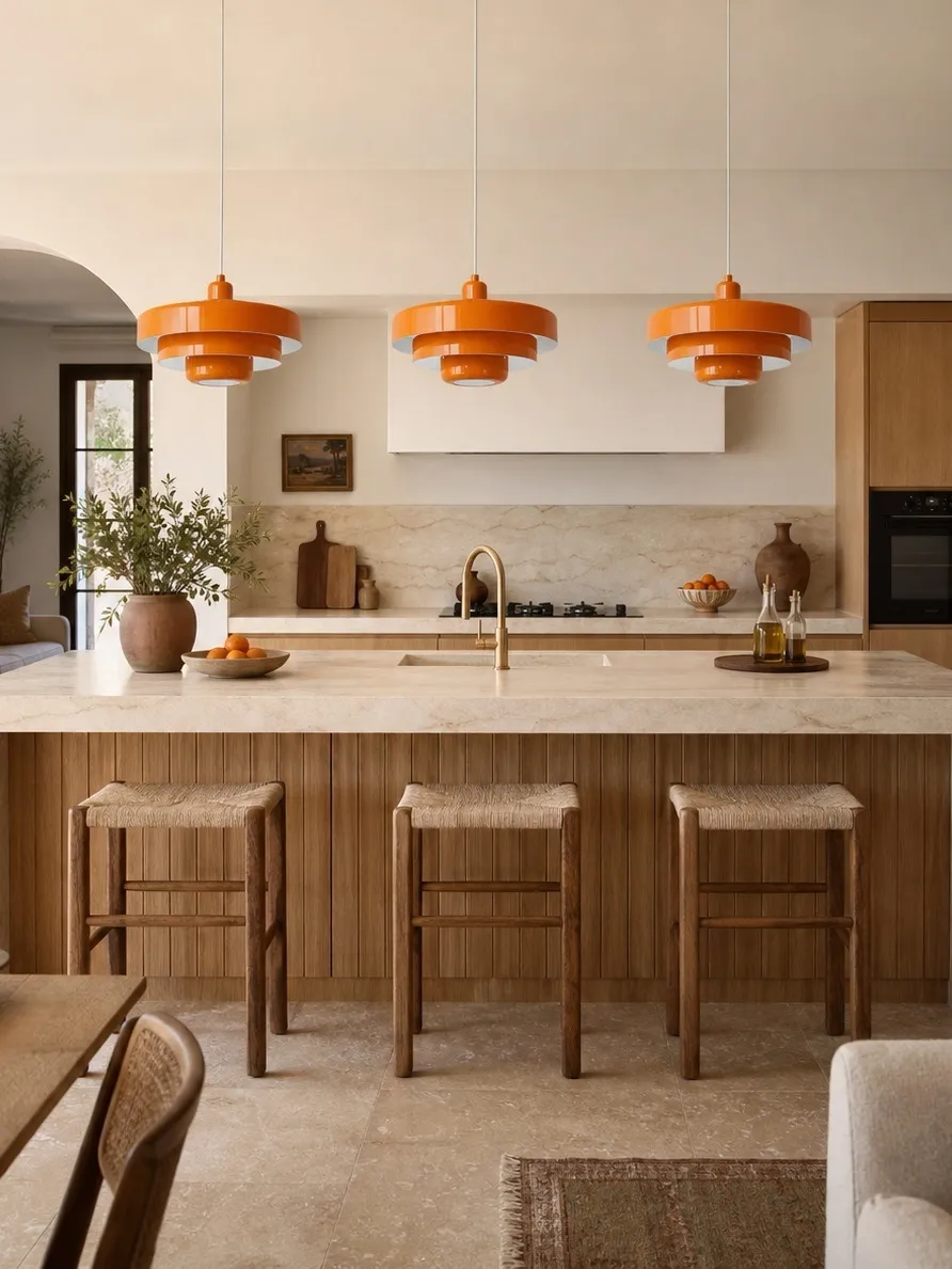
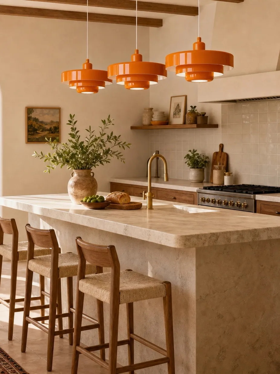
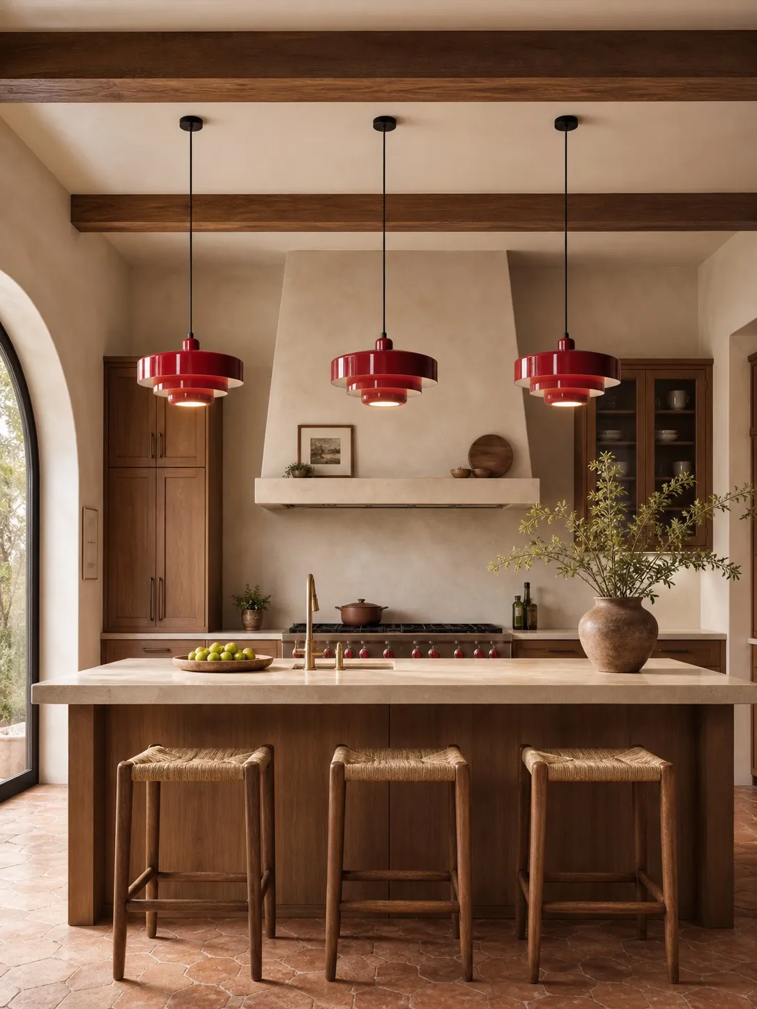
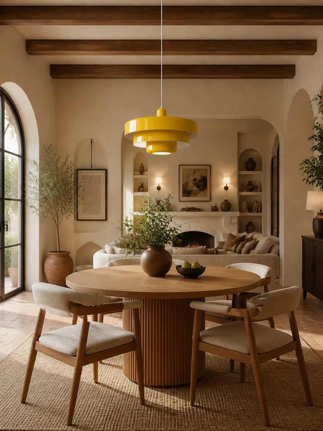
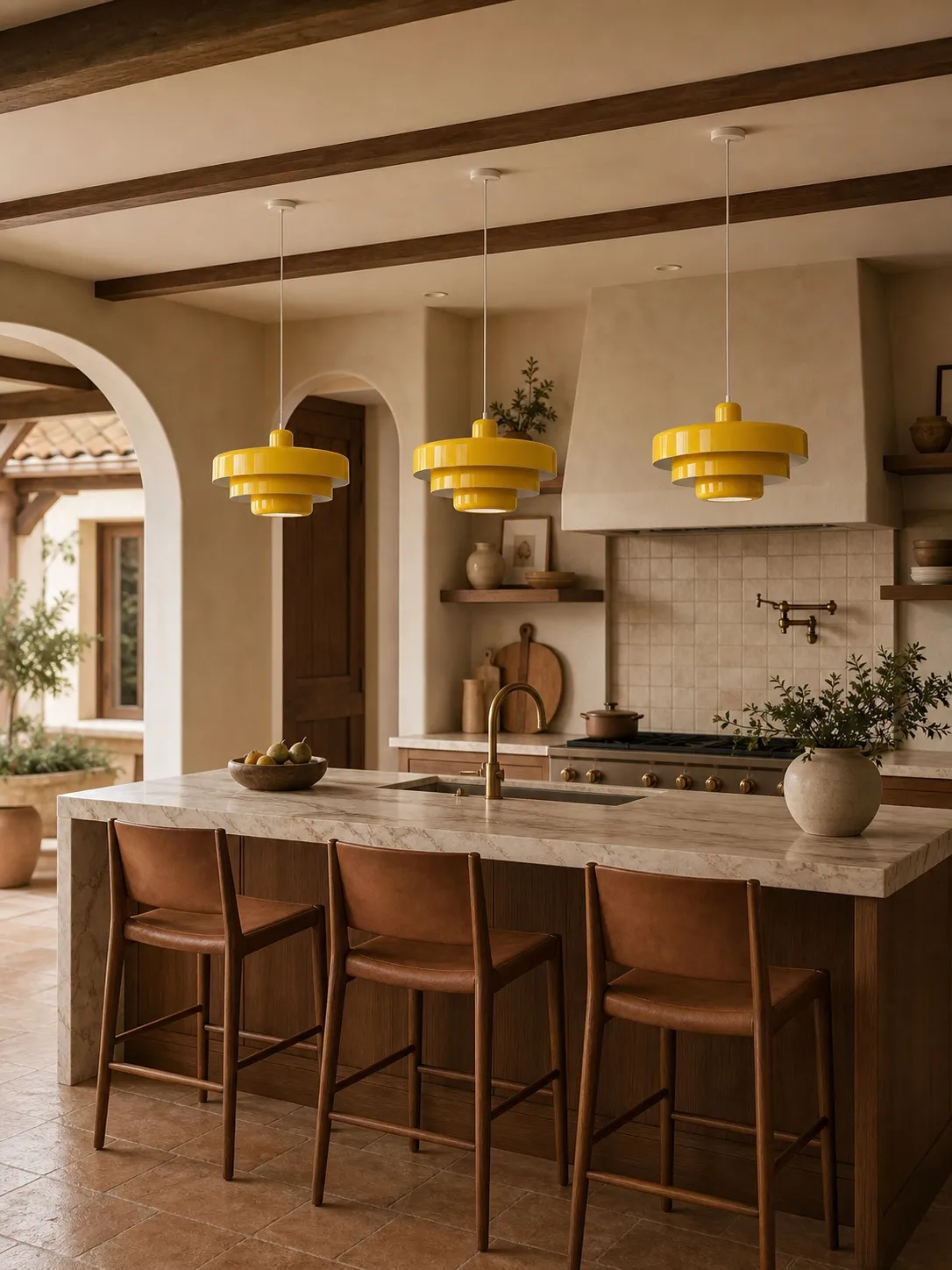
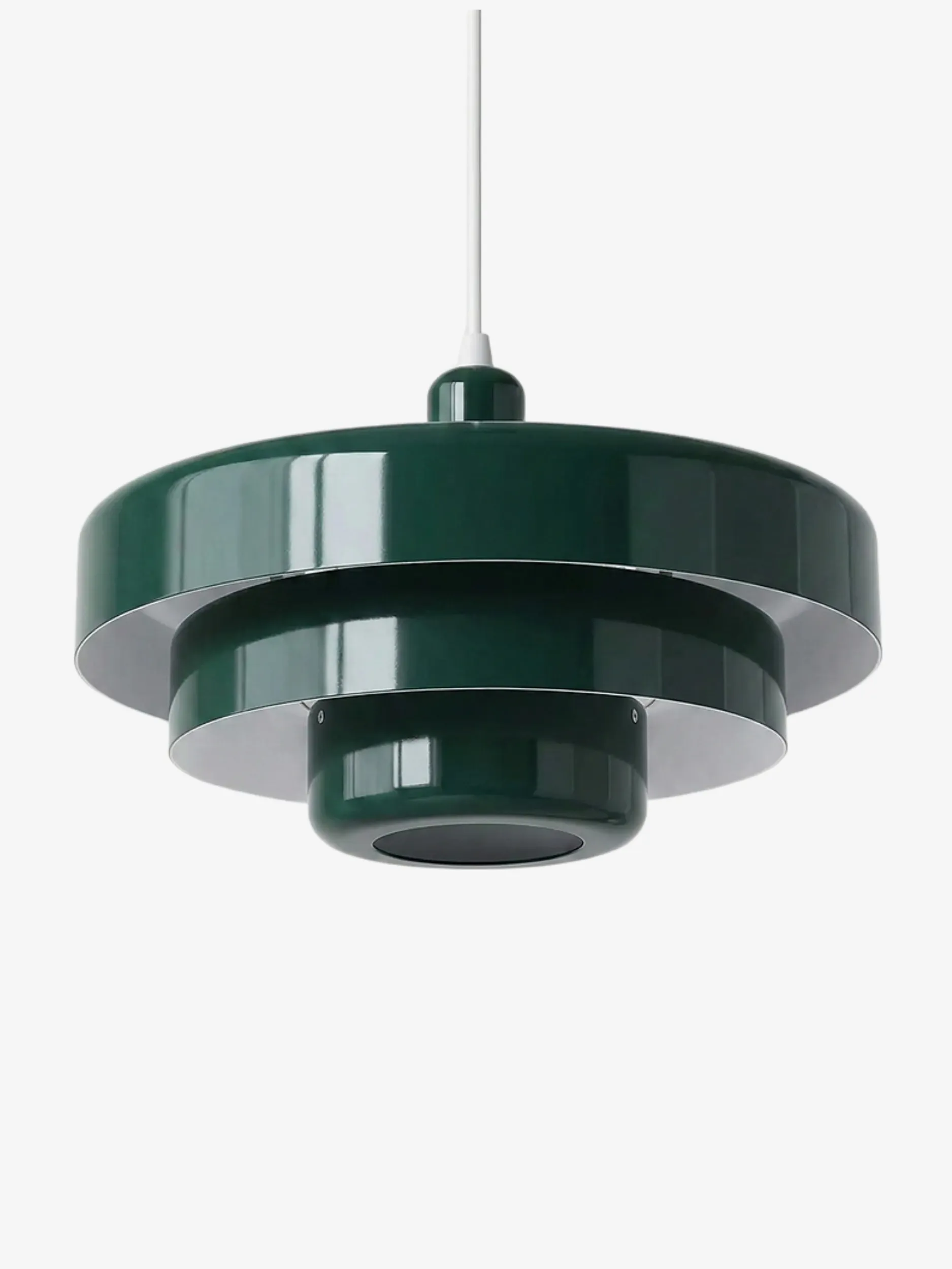
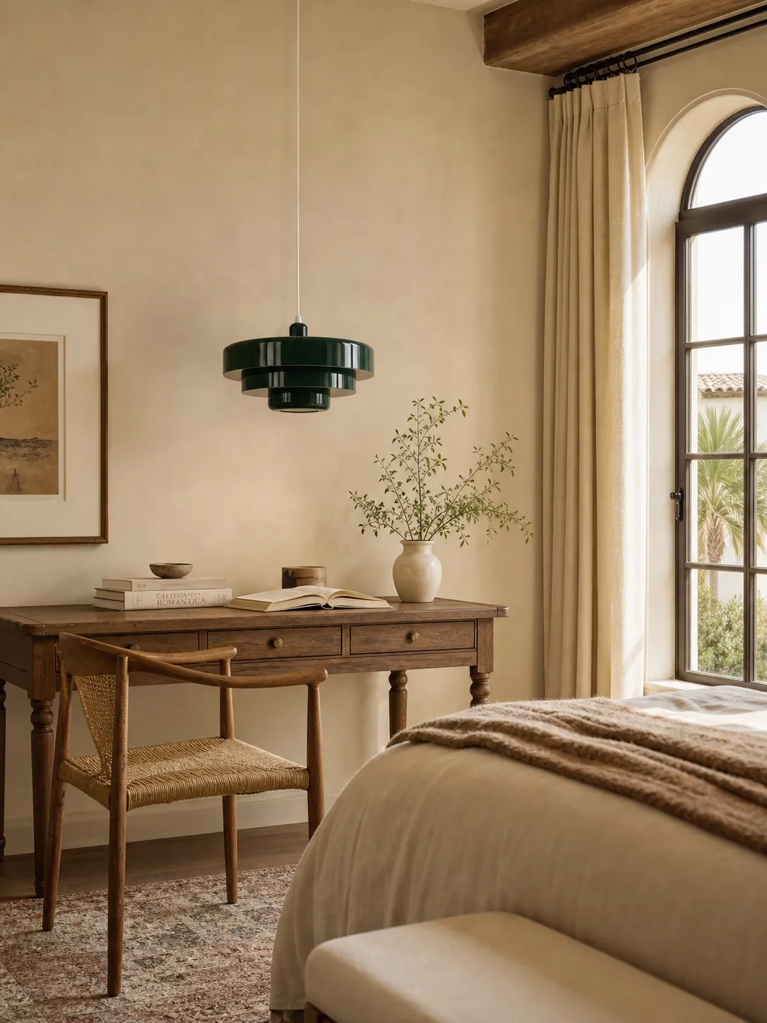
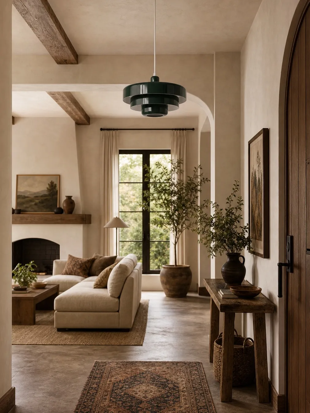
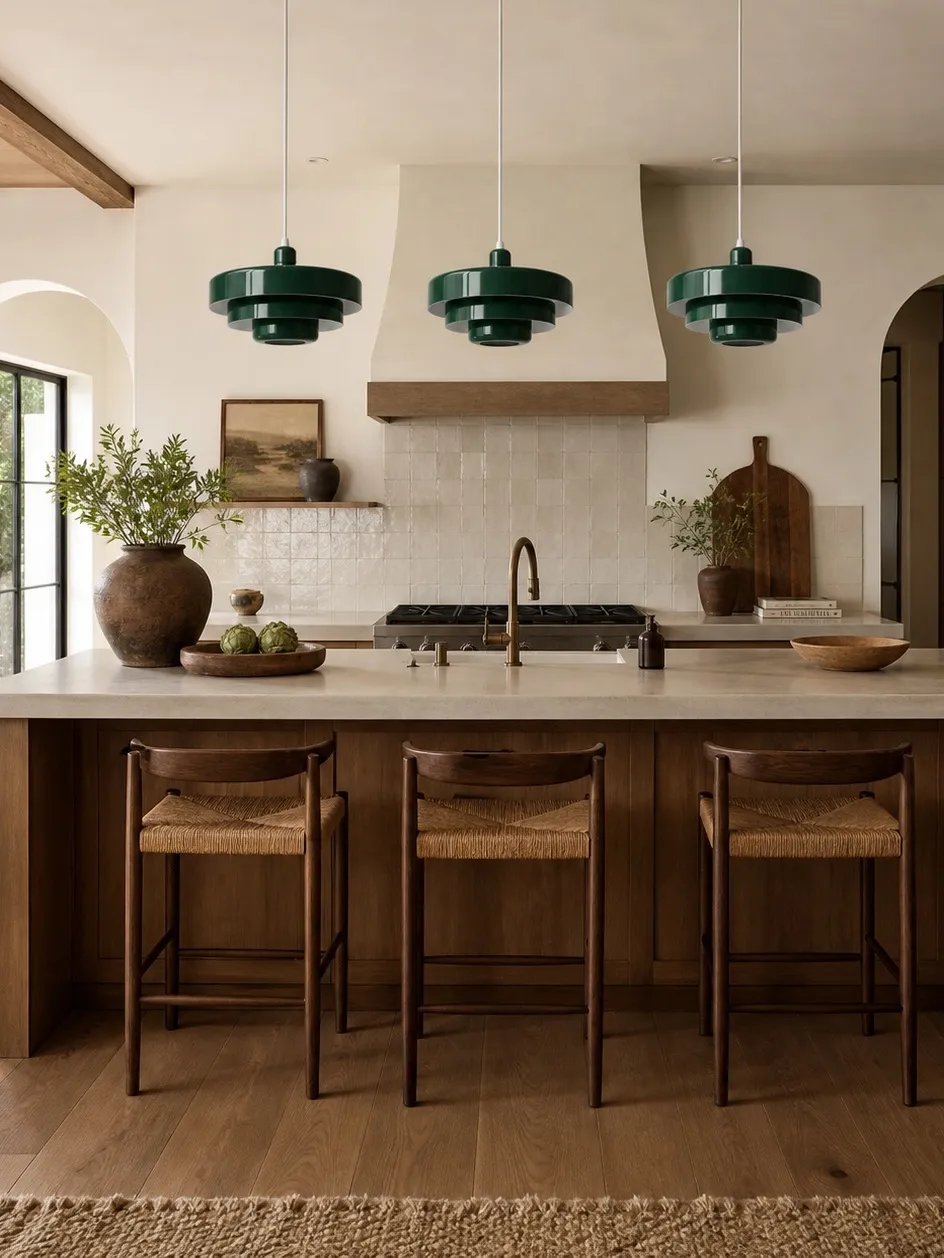
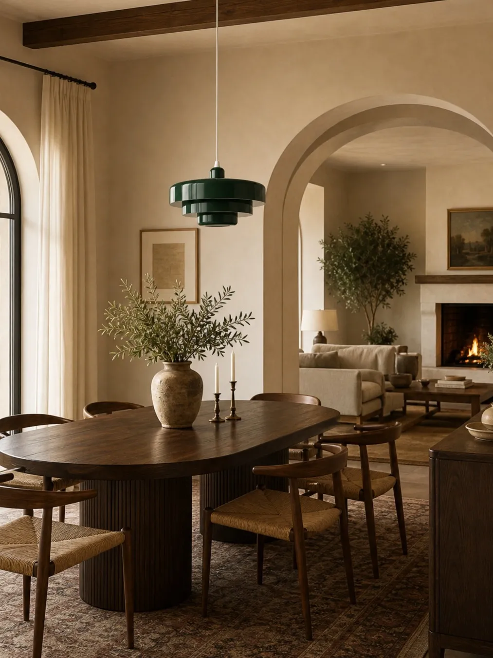
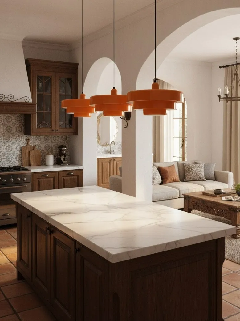
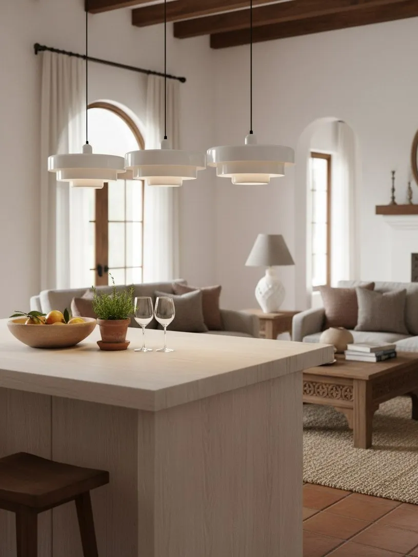
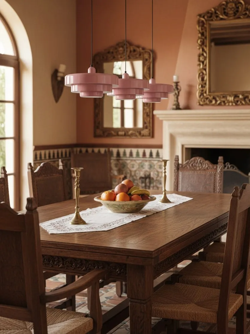
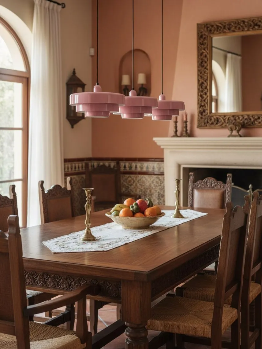
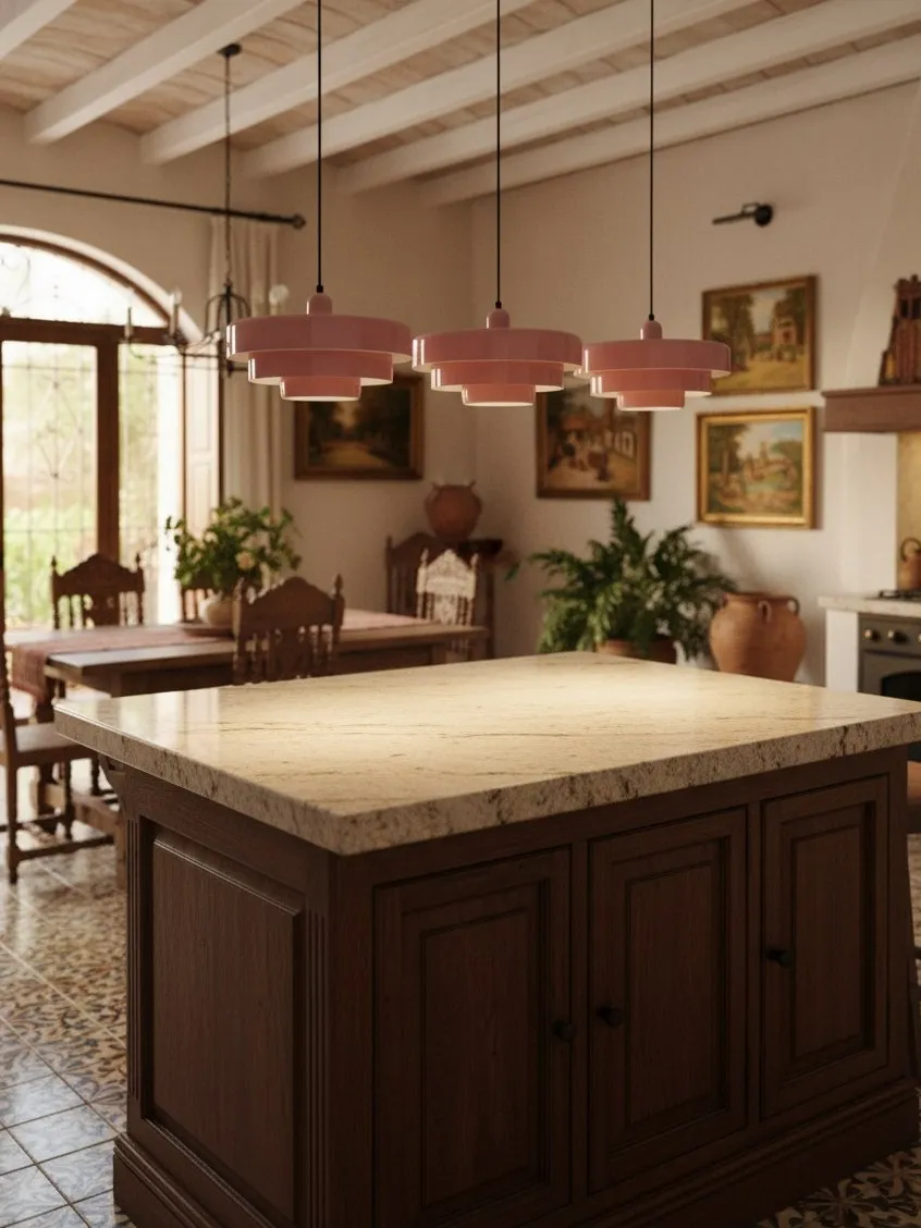
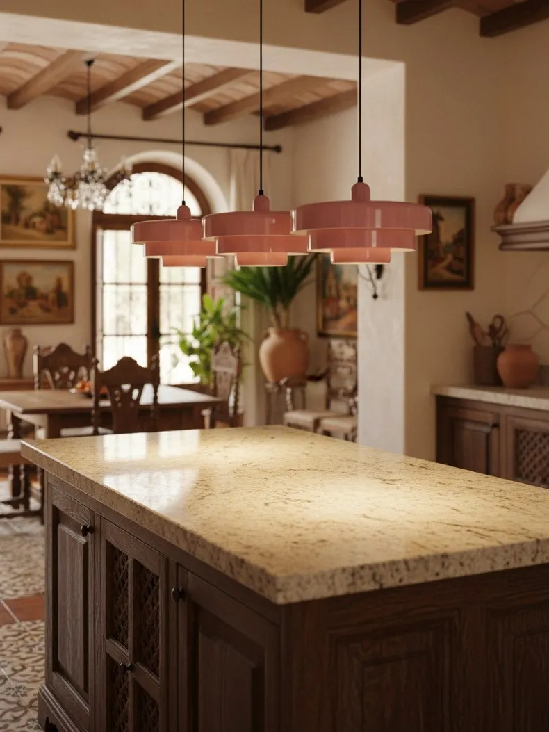
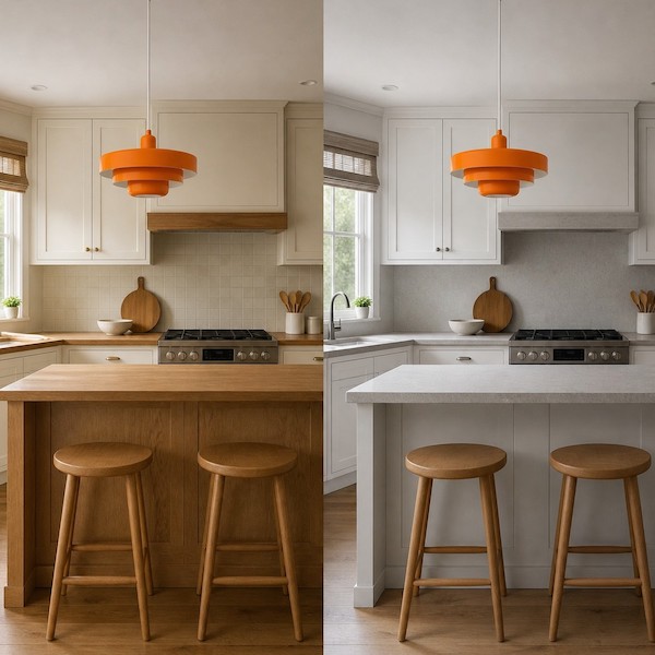
Harmony is the low-risk route. Warm orange or terracotta feels related to cream, oak and warm stone; deep green often complements timber while giving pale cabinets more depth; white keeps the room airy. Deliberate contrast is stronger: a cool green against warm beige, for example. The key word is deliberate. If the pendant is the only cool element in a warm room, give it one small supporting note elsewhere.
For the broader room-building strategy, Statement Pendant Lighting in 2026: How to Style a Colorful Metal Pendant in a Neutral Kitchen or Dining Room explains how colour, scale and layered lighting work together.
Step 2: Choose Your Contrast Level
Think in three levels rather than dozens of colour names:
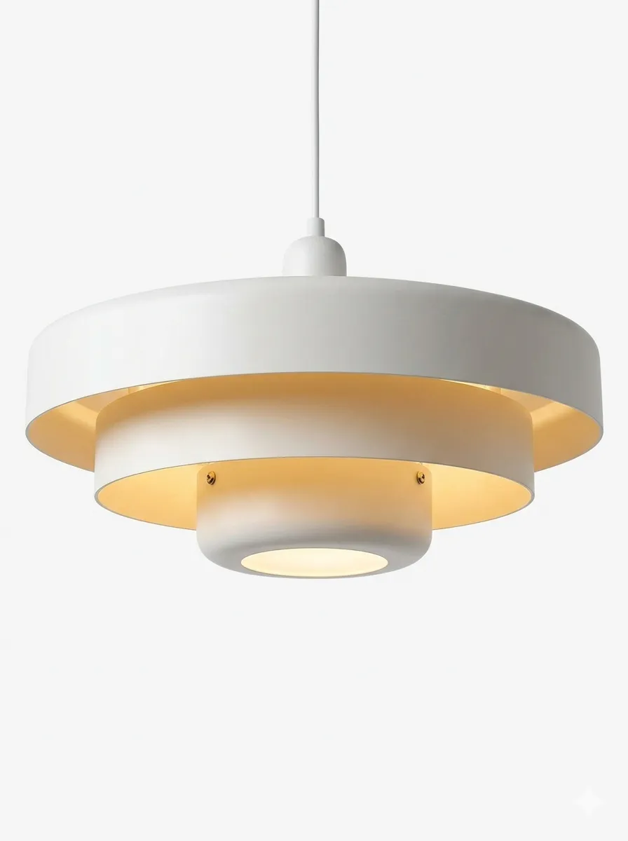
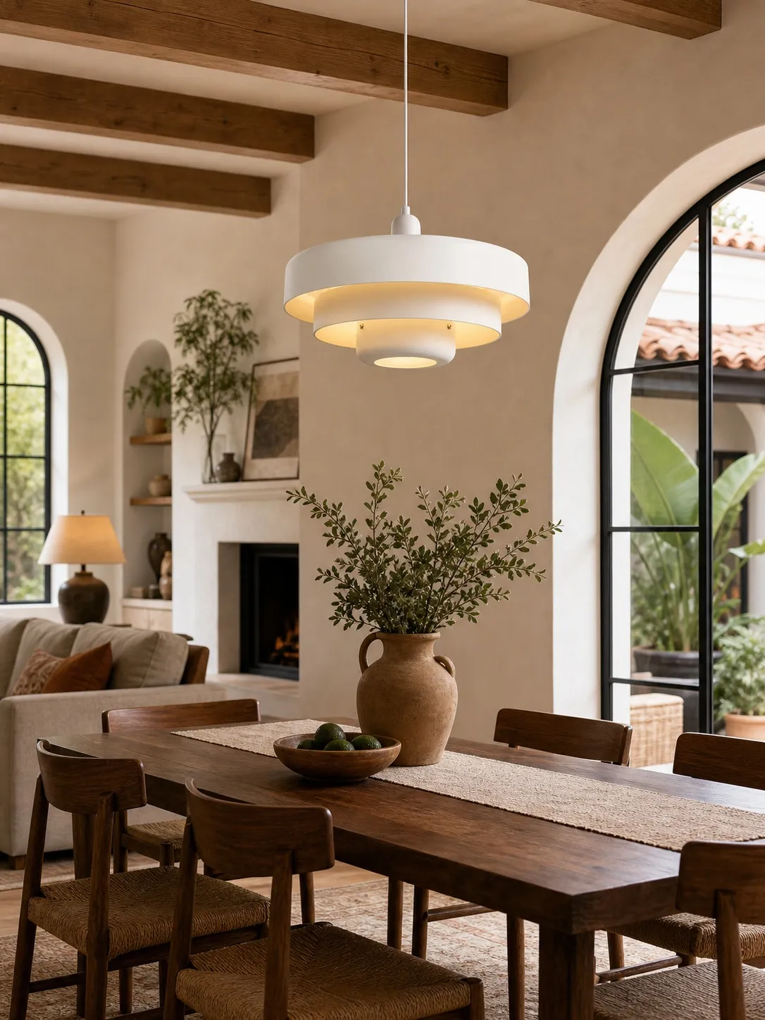
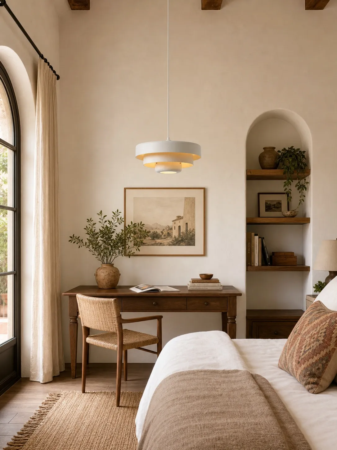
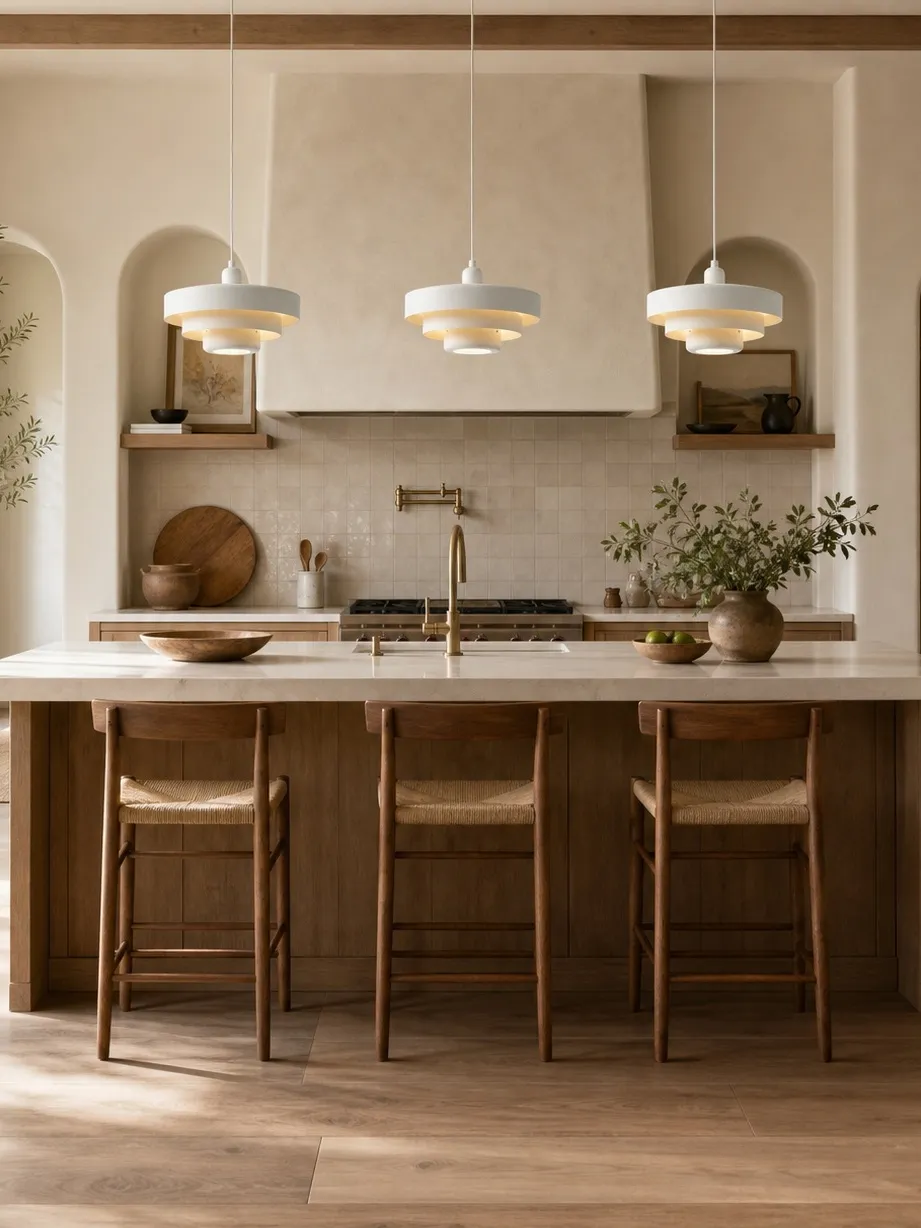
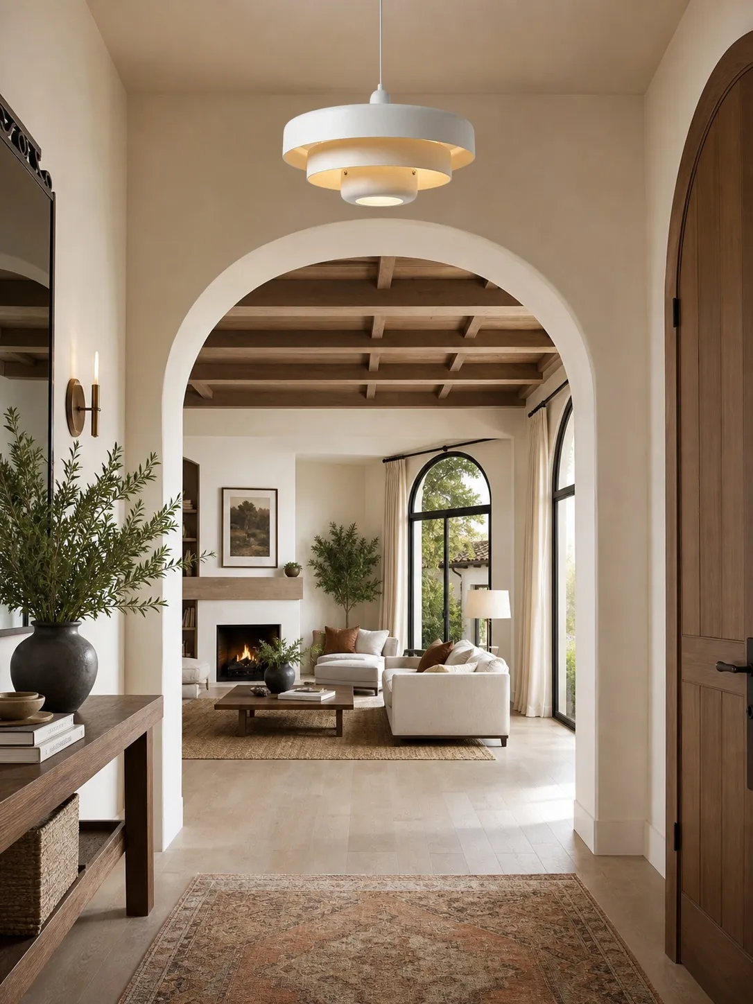
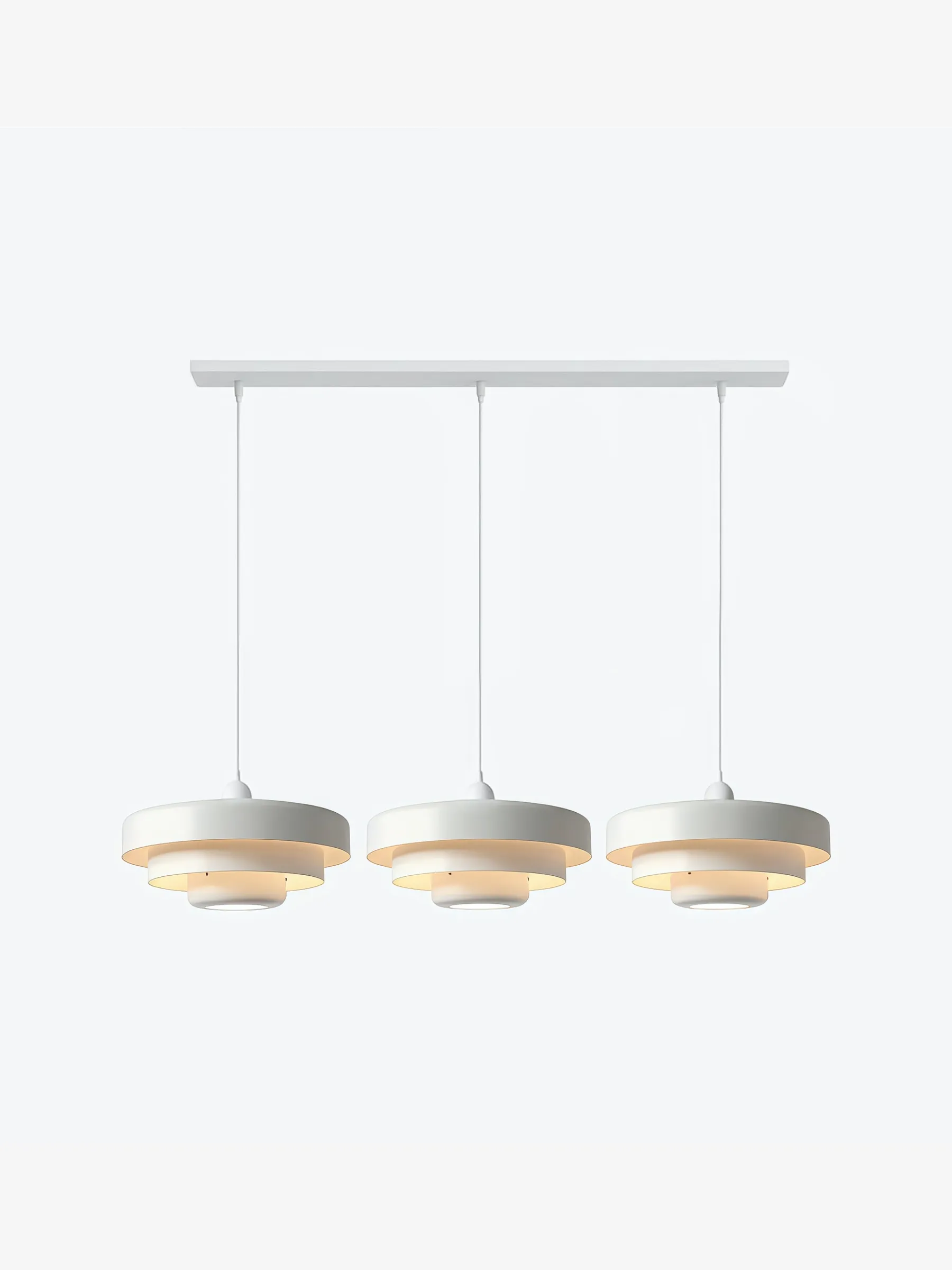
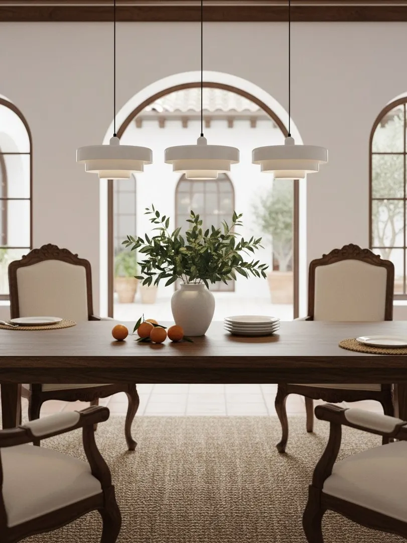
- Low contrast: white or a very pale finish. Best when the shade’s layered silhouette should speak more loudly than its colour.
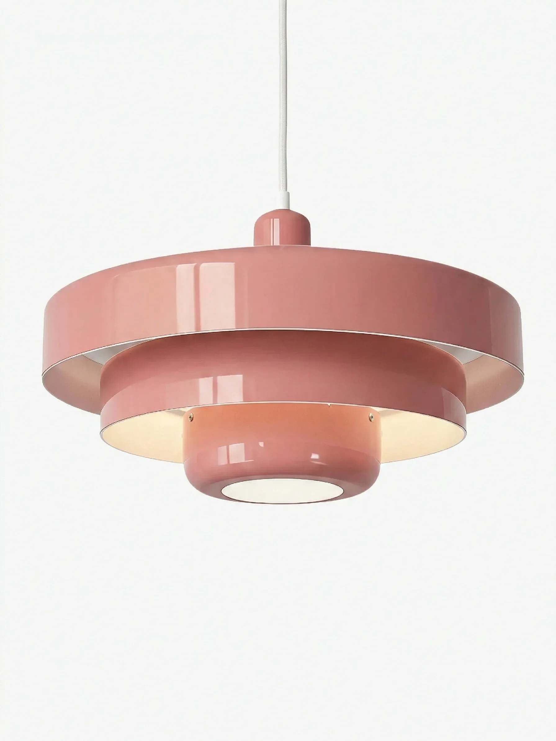
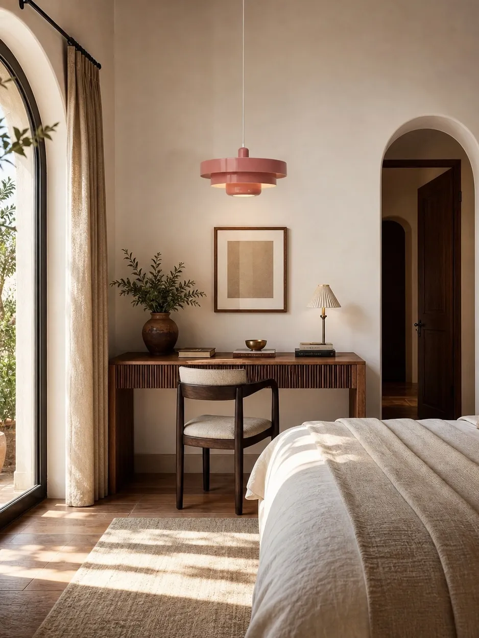
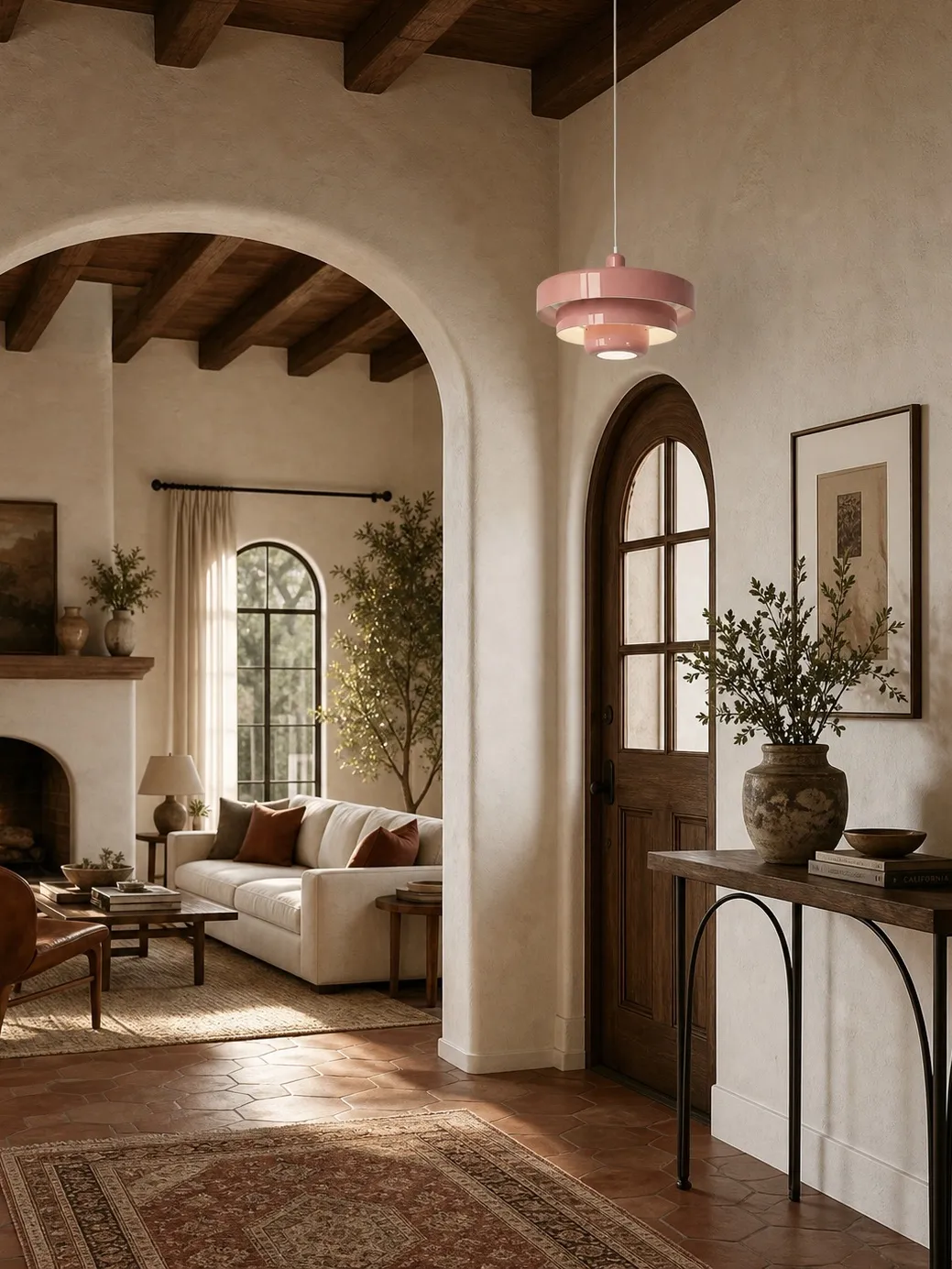
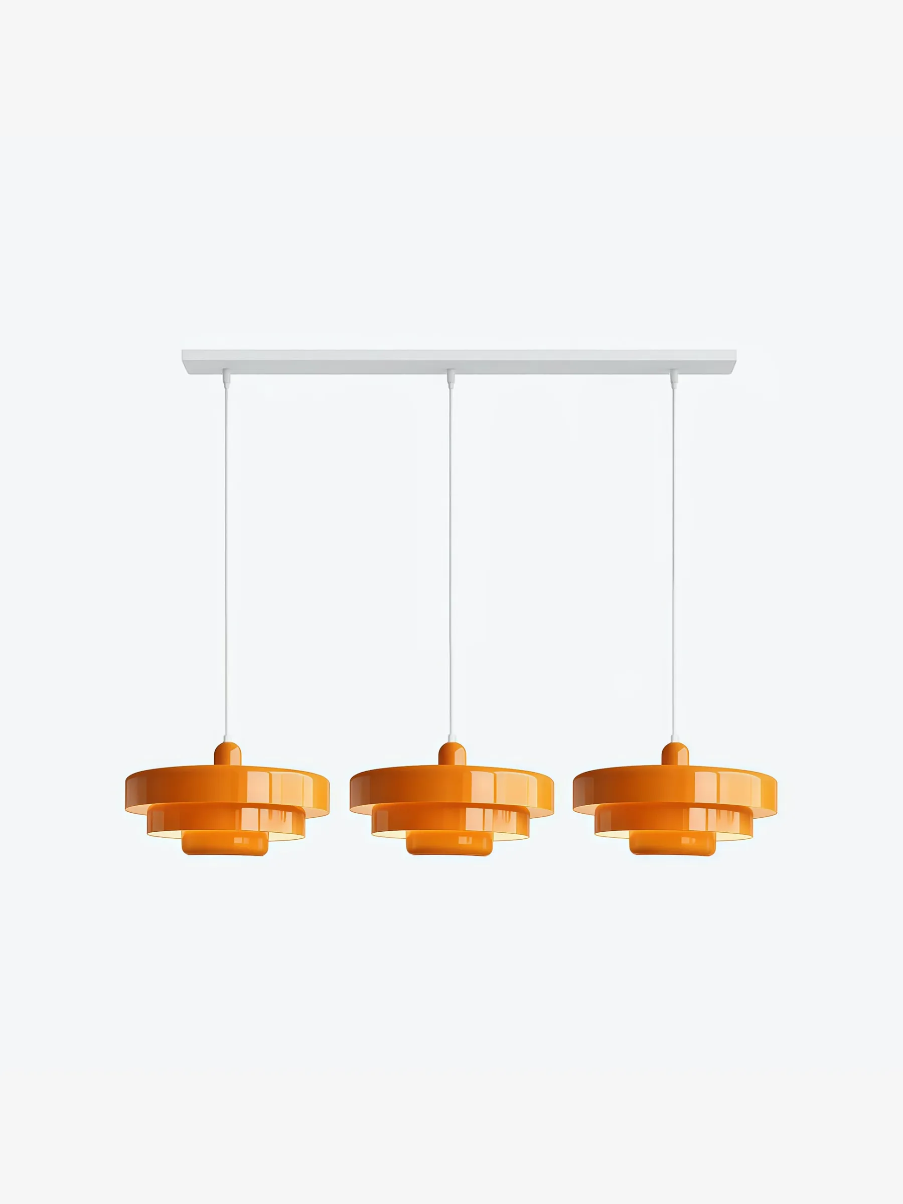
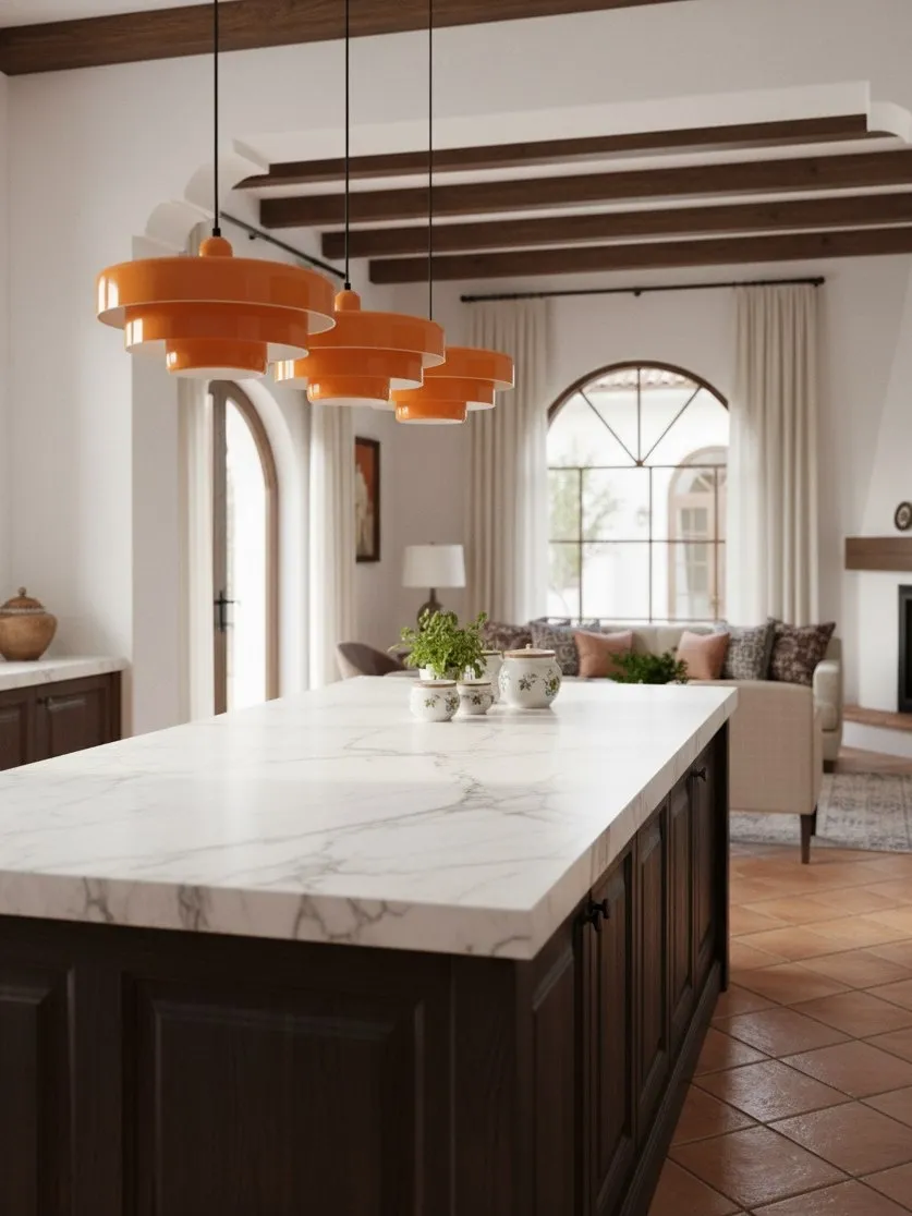
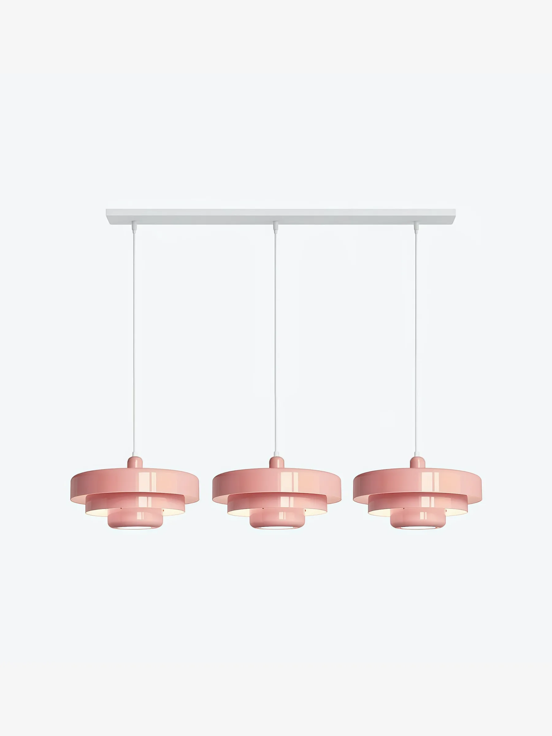
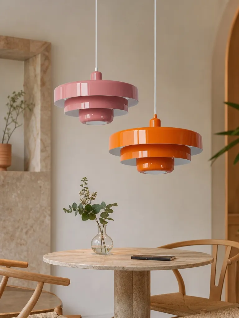
- Medium contrast: muted clay, soft orange or dusty green. Best for most neutral kitchens because the fitting is visible without dominating every view.
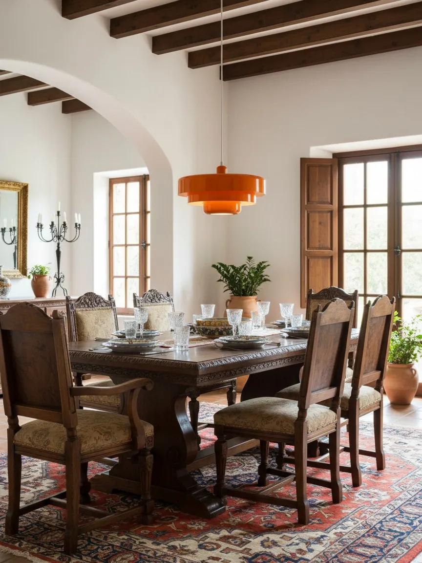
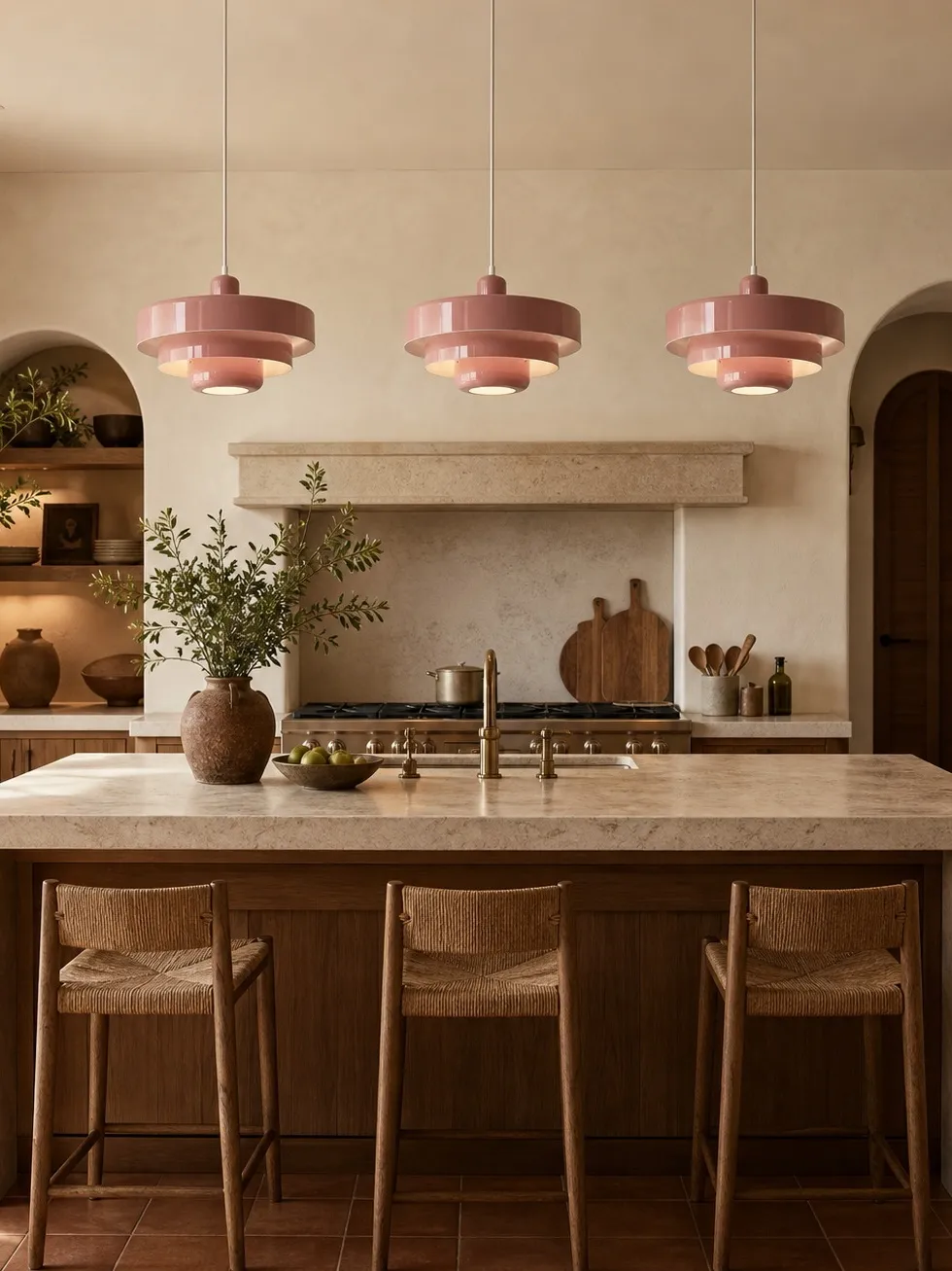
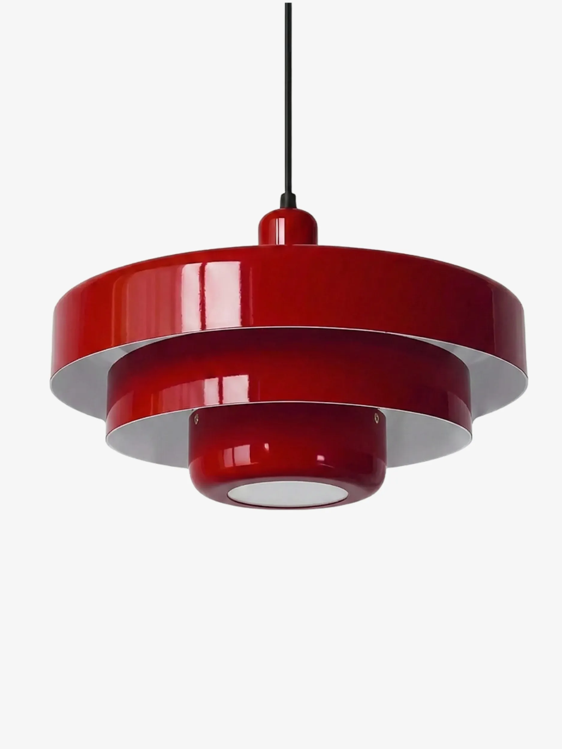
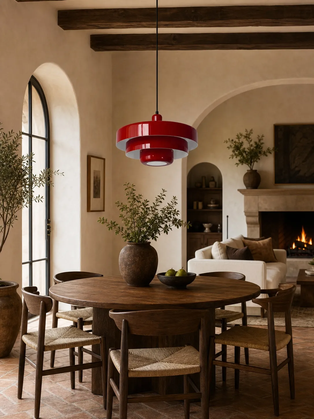
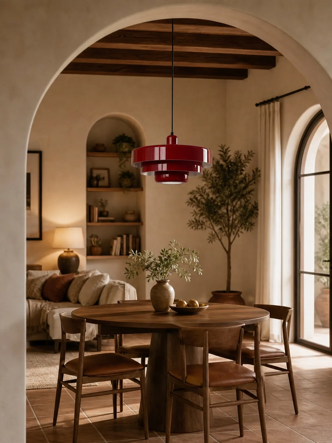
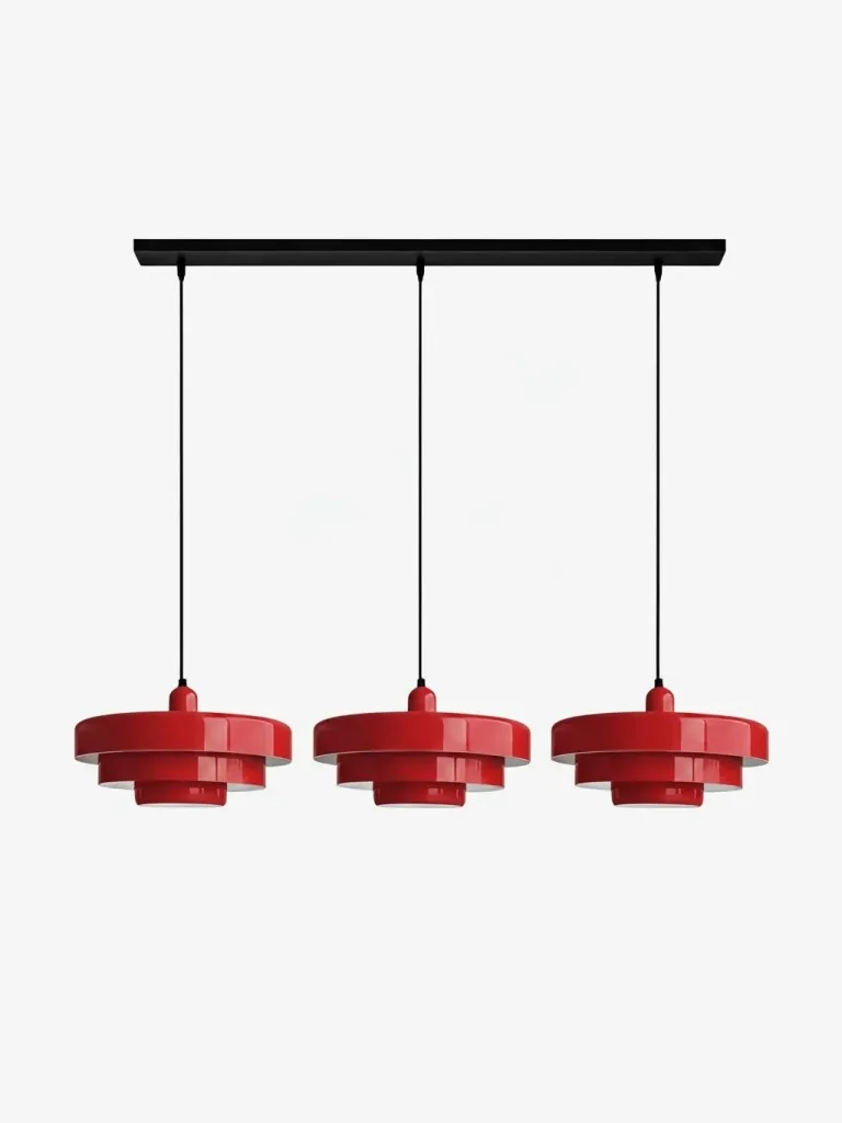
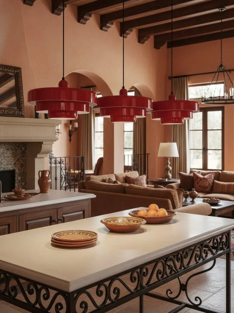
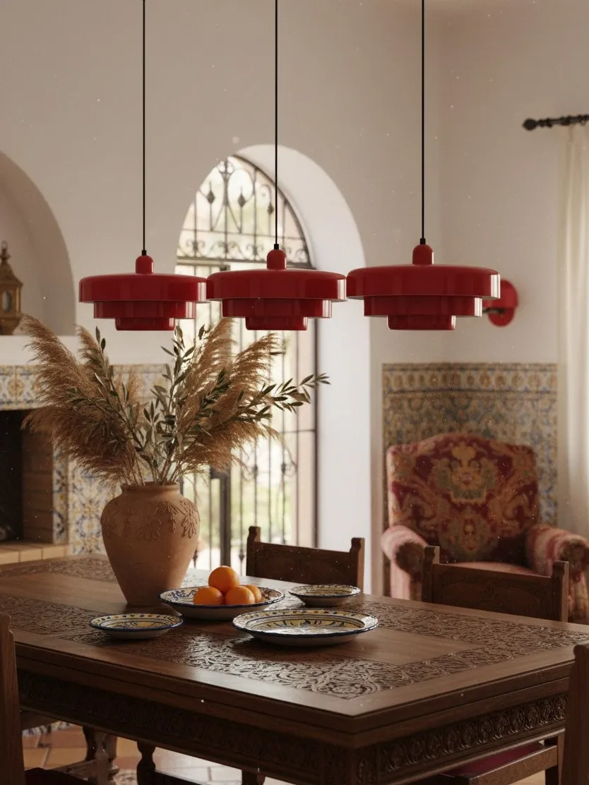
- High contrast: dark green, strong red or another deep finish. Best when the pendant needs to define a dining or island zone in an open plan.
Room size does not automatically dictate contrast. A small kitchen can carry a dark or colourful fitting if the surroundings are disciplined. The more useful question is how many other high-contrast edges already exist: black appliances, patterned stone, dark frames and busy shelving all add visual weight.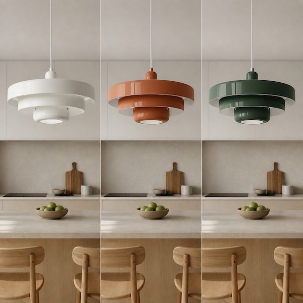
Step 3: Test Three Sightlines, Not One Close-Up
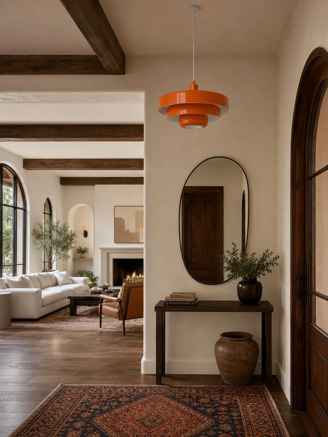
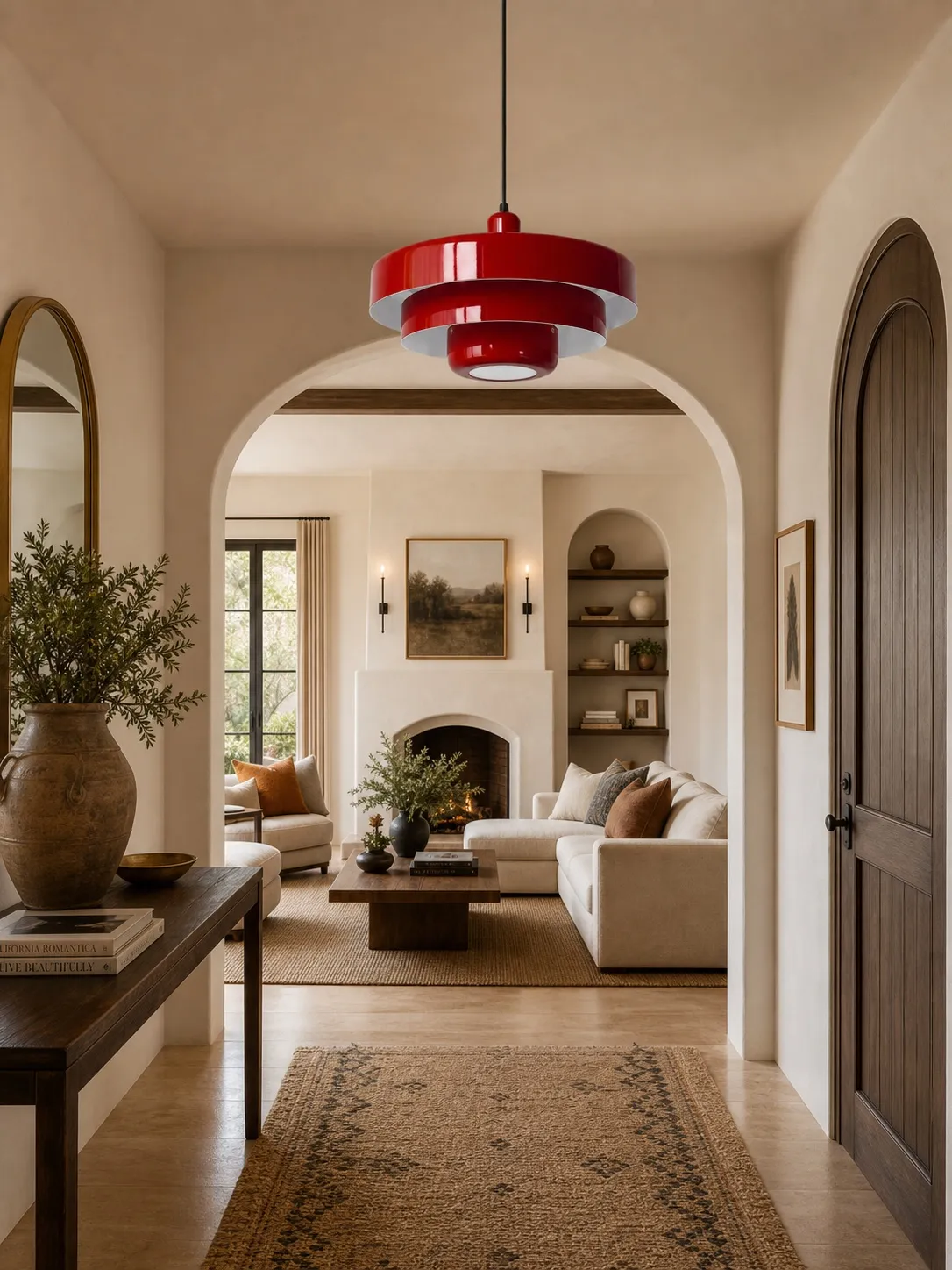
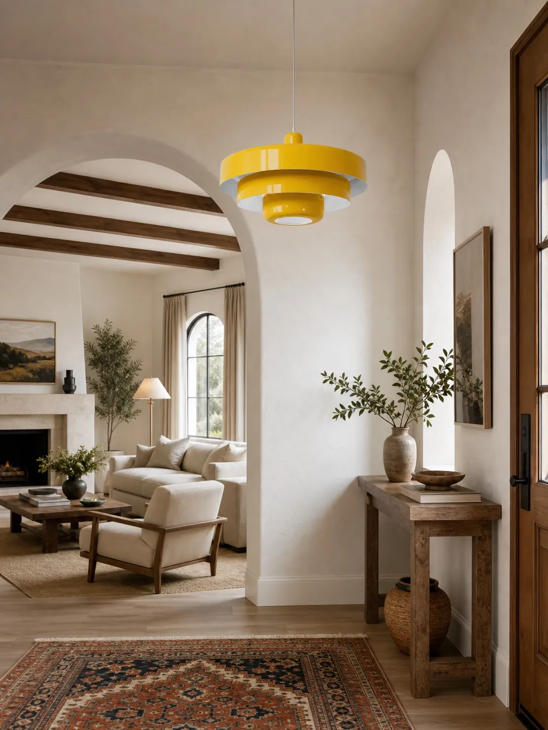
Stand at the kitchen entrance, the main preparation position and the adjoining living or dining area. A finish that looks subtle beneath the light can appear much stronger from twenty feet away. In an open plan, the pendant may become a navigation point. That can be helpful, but only if it does not compete with a fireplace, large artwork or colourful sofa.
For compact layouts, read Can a Colorful Pendant Light Work in a Small Neutral Kitchen? before choosing a high-contrast finish; it includes a simple fit test for sightlines, circulation and lighting support.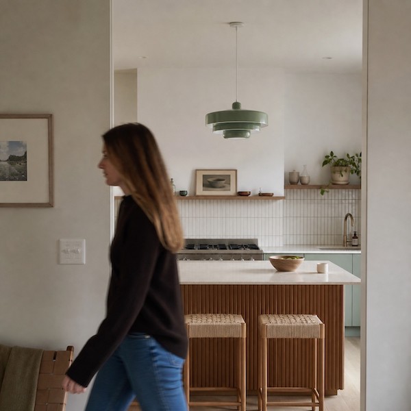
Step 4: Check Daylight, Evening Light and the Off-State
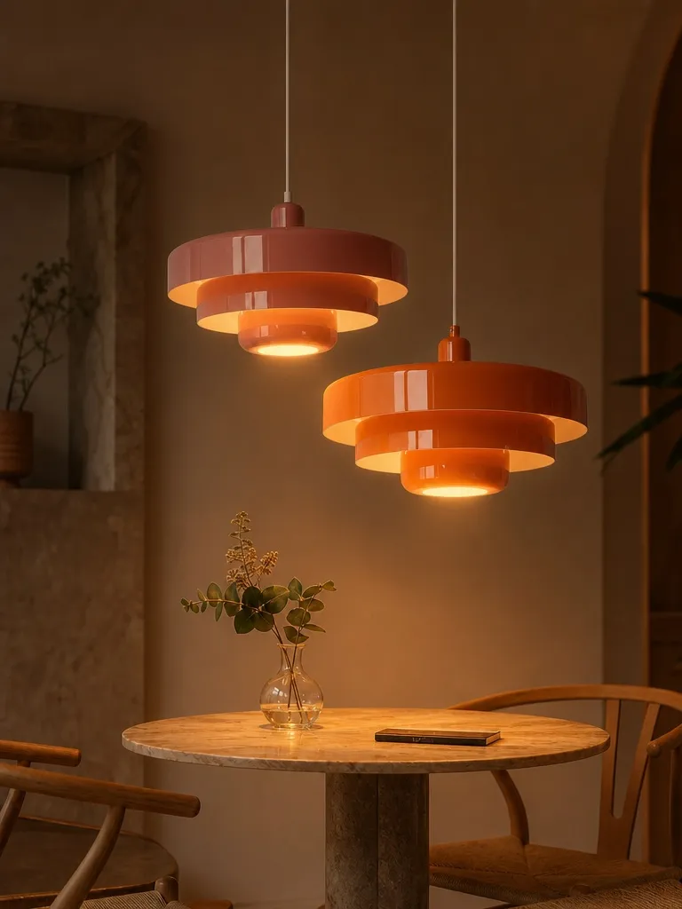
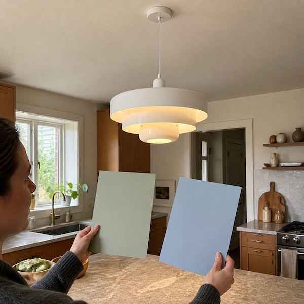
Colour changes with illumination. Morning daylight may make a green finish look fresh; warm evening light may make it deeper and more olive. Orange can become richer at night and paler in bright daylight. Test a large paper or painted sample near the proposed position for at least one full day. Do not hold it directly under a bulb, because glare can make the sample look lighter than the installed shade.
Then choose the bulb by light output and appearance, not by an old watt habit. ENERGY STAR advises using lumens for brightness and kelvin for warm-to-cool appearance. Verify the bulb type and maximum rating listed for the fixture, and remember that shade geometry changes how much light reaches the surface below.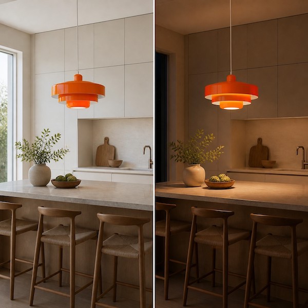
Step 5: Give the Colour Two Quiet Allies
Repeat the pendant hue in one object near the work zone and one object farther away. Good candidates include a small artwork, a ceramic bowl, a linen stripe or a book spine. Use a related tone rather than an exact retail match. Different materials prevent the room from looking like a coordinated set.
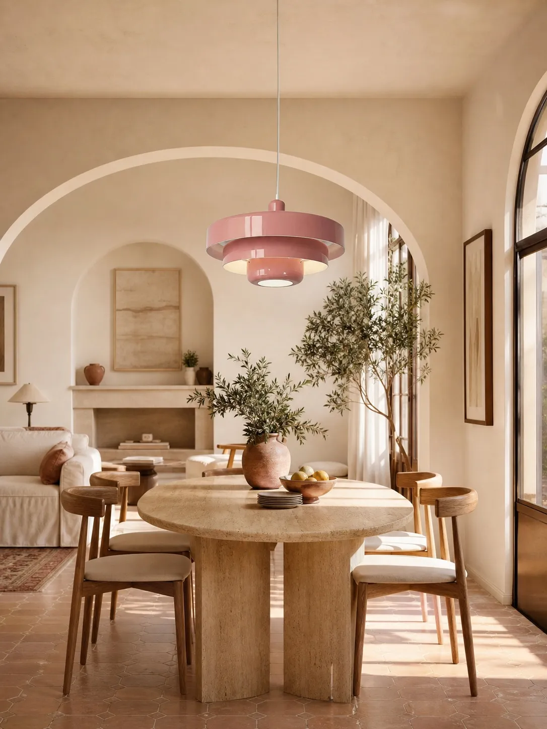
If you are choosing specifically for a dining zone, Colorful vs Neutral Pendant Lights: Which Makes a Better Dining Room Focal Point? helps decide whether colour or sculptural form should carry more of the visual work.
Step 6: Check Shape, Scale and Maintenance
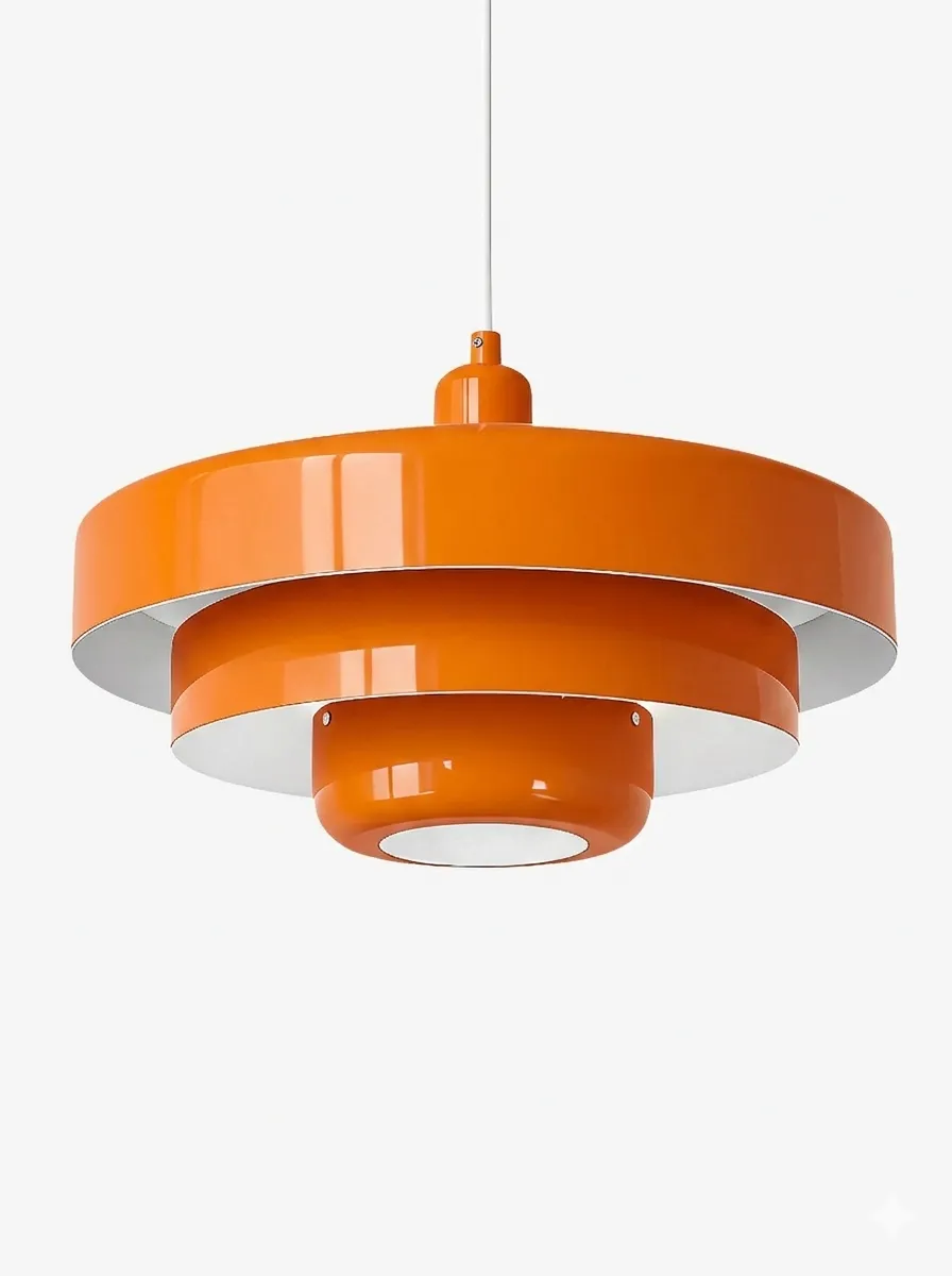
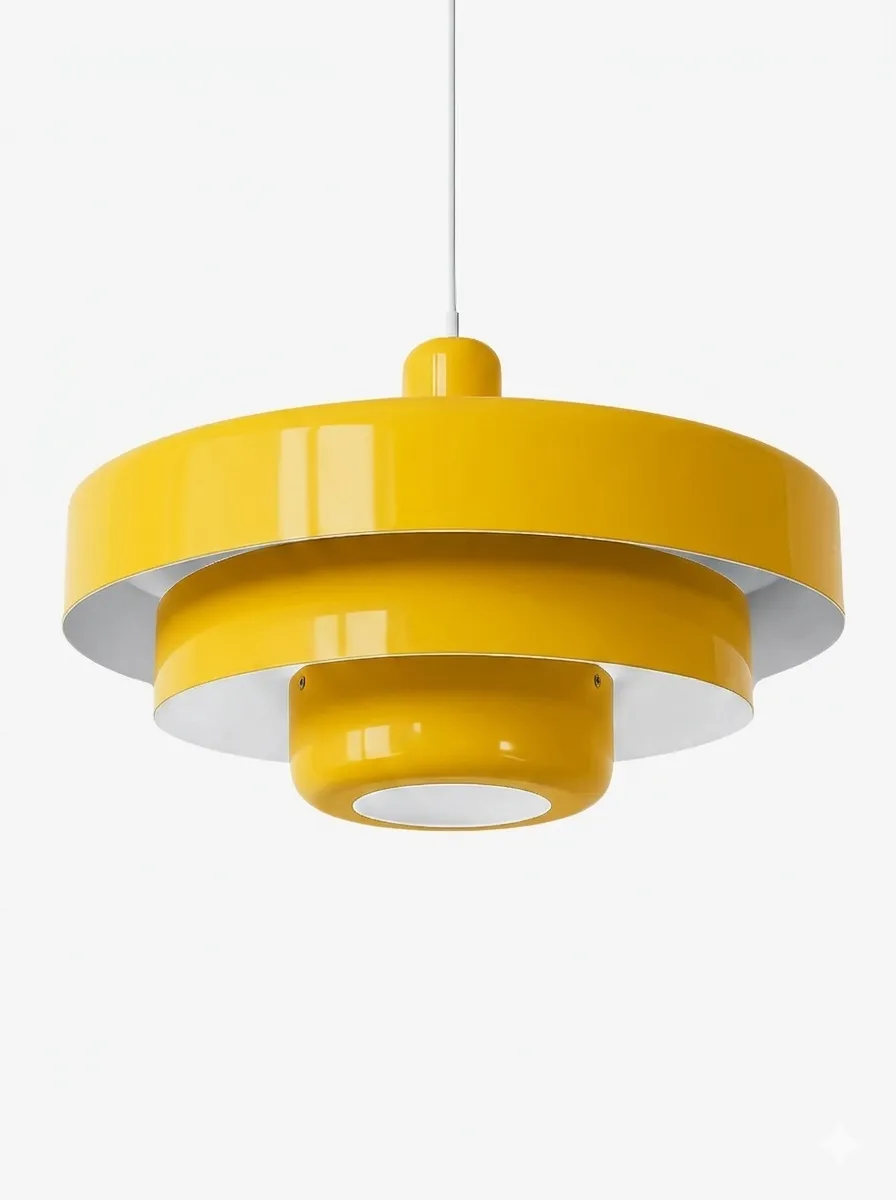
Colour cannot rescue the wrong proportions. A compact shade may disappear over a broad island, while a deep layered shade may interrupt views if hung too low. Make a paper silhouette using the listed product dimensions and view it from seated and standing positions. Consider cleaning too: a light finish may show cooking residue differently from a dark one, while layered forms need accessible spacing for dusting.
Do not assume every pendant is suitable for every ceiling or location. Confirm canopy size, suspension adjustment, bulb access and the installation instructions. Have fixed electrical work completed according to local requirements.
The Final Sample Test
- Photograph the fixed materials together in daylight.
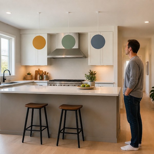
- Select one low-, one medium- and one high-contrast sample.
- Place each sample near the proposed hanging position.
- View it from three sightlines in daylight and at night.
- Remove every sample that needs more than two supporting colour echoes.
- Choose the remaining option that still looks good when the light is off.
Common Colour Mistakes
- Matching a screen image to a worktop without a real-world sample.
- Choosing a trendy shade that has no relationship to fixed materials.
- Judging the pendant only from directly beneath it.
- Repeating the colour in every accessory.
- Ignoring how bulb colour changes the finish at night.
FAQ
What pendant colour is safest with white cabinets?
Warm white is quietest; muted green or orange adds controlled contrast.
Should the light match the splashback?
No. Relating by undertone is usually more natural than exact matching.
Can a dark pendant work with a low ceiling?
Yes, if its depth, hanging position and sightlines remain comfortable.
How many colour samples should I test?
Three contrast levels are enough for a useful comparison.
What if the colour looks different at night?
Choose the version you prefer during the hours when the kitchen is used most.