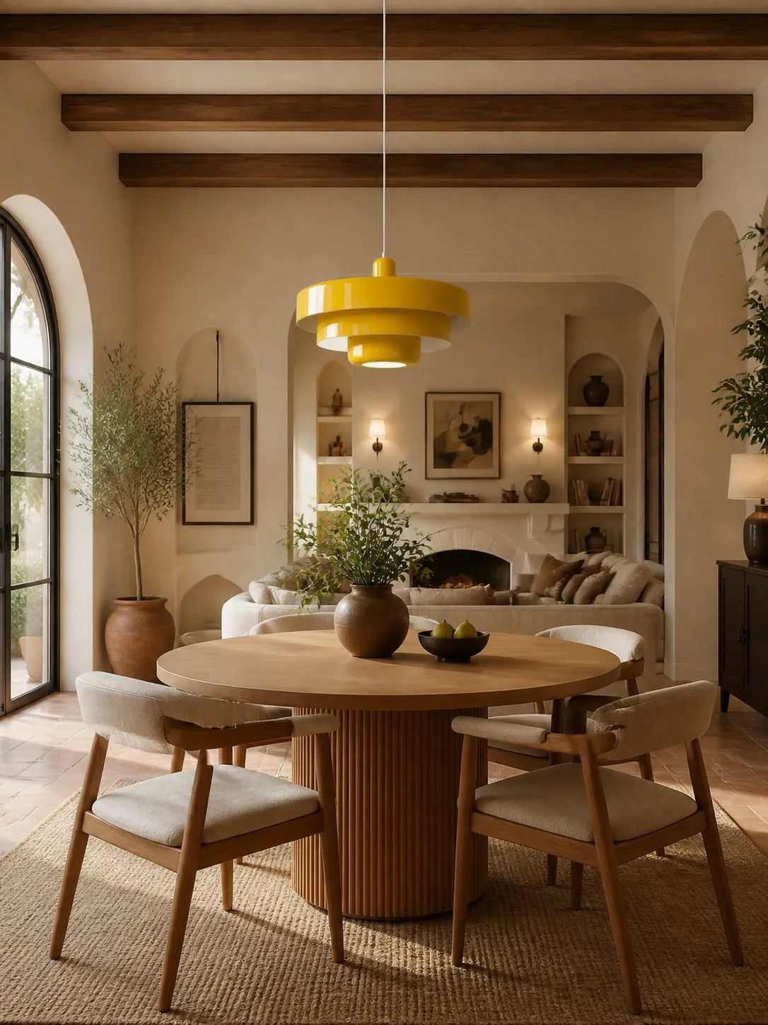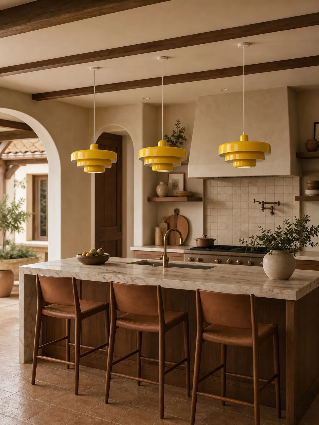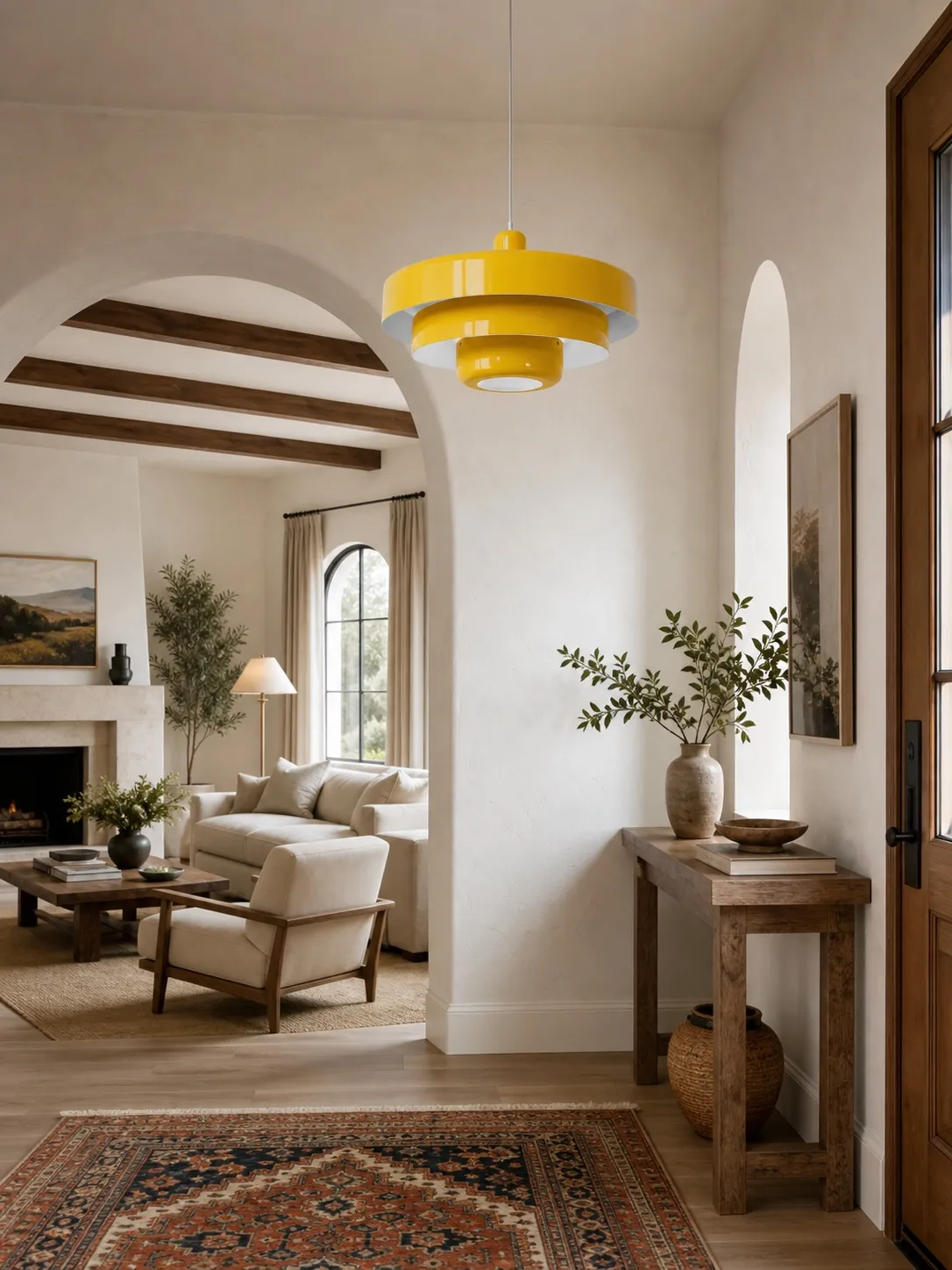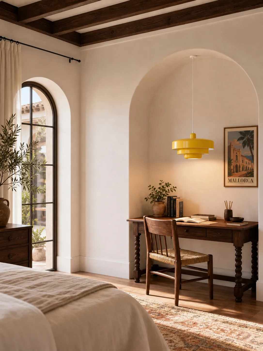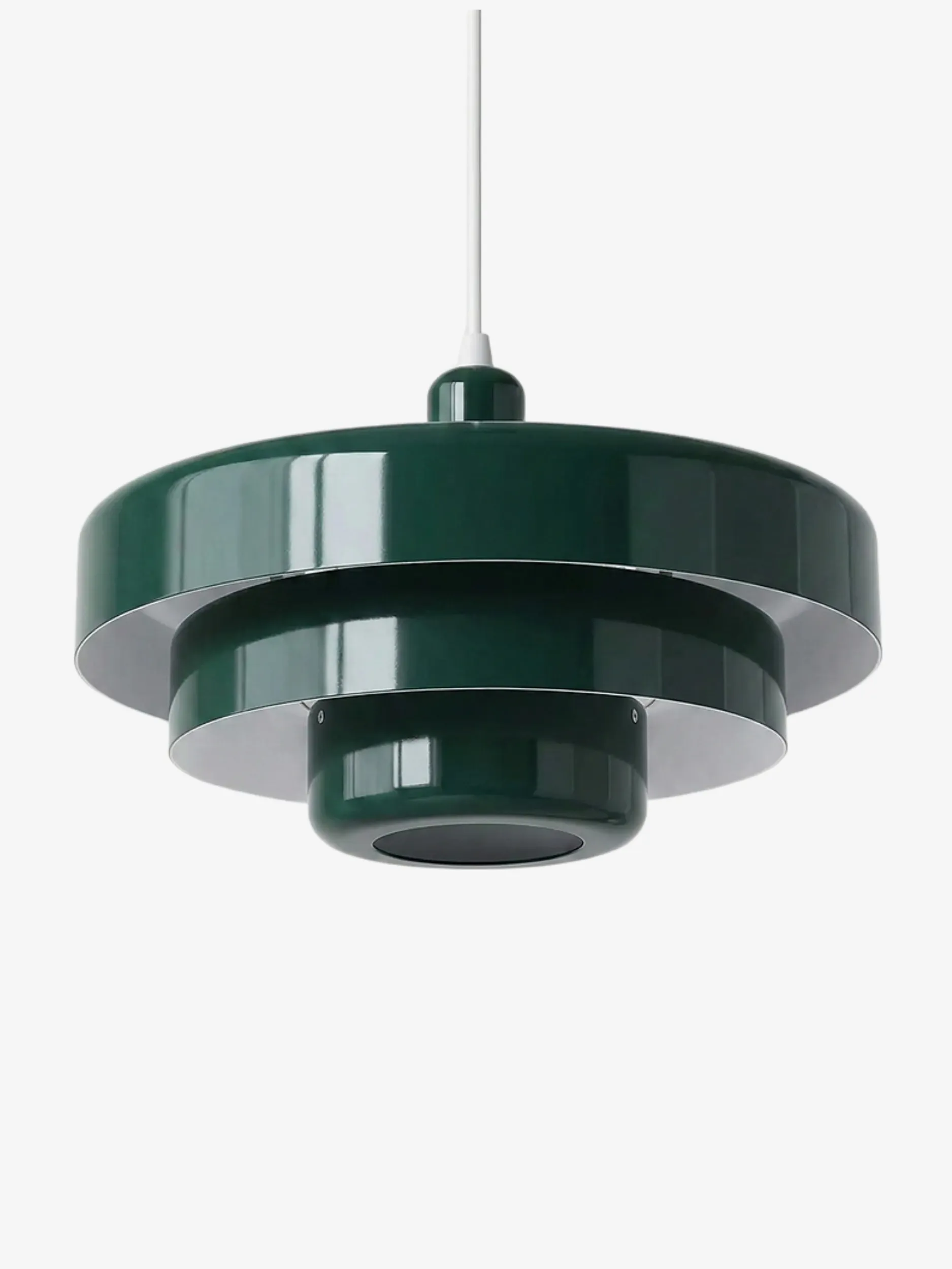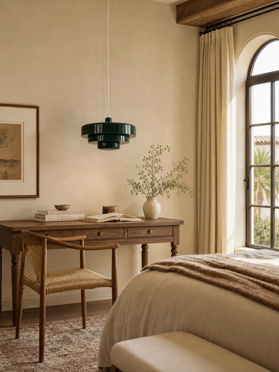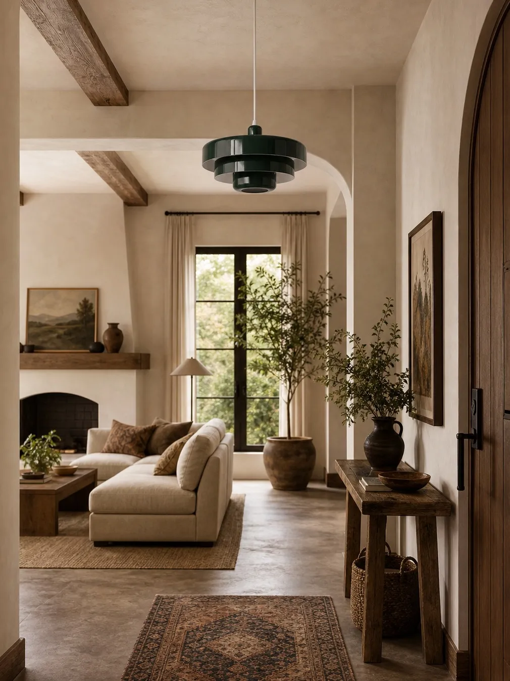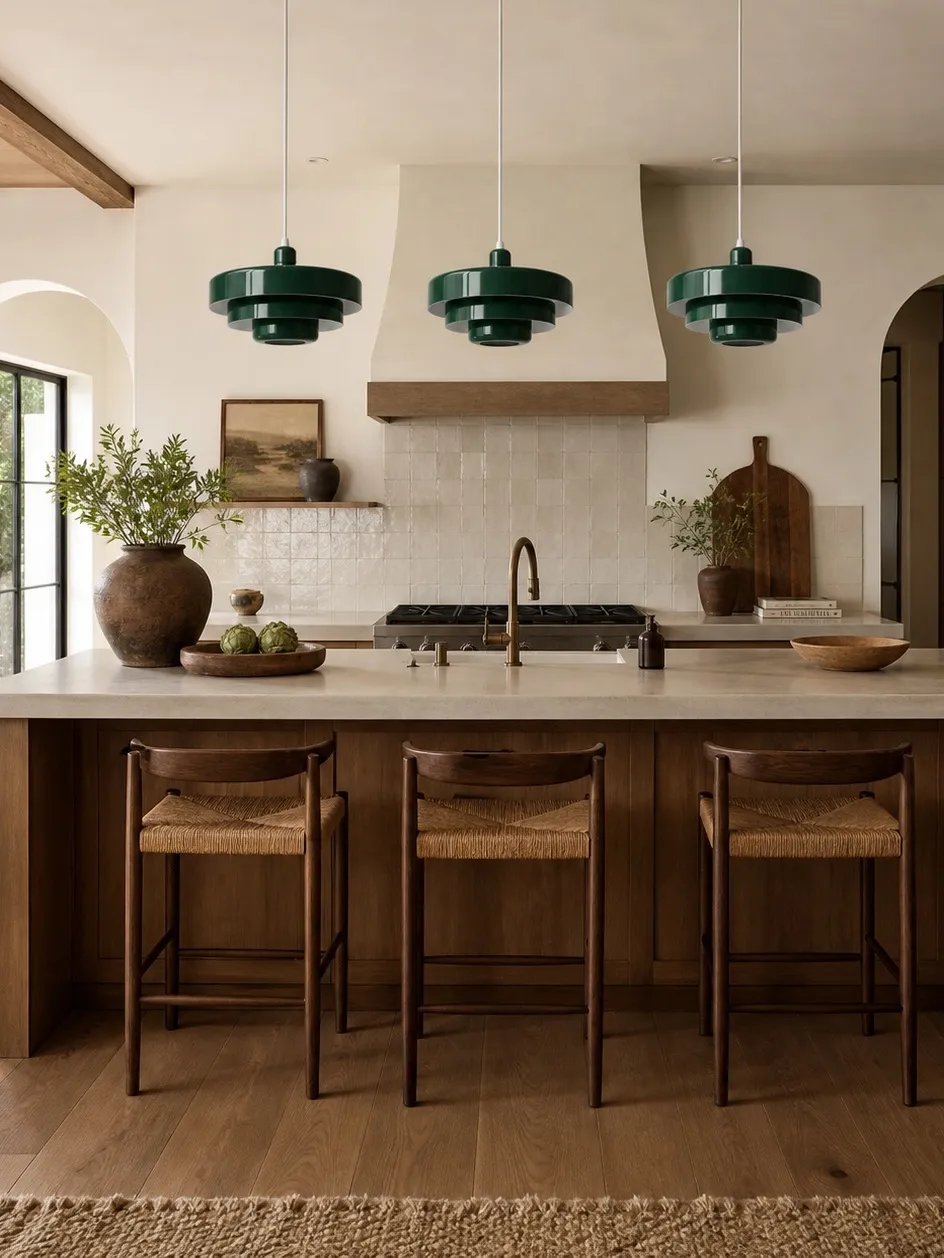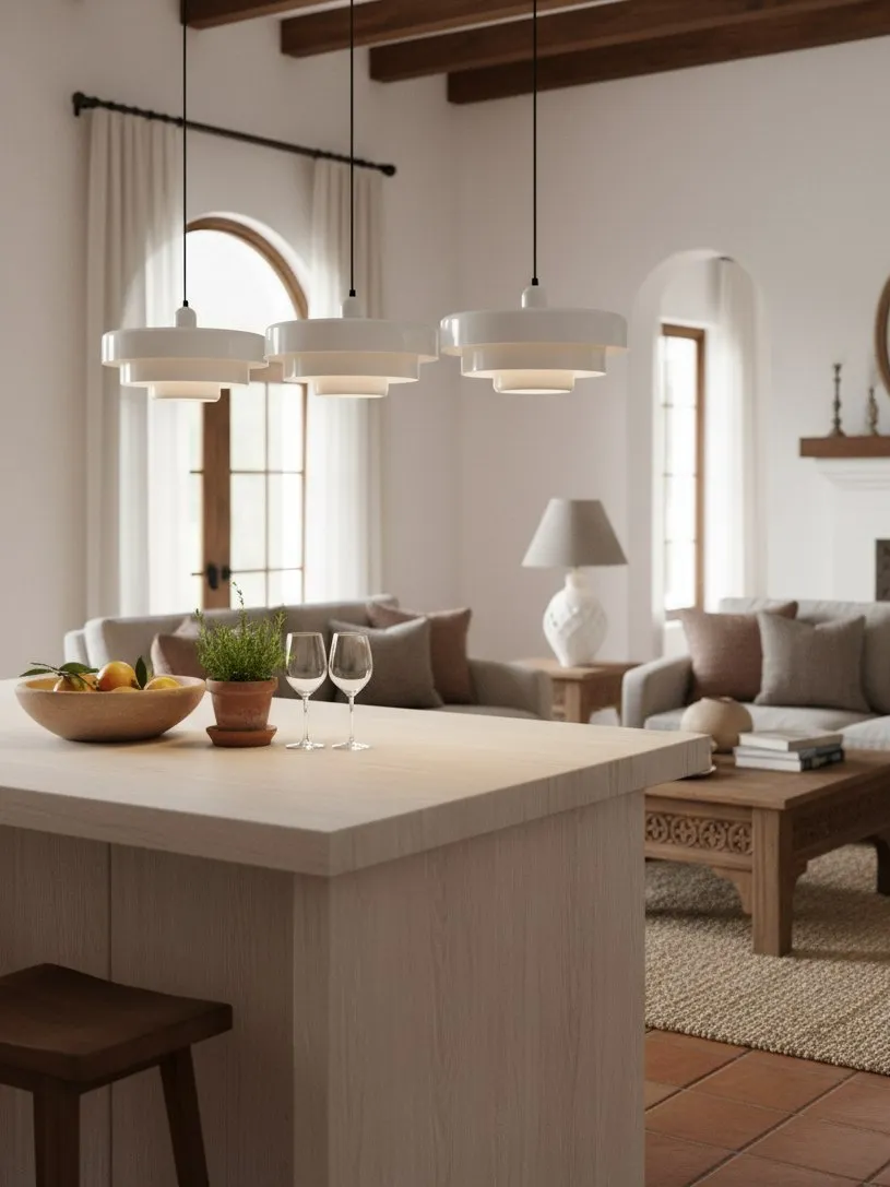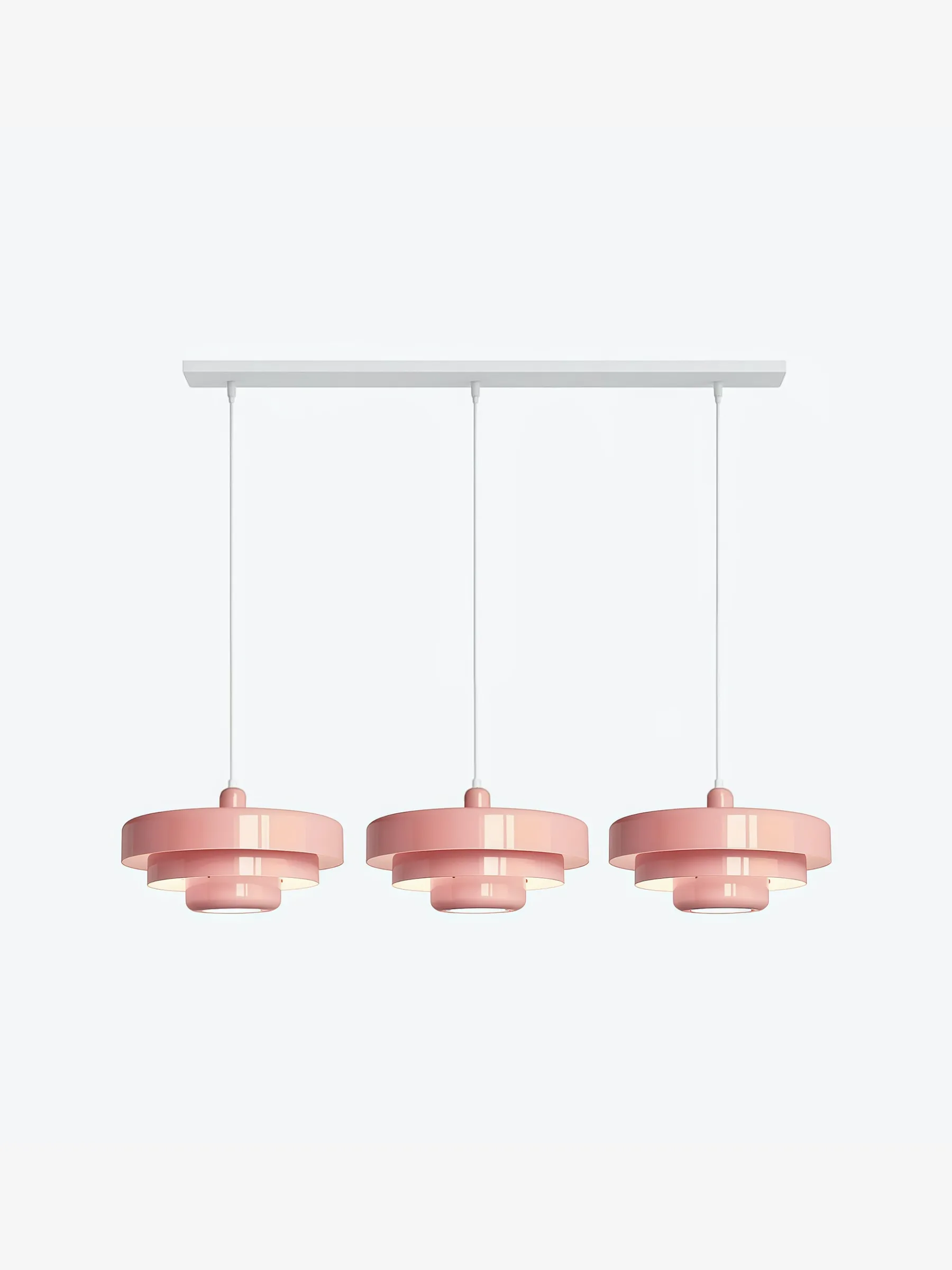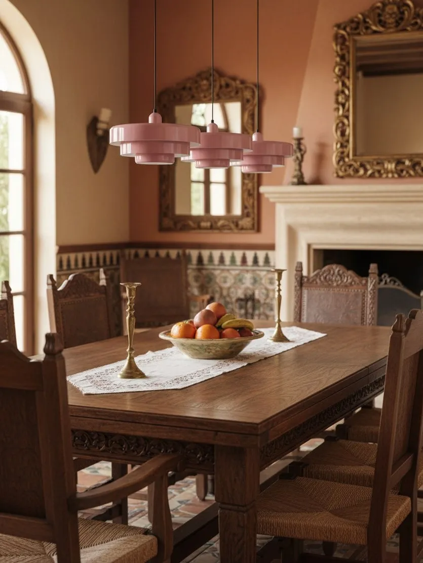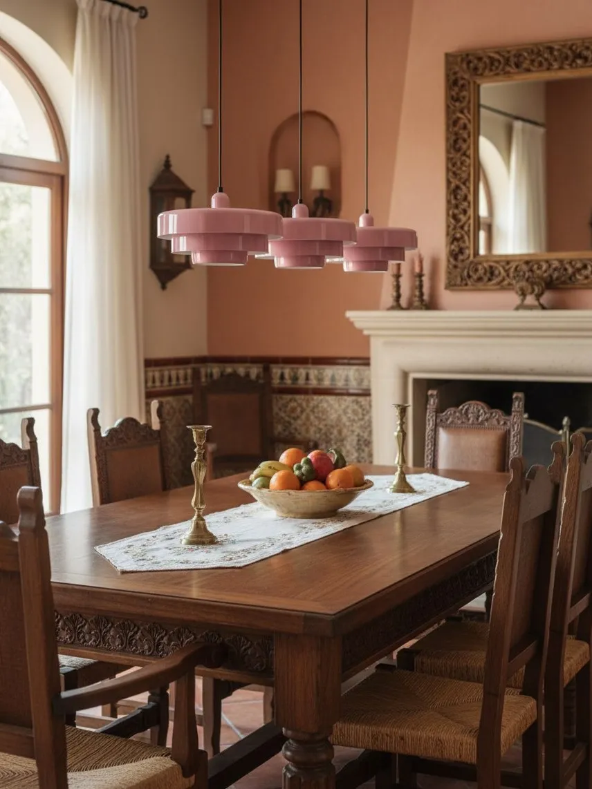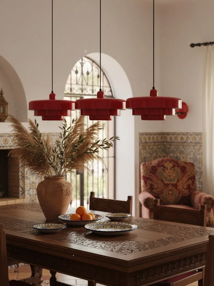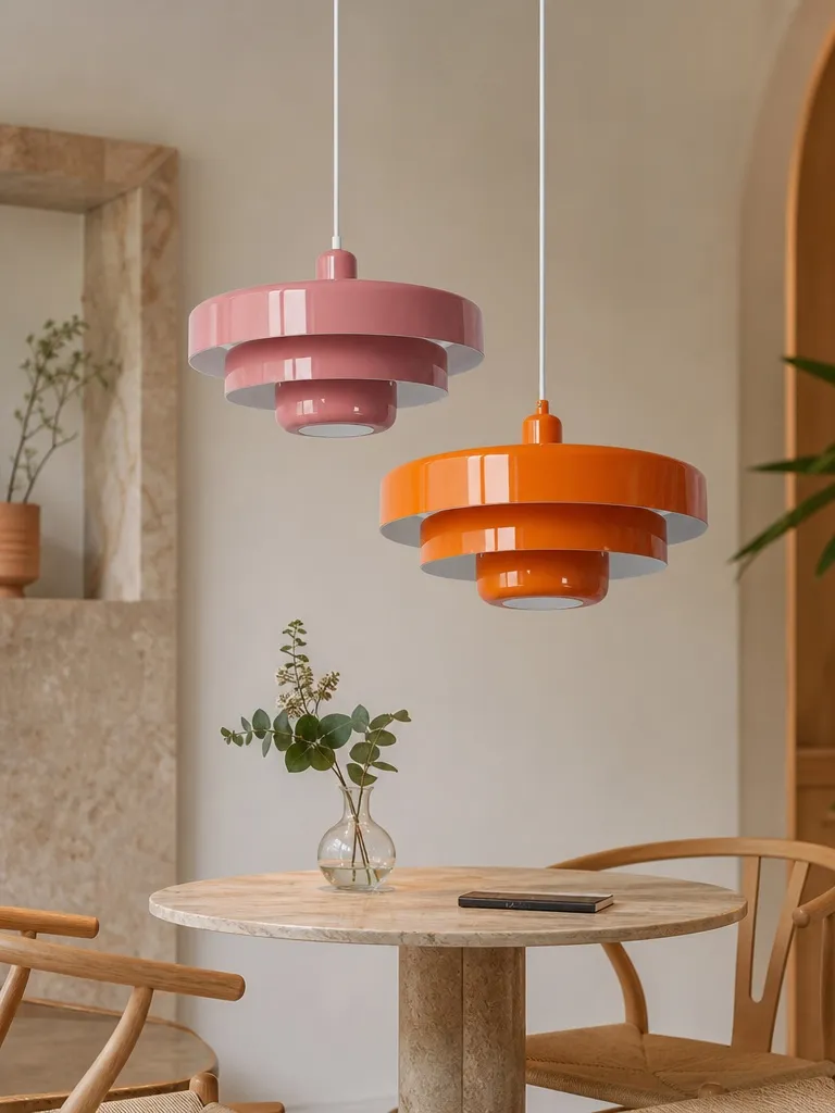
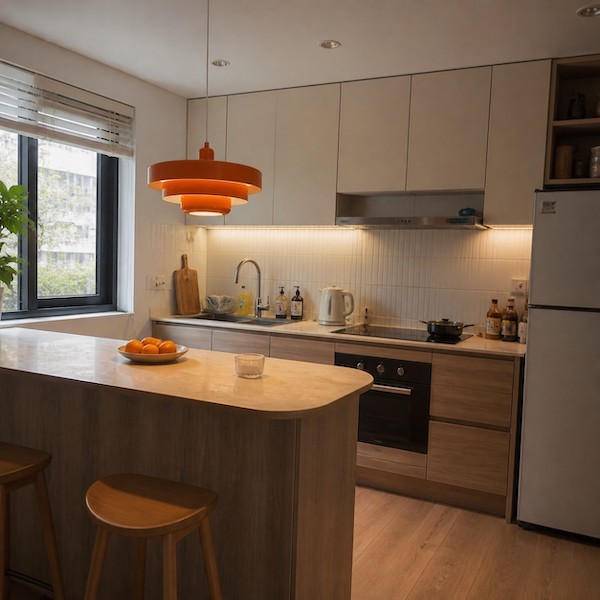
Can a Colourful Pendant Light Work in a Small Neutral Kitchen? Yes—If It Earns Its Space
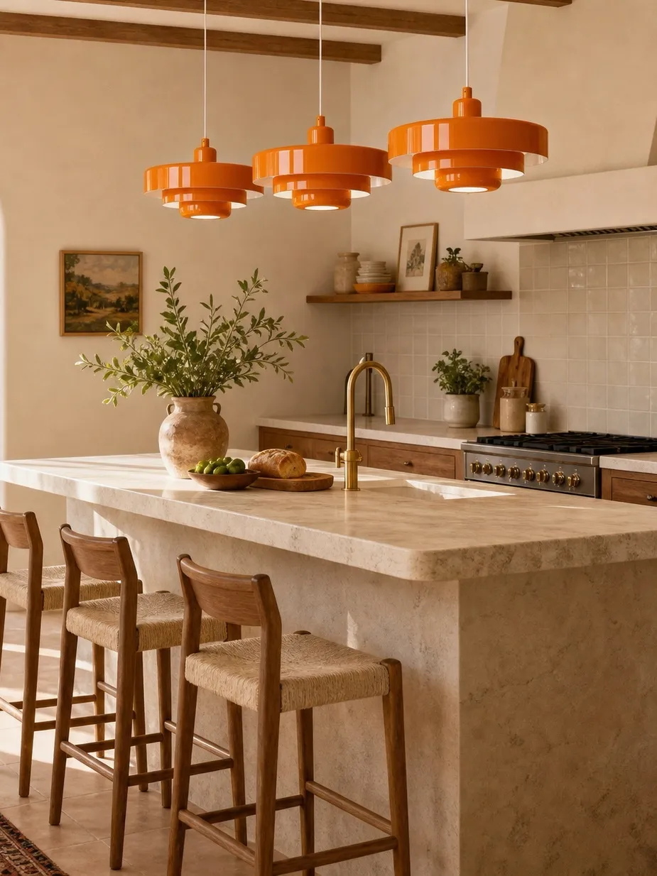
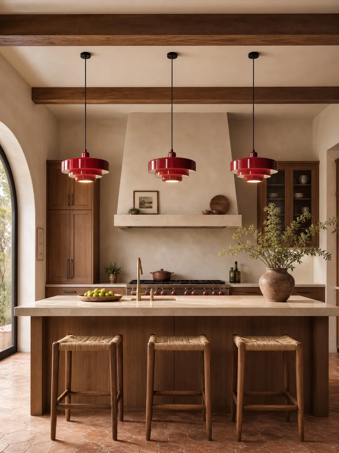
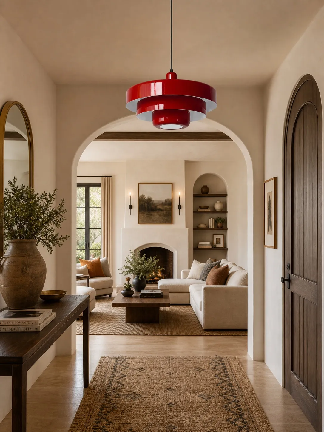
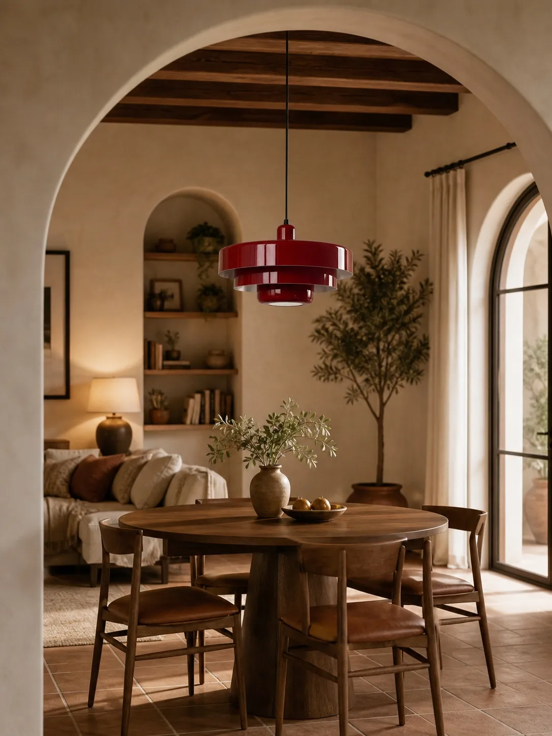
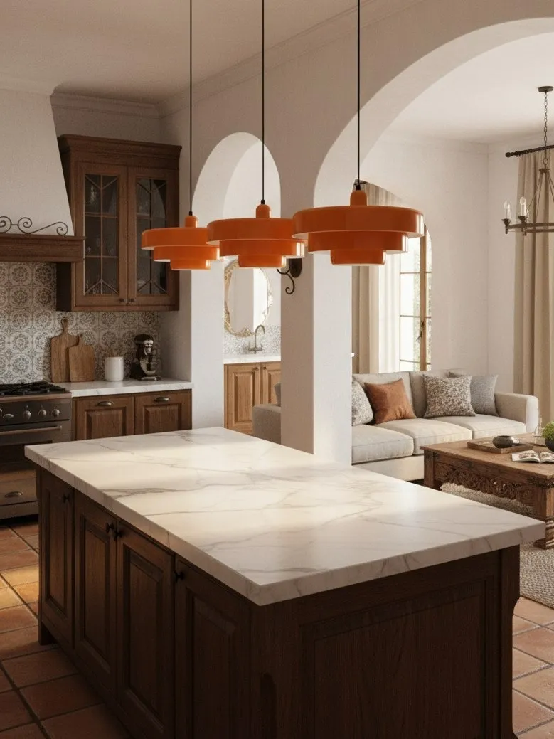
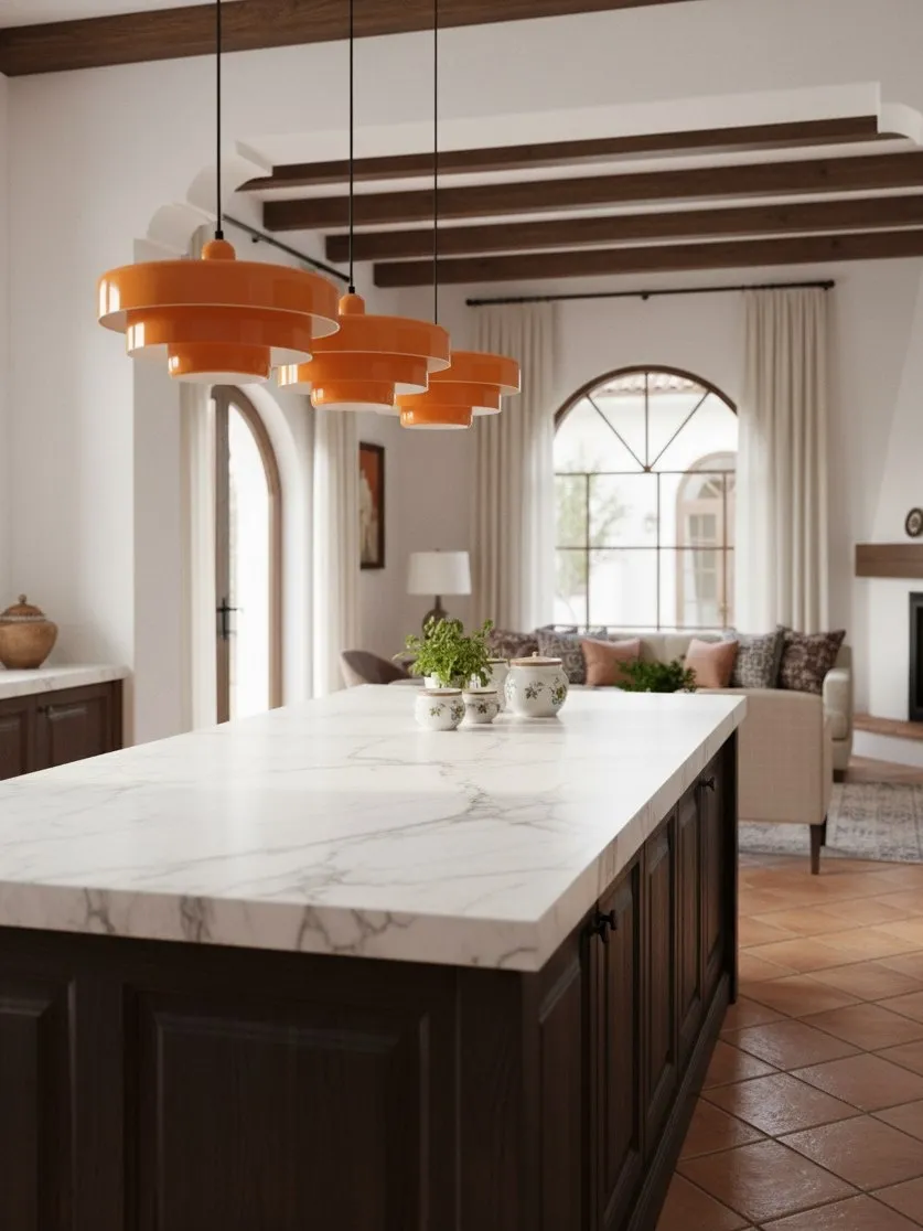
Yes, a colourful pendant light can work beautifully in a small neutral kitchen. In fact, one controlled colour can make a compact room feel more organised by giving the eye a clear destination. The idea fails only when the fixture blocks movement, competes with several other bold elements or is expected to provide every layer of light by itself.
The Three-Part Fit Test: Volume, View and Visibility
Before thinking about colour, test physical fit.
- Volume: imagine the whole shade as a solid object. Does it leave breathing room around cabinet doors and the ceiling?
- View: from the kitchen entrance and the main seat, does the shade hide faces, shelving or the far worktop?
- Visibility: is it centred over an island, peninsula or table, or is it floating over a walkway where people could meet it?
A lightweight paper mock-up is more informative than guessing from a measurement alone. Hang it temporarily at the proposed lowest edge and walk the normal route through the room.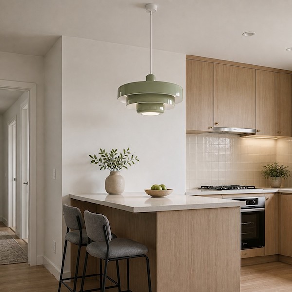
Why One Colour Can Make a Small Room Feel Clearer
A neutral compact kitchen often contains many small lines: cupboard joints, appliance edges, handles and open shelves. A single rounded or layered coloured form interrupts that visual grid and tells the eye where to settle. The result can feel calmer, provided the counters and walls do not introduce rival focal points.
If you want a full-room styling plan rather than a small-space test, Statement Pendant Lighting in 2026: How to Style a Colorful Metal Pendant in a Neutral Kitchen or Dining Room covers colour bridges, scale and four broader design directions.
Give the Pendant a Supporting Cast
A decorative pendant is not automatically complete kitchen lighting. Small rooms still need clear light on preparation surfaces, especially where wall cabinets can cast shadows. Use under-cabinet or carefully placed task lights for the worktop, a modest ambient source for circulation and the pendant for focus over the fixed surface. Layering prevents the common mistake of fitting an overly bright bulb in one shade and creating glare while corners remain dim.
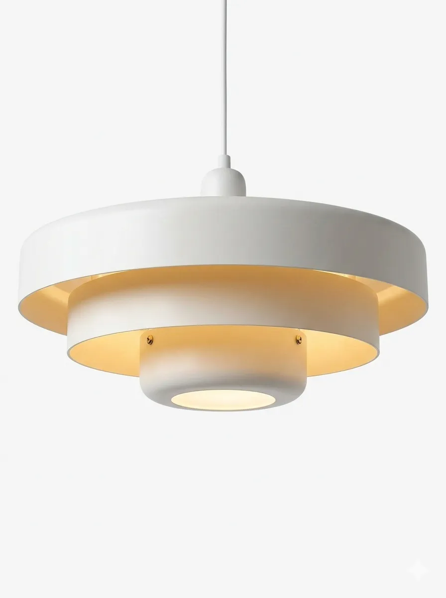
Use lumens to compare brightness and kelvin to compare warm or cool appearance, as advised in ENERGY STAR’s bulb guidance. Check the fixture label for compatible bulb shape and maximum rating. A metal shade’s layered form will also affect the direction of light, so judge the illuminated worktop rather than the bulb alone.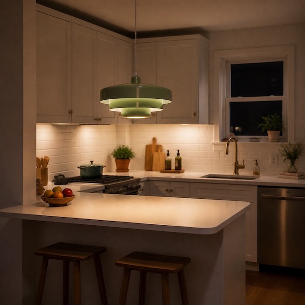
When Colour Helps a Compact Neutral Kitchen
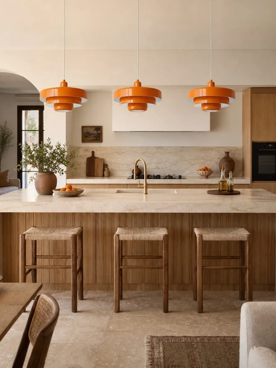
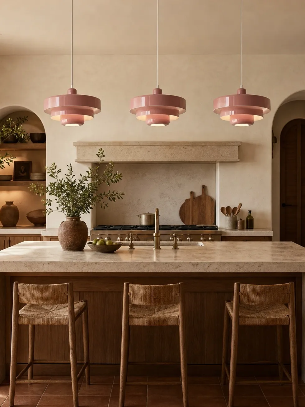
Colour is especially effective when the room needs zoning. A pendant over a small peninsula can separate cooking from living without a wall. It can also draw attention away from uneven cabinet colours or rental finishes that cannot be replaced. Choose a hue with some grey, brown or earth in it; muted colours hold their presence without appearing to move toward the viewer as aggressively as very bright ones.
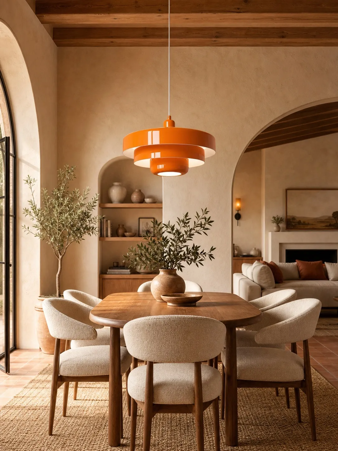
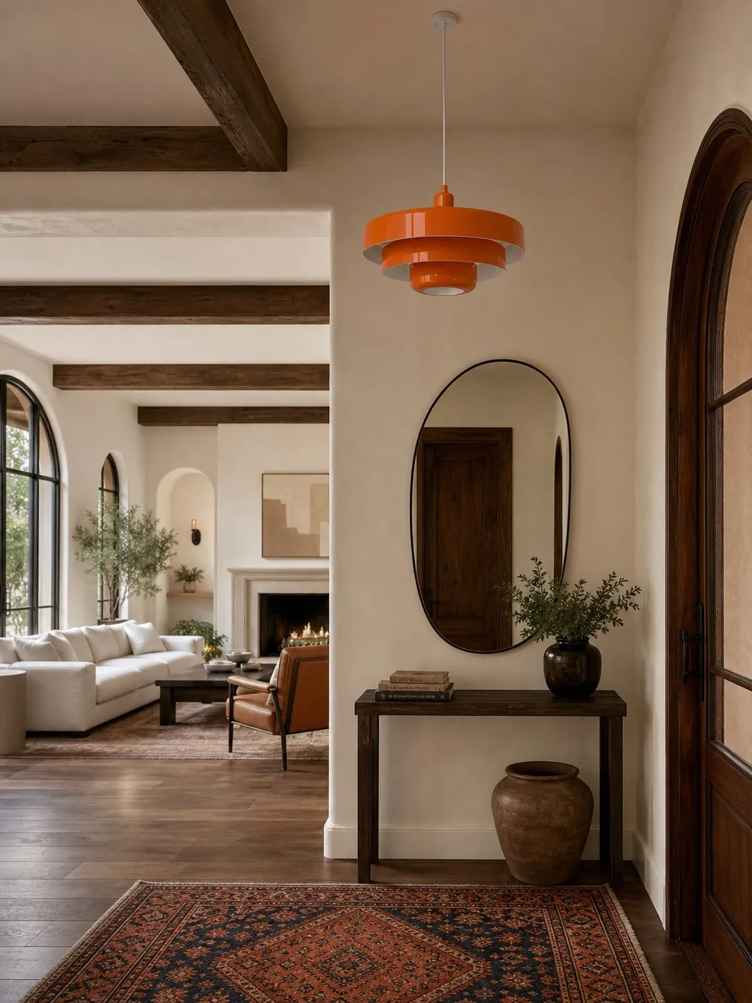
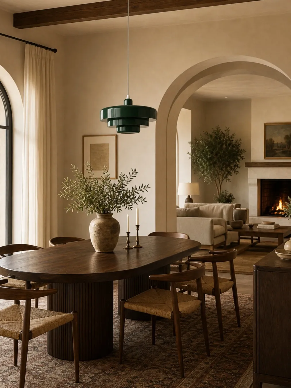
Repeat the hue in one or two small details. A green pendant might connect to a landscape print and a ceramic bowl. An orange shade could relate to warm timber and one linen stripe. Stop there. Too many repeats shrink the visual breathing room.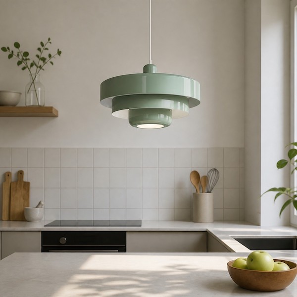
When to Avoid a Hanging Statement
A colourful pendant is the wrong solution when the only ceiling point sits in a circulation route, when cabinet doors would strike the shade, or when the ceiling is so low that a useful drop blocks sightlines. In those cases, a colourful flush or wall-mounted fitting may preserve the idea without occupying head space.
Also pause if the splashback, flooring and appliances already create several strong patterns. The room may need simplification before another focal point. If the colour decision itself is unresolved, How to Choose the Best Pendant Light Color for a Neutral Kitchen provides a six-step sample test.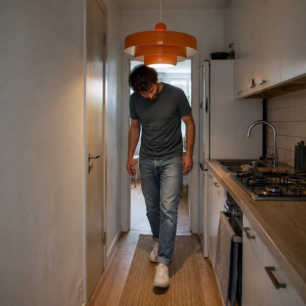
Five Moves That Keep the Room Airy
- Use one visual family. Choose one pendant or a tightly grouped pair that reads as one unit.
- Keep the ceiling connection quiet. A neat canopy and straight suspension reduce visual noise.
- Clear the backdrop. Place the fitting against a calm wall or cabinet run rather than open shelves full of small objects.
- Preserve light around the shade. Do not crowd it against tall cabinets or a bulkhead.
- Control reflections. Highly polished worktops can multiply a bright colour; a muted finish usually behaves more gently.
Common Small-Kitchen Mistakes
- Installing a pendant over open floor instead of a table, island or peninsula.
- Choosing a tiny shade because the room is small, then using several to compensate.
- Hanging the fitting high enough to feel disconnected from the surface below.
- Using a very bright exposed source to make one light do every job.
- Adding matching colourful appliances after the pendant is installed.
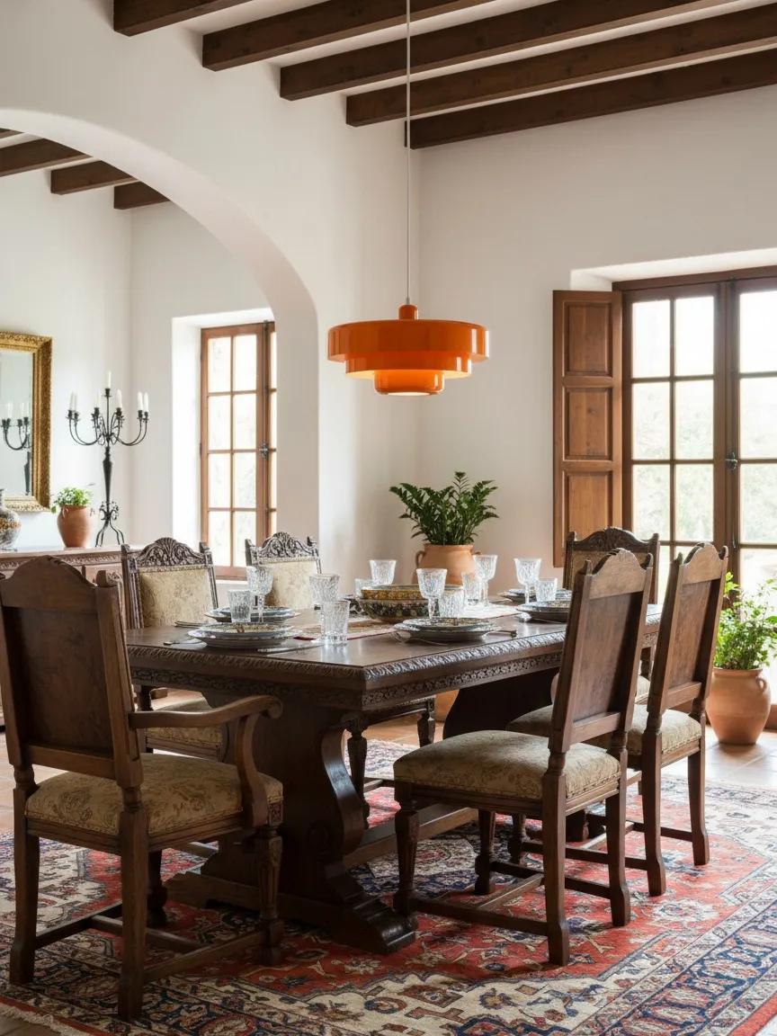
For dining-focused rooms, the priorities shift from circulation and worktop lighting to atmosphere and visual hierarchy. Colorful vs Neutral Pendant Lights: Which Makes a Better Dining Room Focal Point? makes that choice directly.
A Better Small-Room Statement
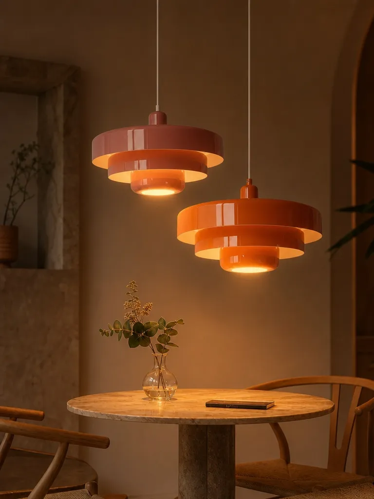
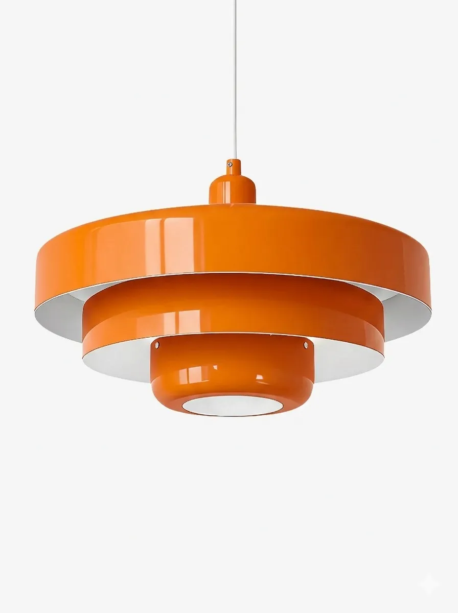
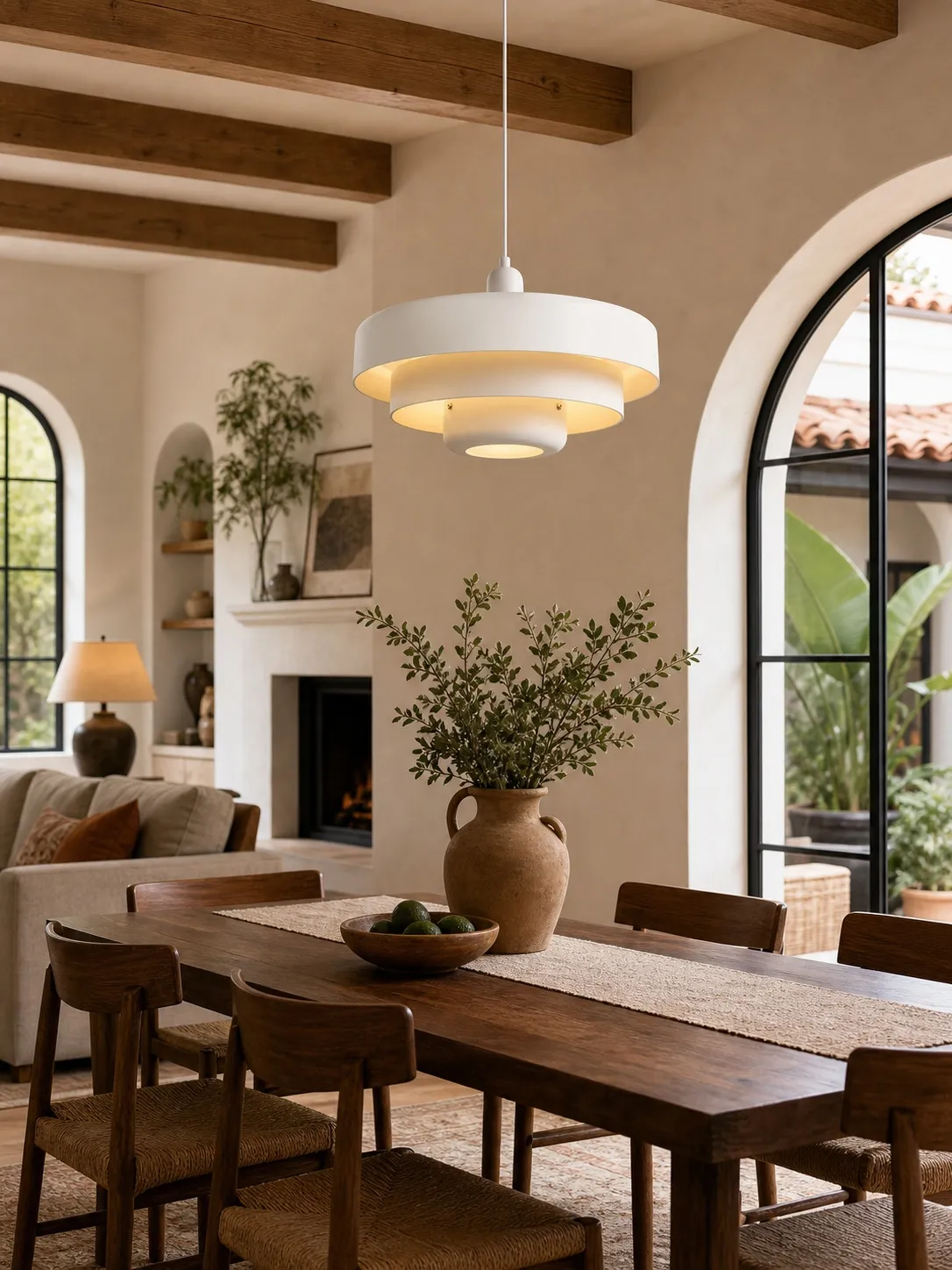
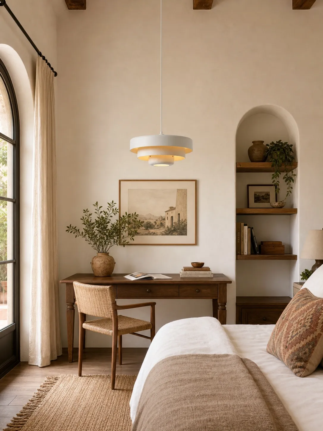
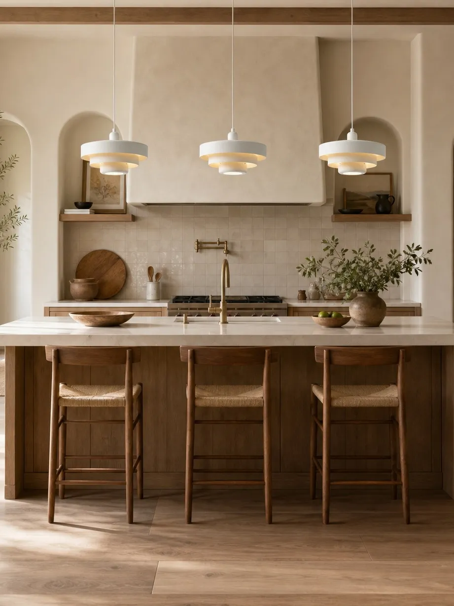
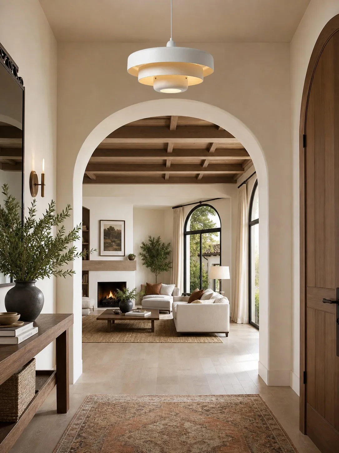
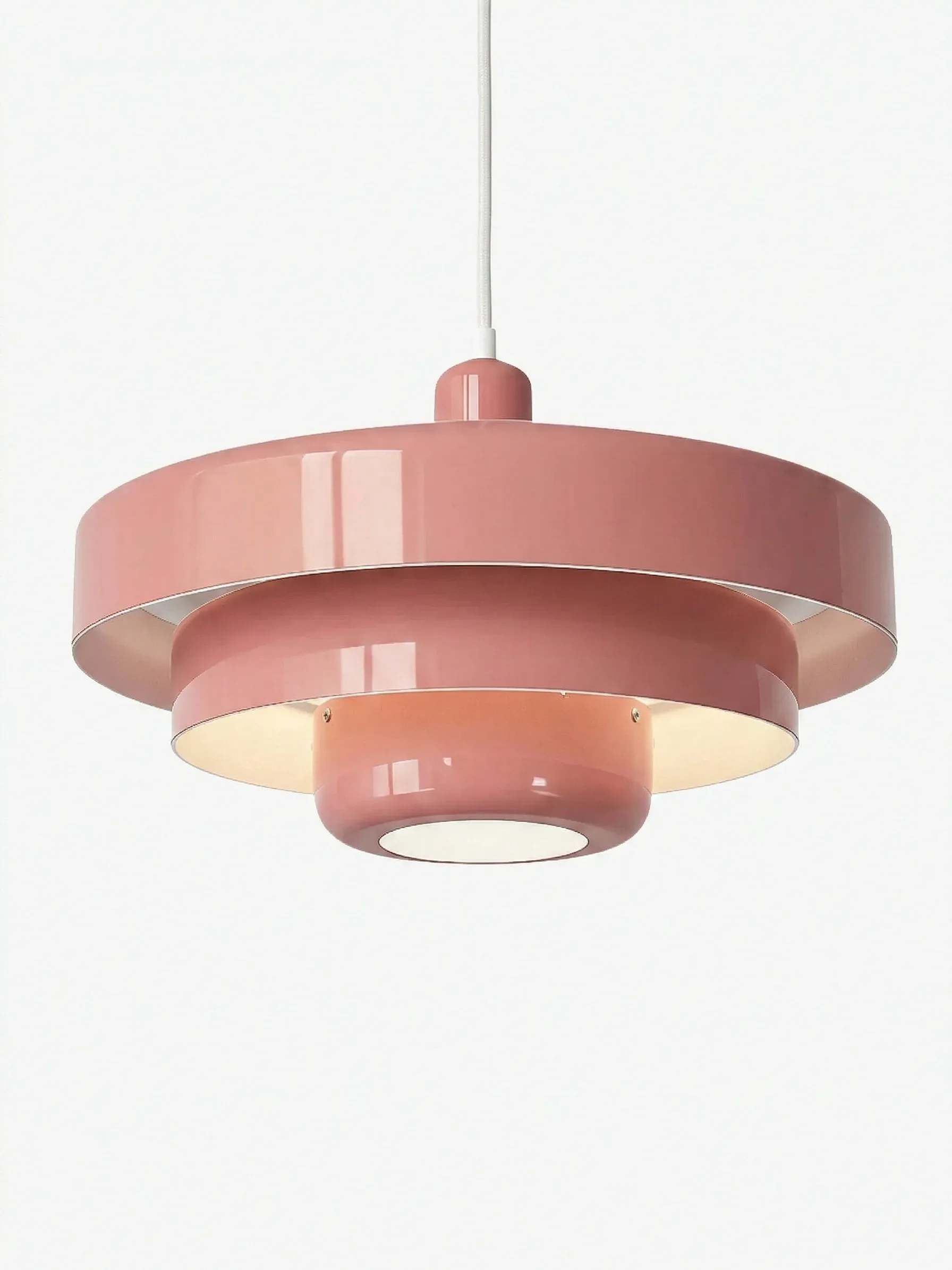
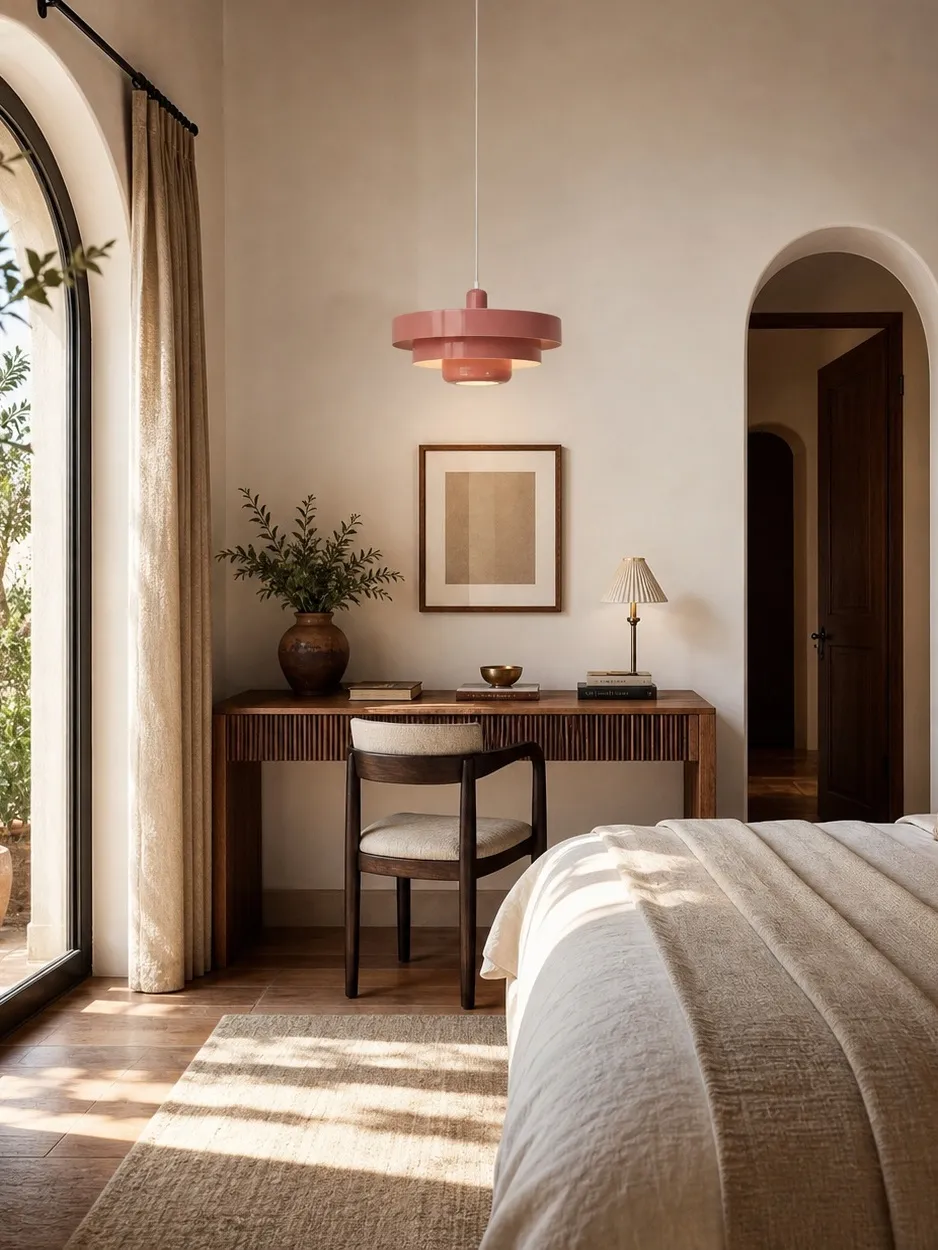
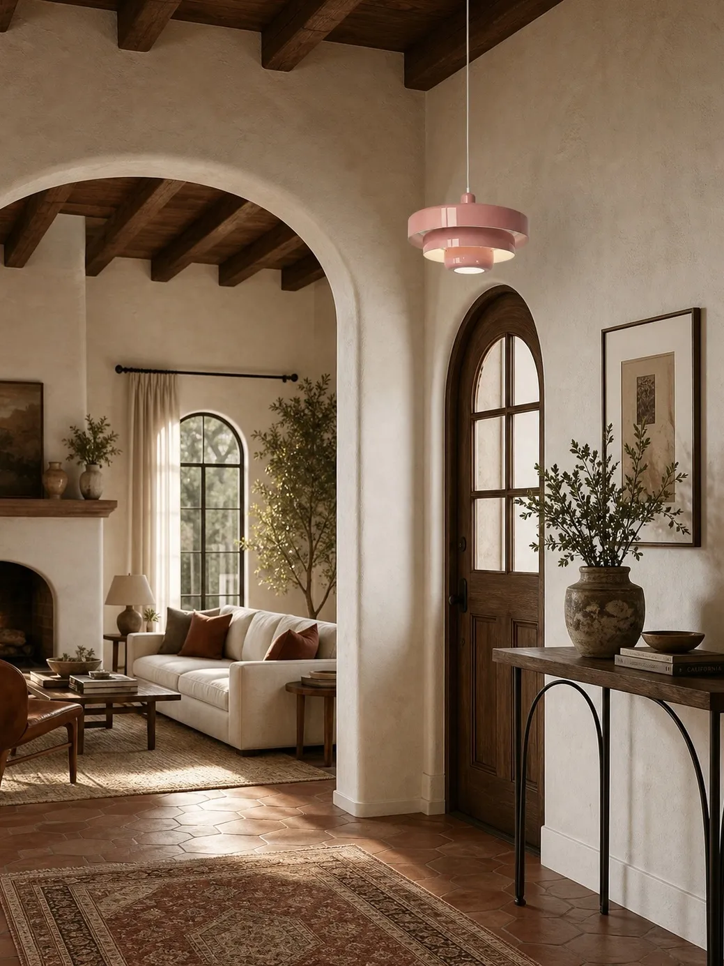
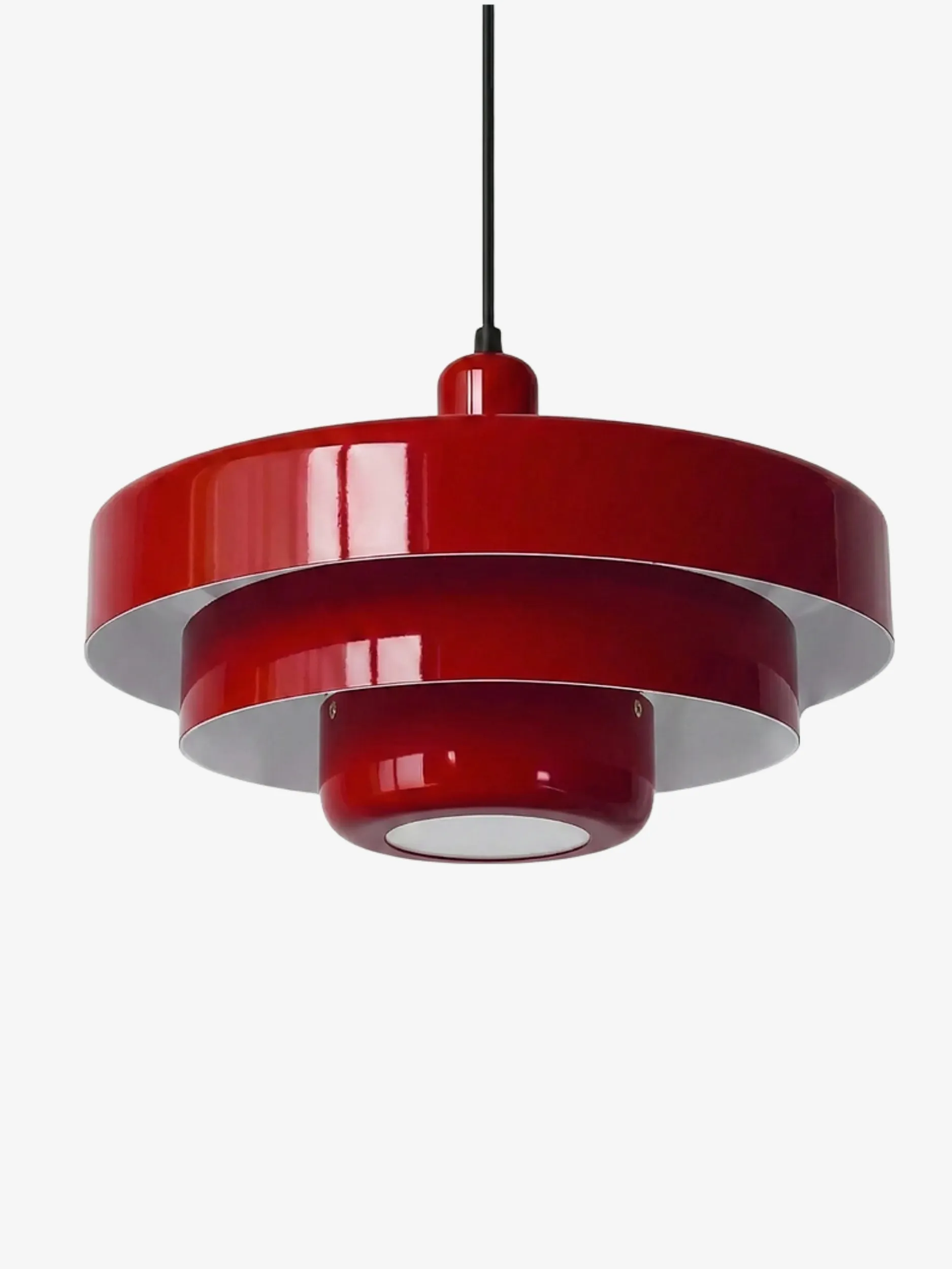
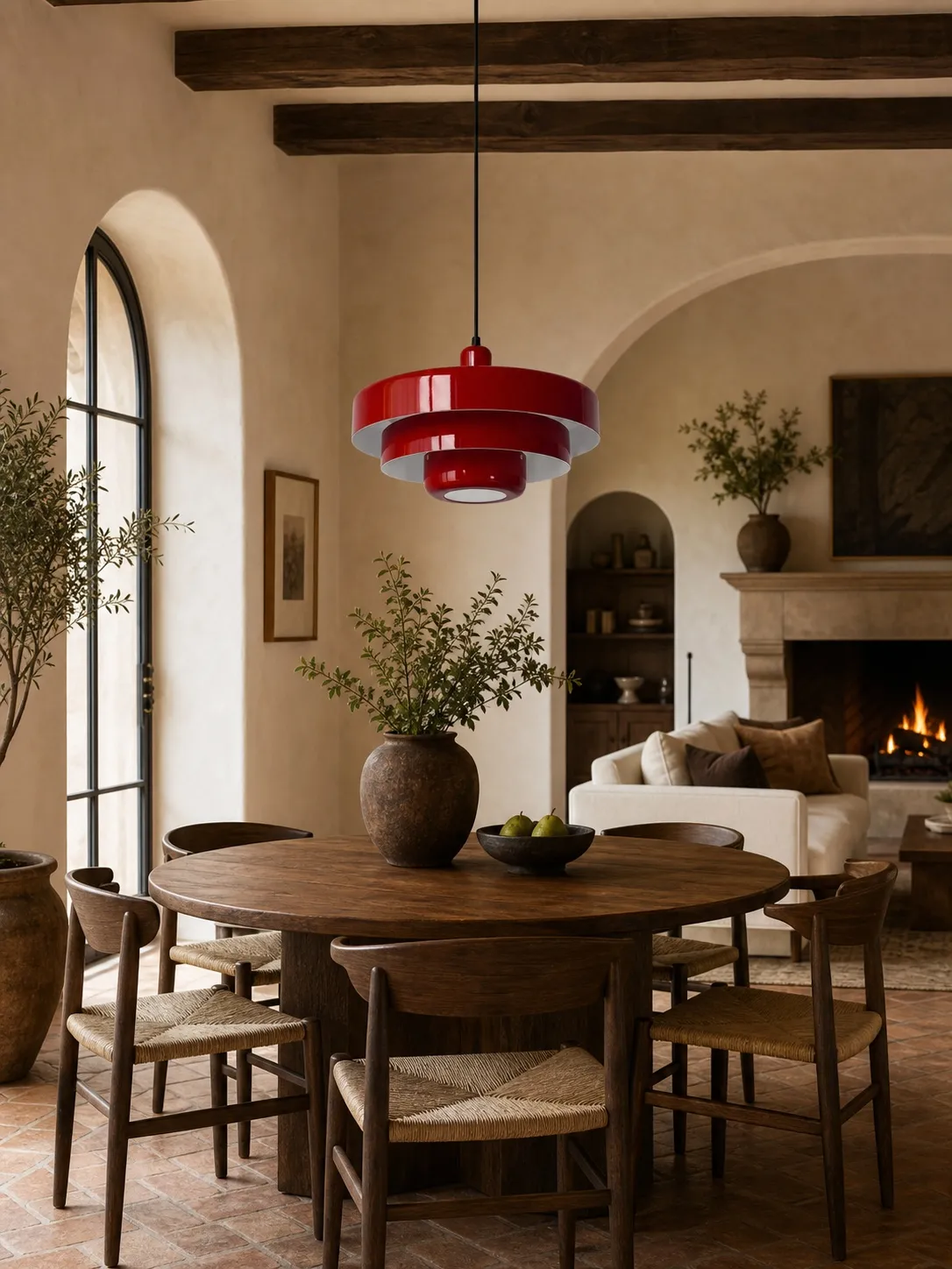
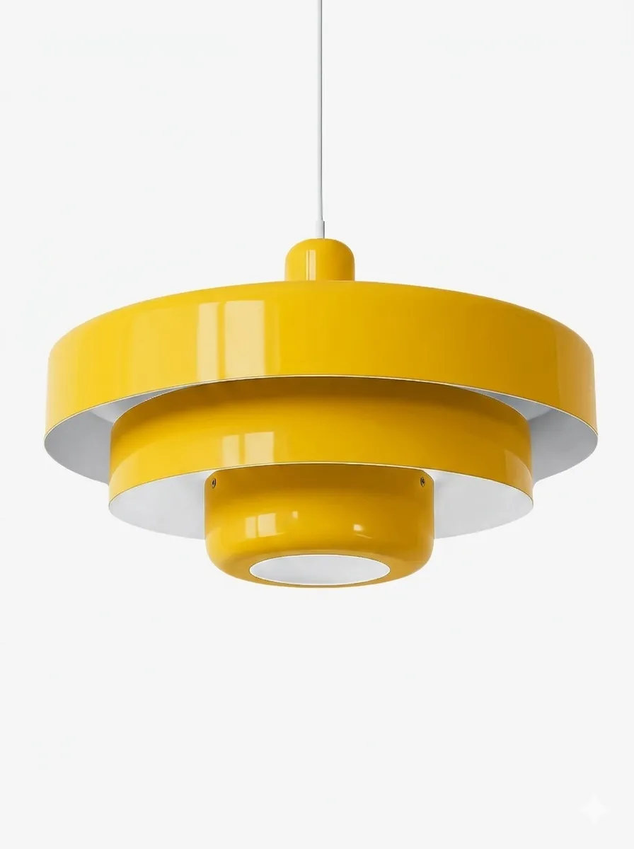
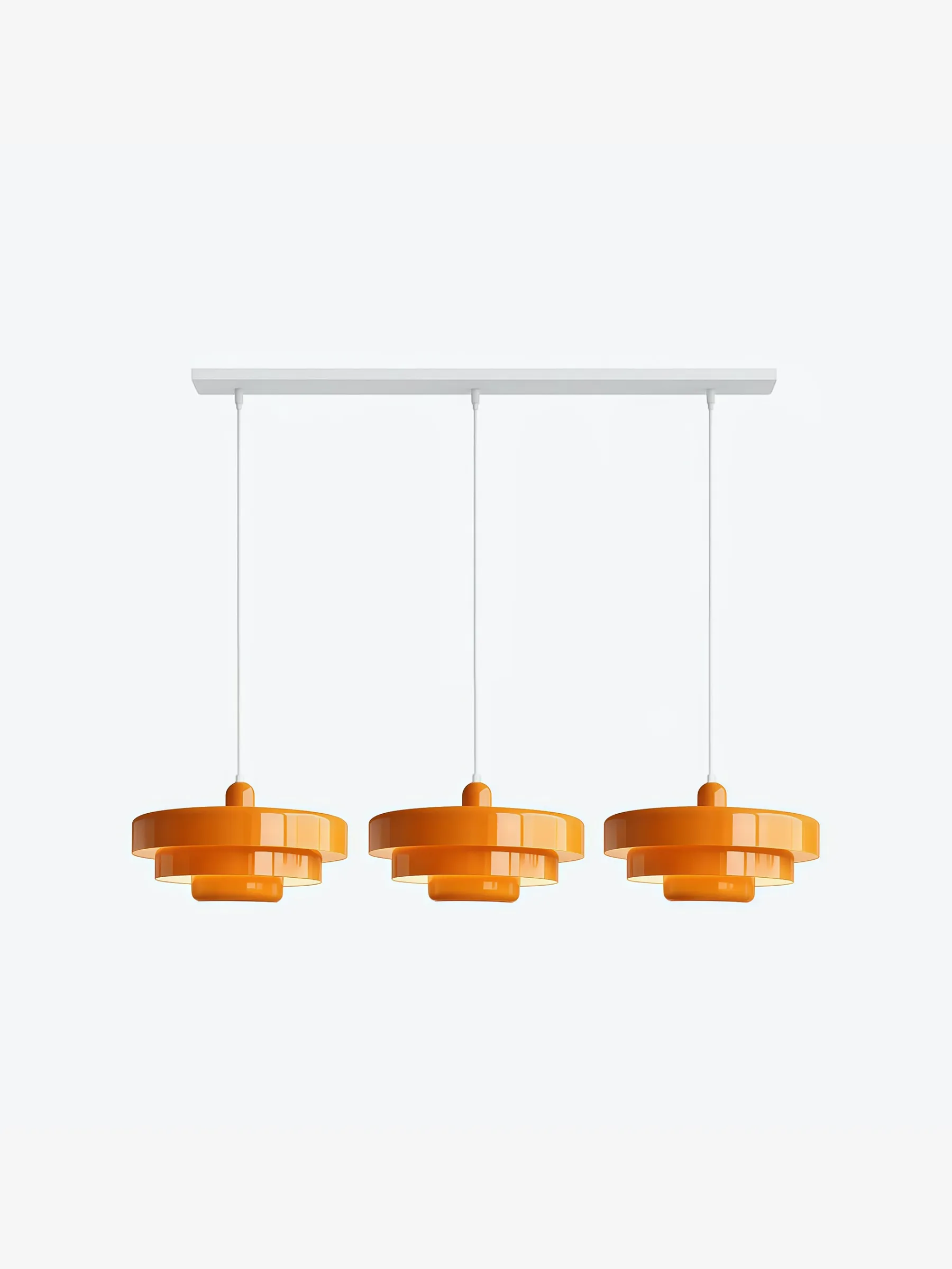
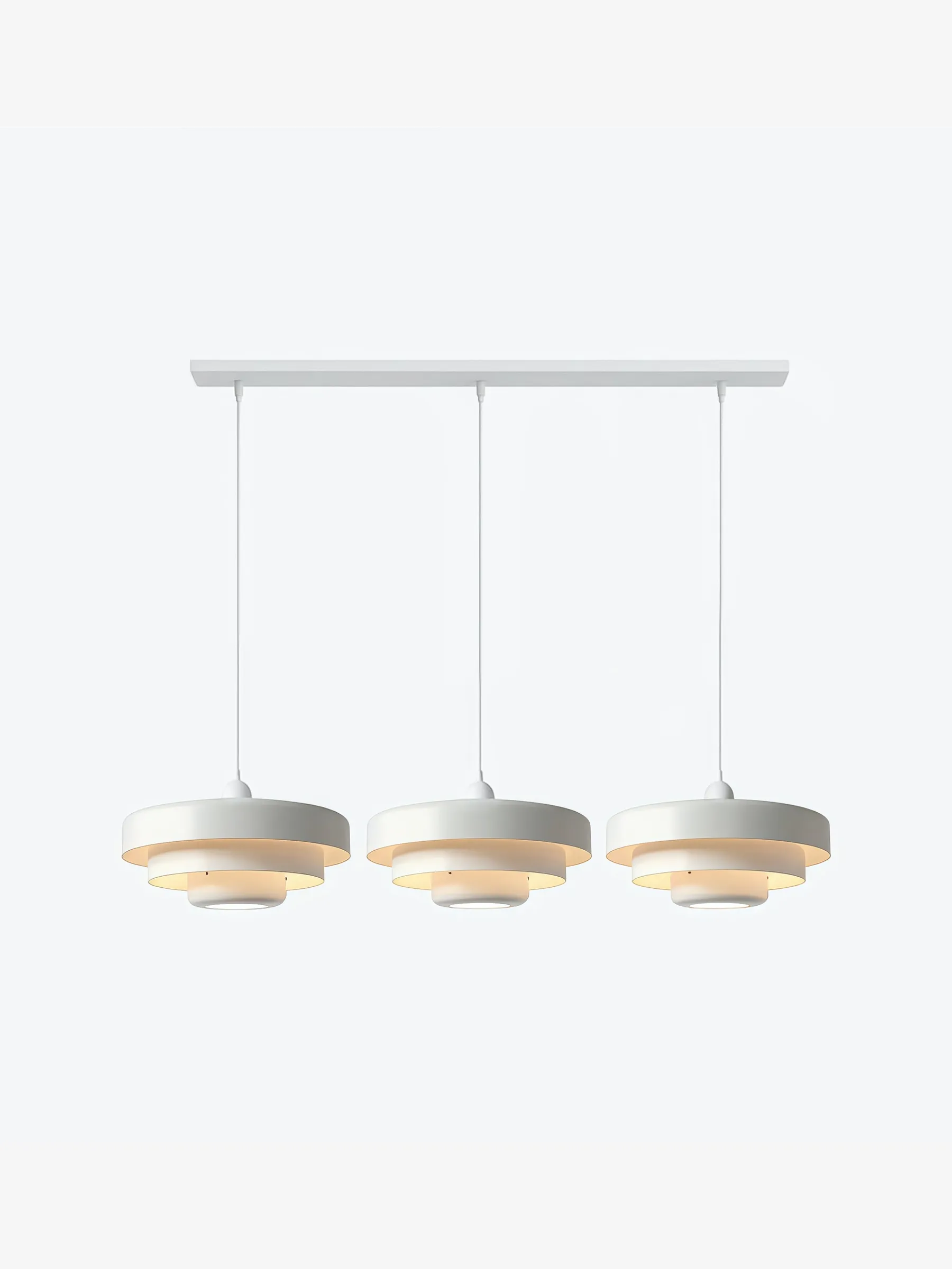
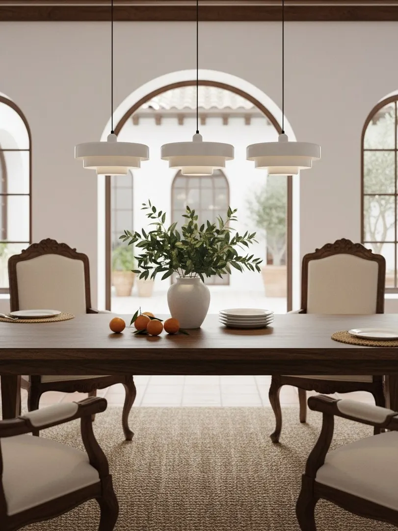
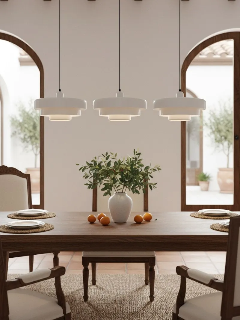
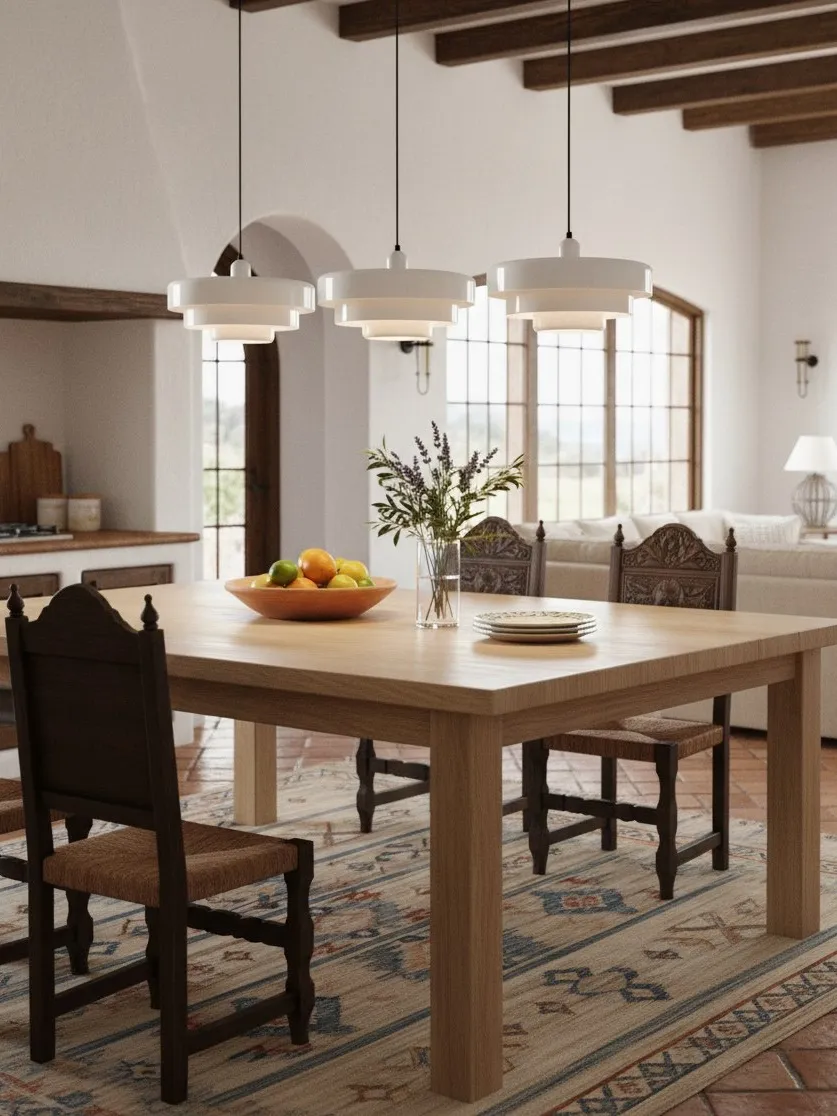
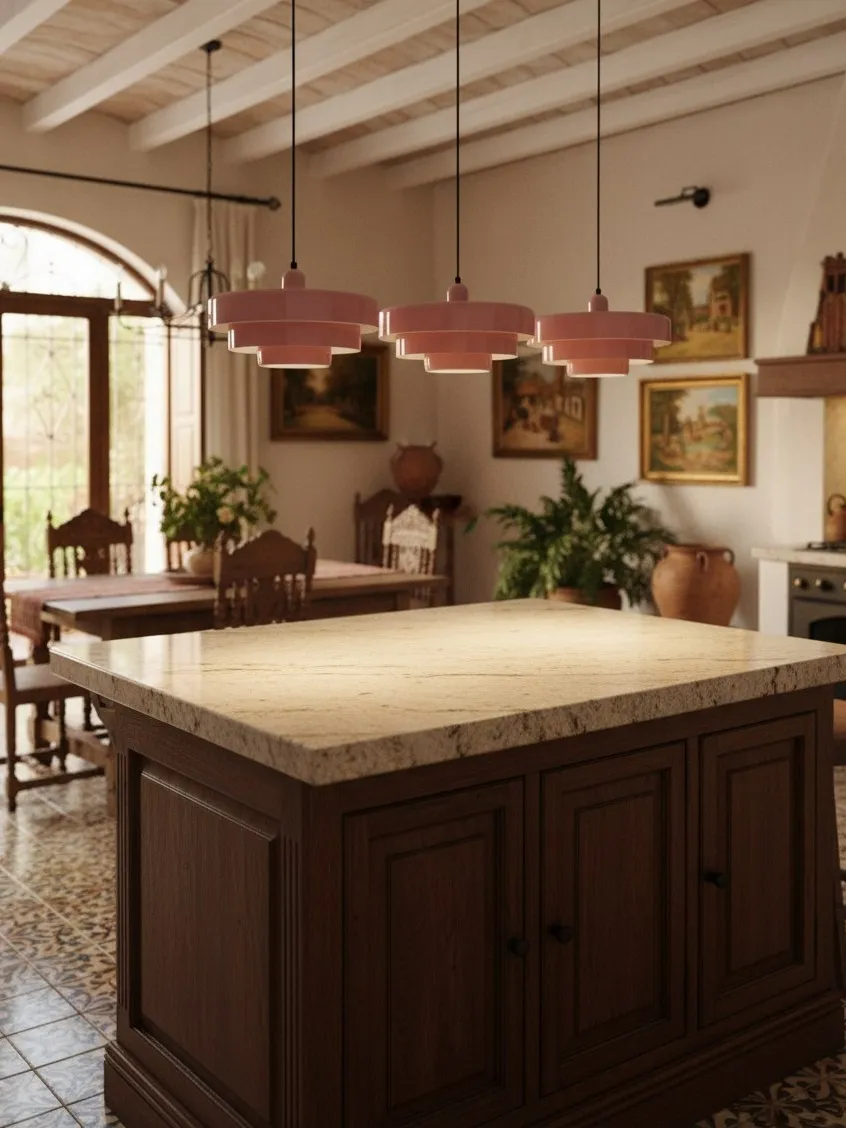
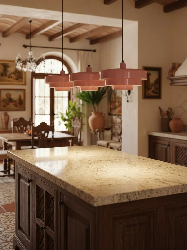
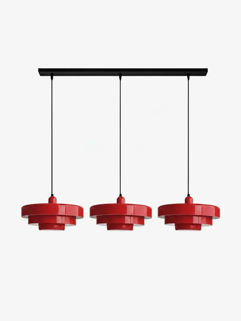
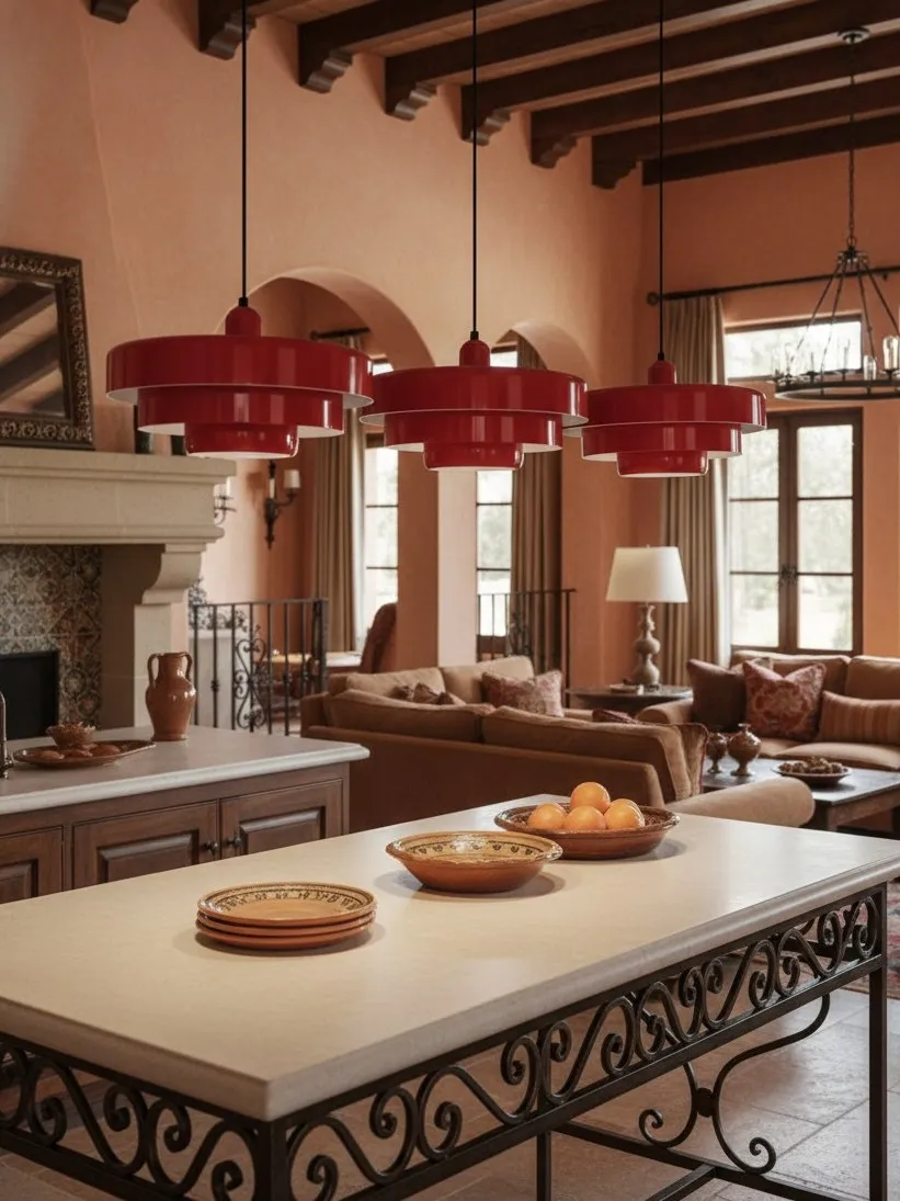
The strongest solution is usually one sculptural fitting, one colour relationship and several quiet functional lights. A layered metal pendant suits this approach because the profile adds depth even when the colour is subdued. Keep the room neutral enough for the form to be legible, but not so bare that the fitting looks imported from another project.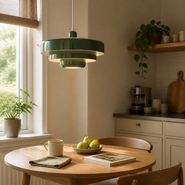
FAQ
Will a dark pendant make a small kitchen look smaller?
Not by itself. Crowding, poor placement and multiple dark focal points matter more.
Is one pendant better than two?
Often yes in a compact room, if one fitting properly relates to the surface below.
Should I choose a transparent shade instead?
Only if glare, bulb visibility and cleaning still suit how the room is used.
Can the pendant be the only kitchen light?
Usually not. Worktops and circulation areas benefit from separate light layers.
What is the fastest fit check?
Hang a paper silhouette at the proposed height and walk every normal route.