Colourful vs Neutral Pendant Lights: Which One Deserves the Centre of Your Dining Room?
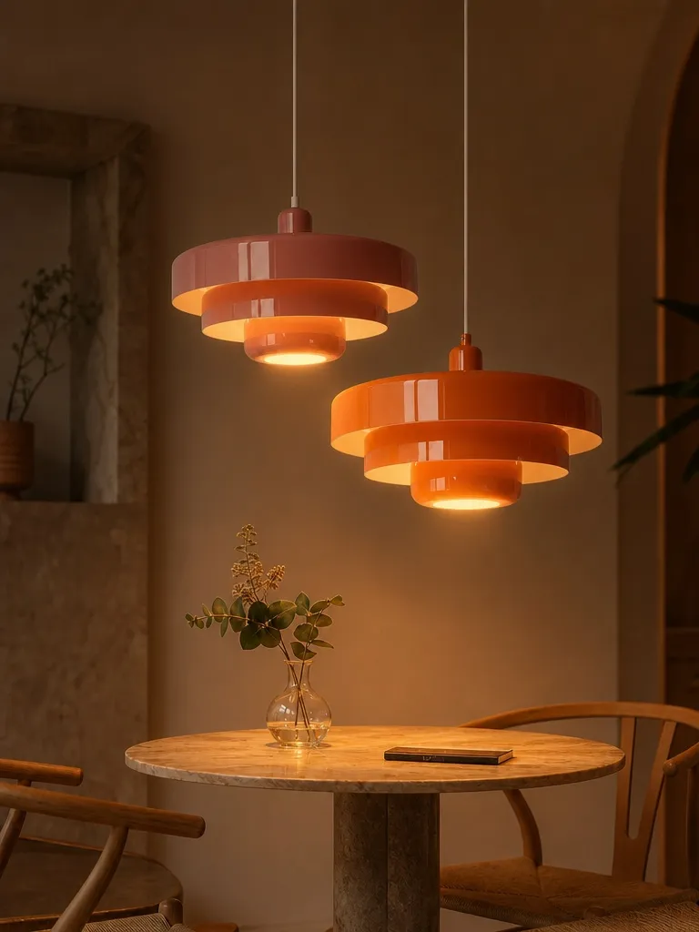
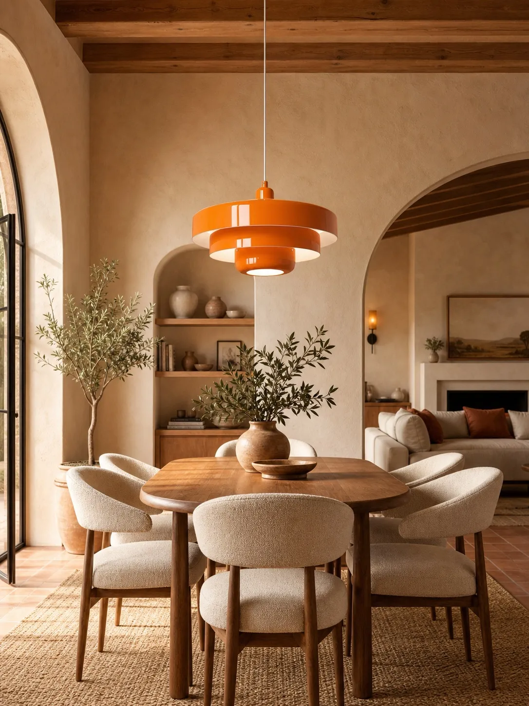
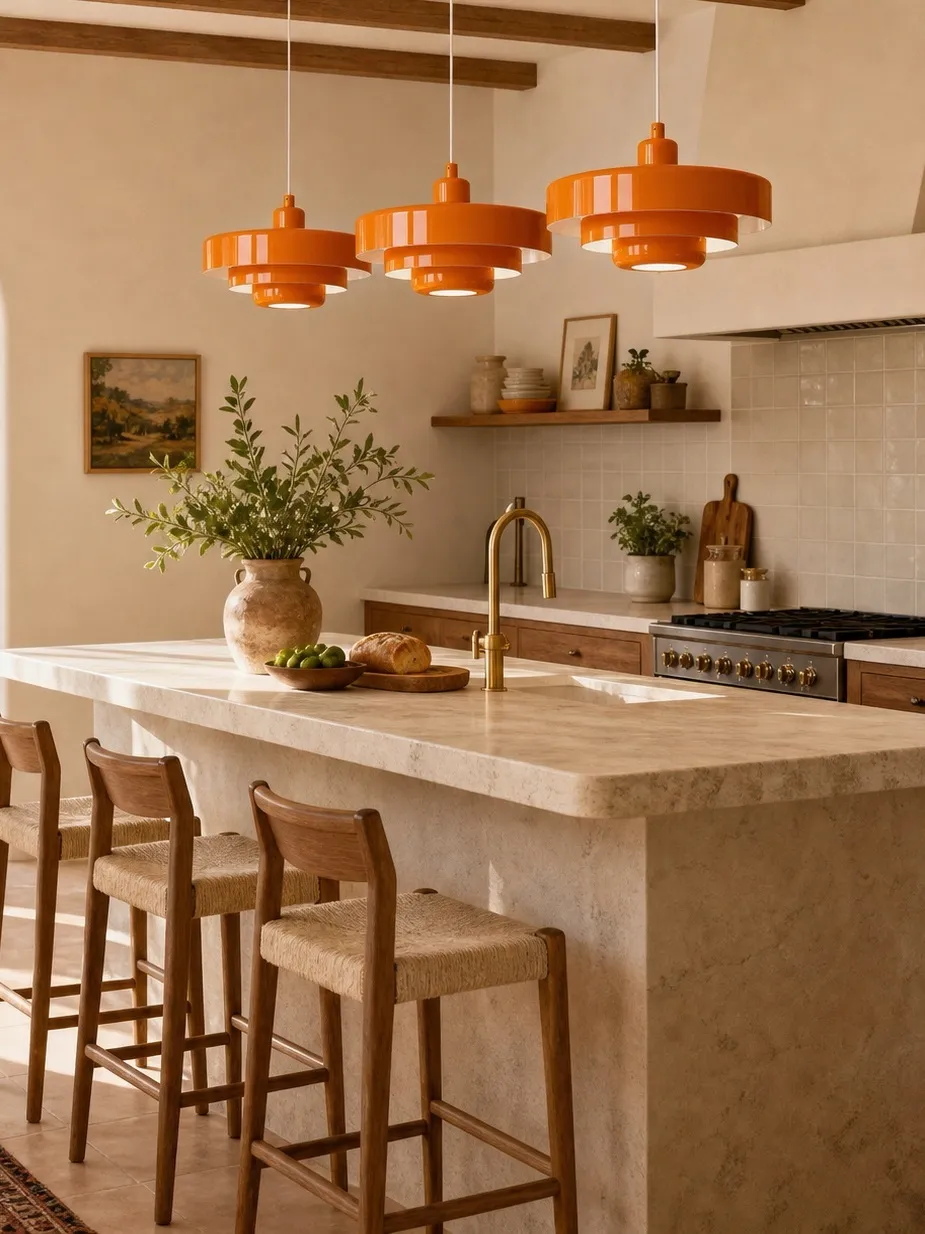
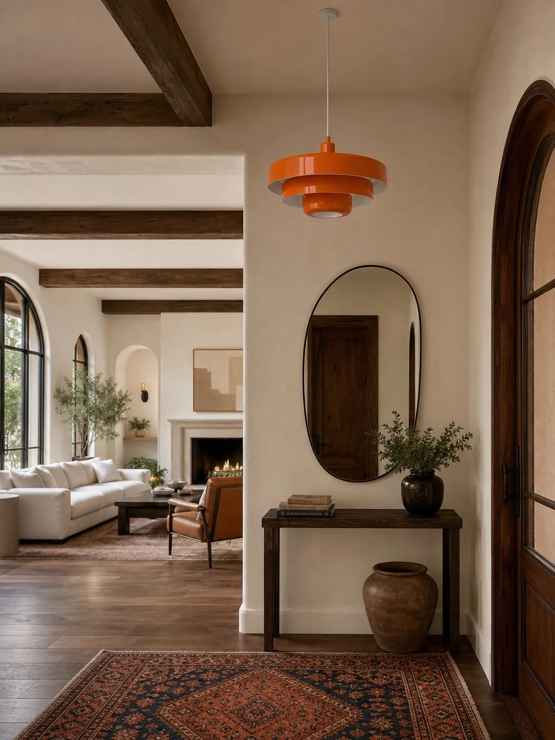
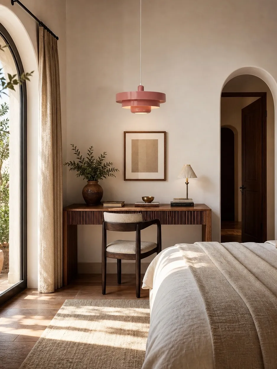
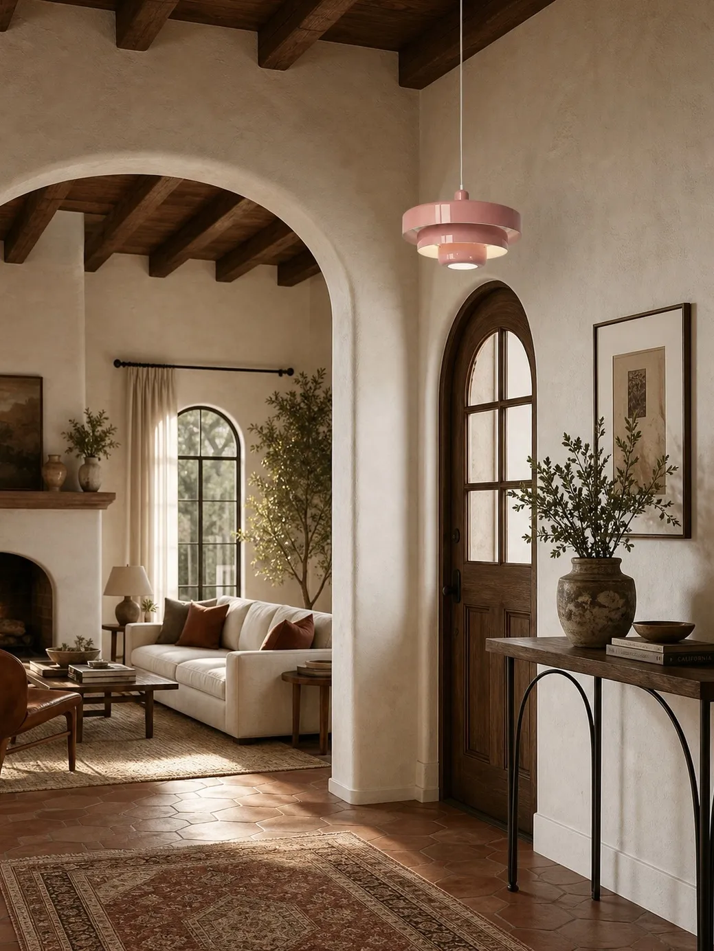
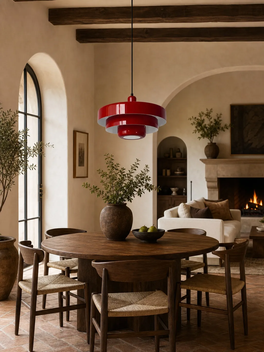
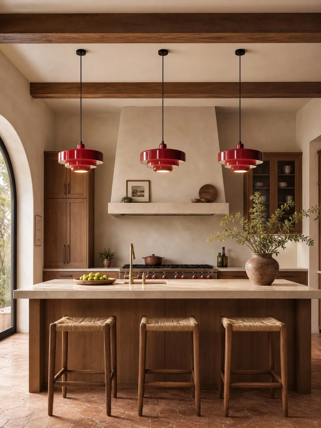
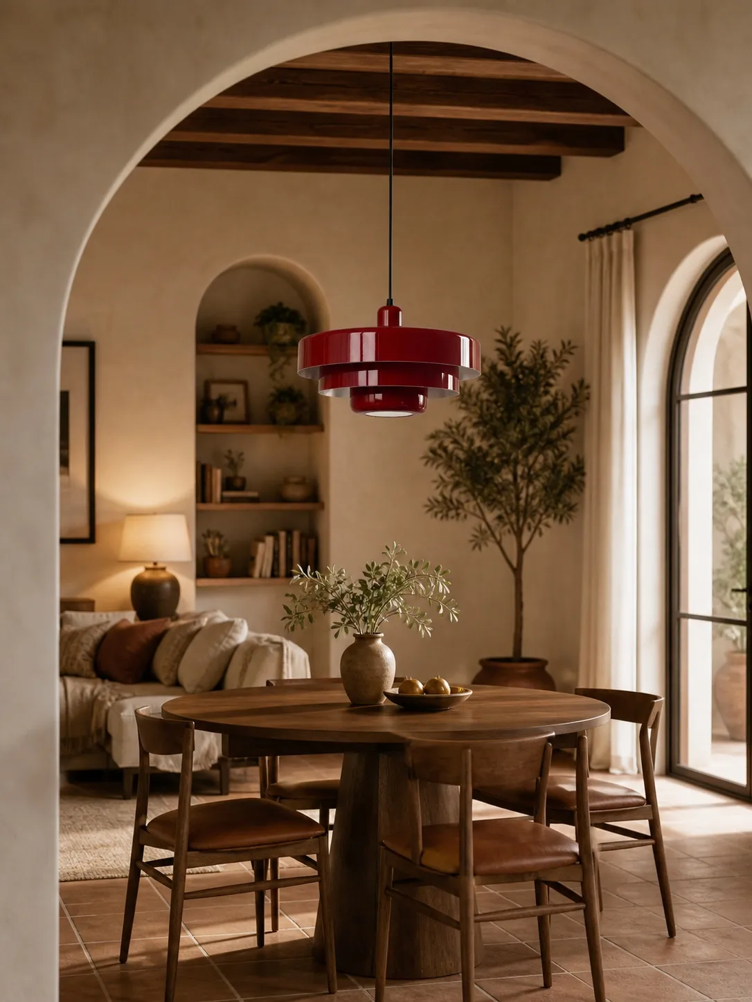
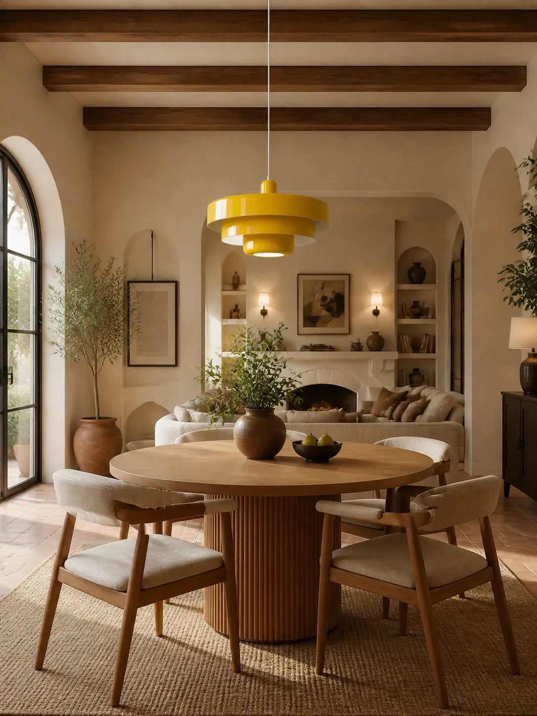
Choose a colourful pendant when the dining table needs a clear identity and the room’s other elements are quiet. Choose a neutral pendant when you change artwork, textiles or table settings often and want the fixture to support them rather than lead them. For most neutral dining rooms that currently lack a focal point, a muted colour is the stronger choice: it creates hierarchy without requiring a major redesign.
The Decision in One View
| Decision factor | Colourful pendant | Neutral during |
|---|---|---|
| Visual impact | Immediate focal point | Quieter; relies on form and shadow |
| Decorating flexibility | Future colours must relate to it | Artwork and textiles can change freely |
| Best setting | Plain or low-contrast room | Patterned, collected or frequently changed room |
| Upkeep appearance | Some mid-tone finishes disguise light dust | Very light or very dark finishes may show residue differently |
| Perceived scale | Strong contrast can make the shade feel larger | Low contrast can make the profile feel lighter |
| Best for | Homeowners seeking a defined dining identity | People who prefer calm or seasonal flexibility |
What a Colourful Pendant Actually Does
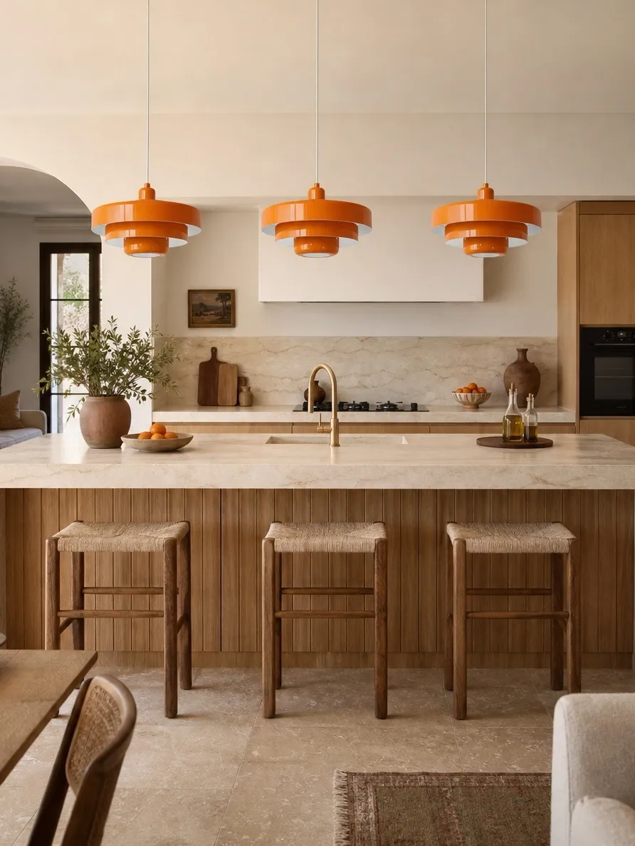
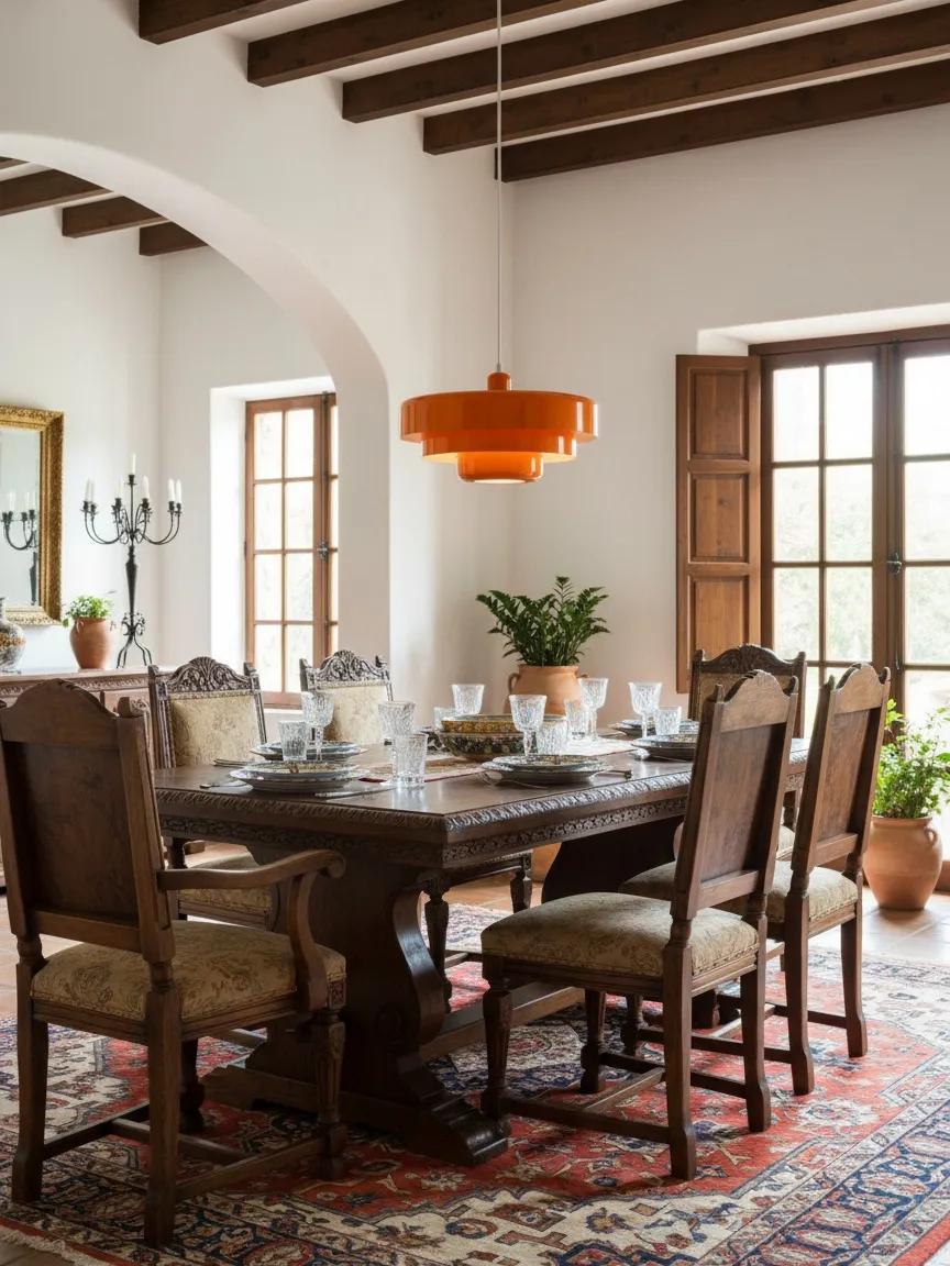
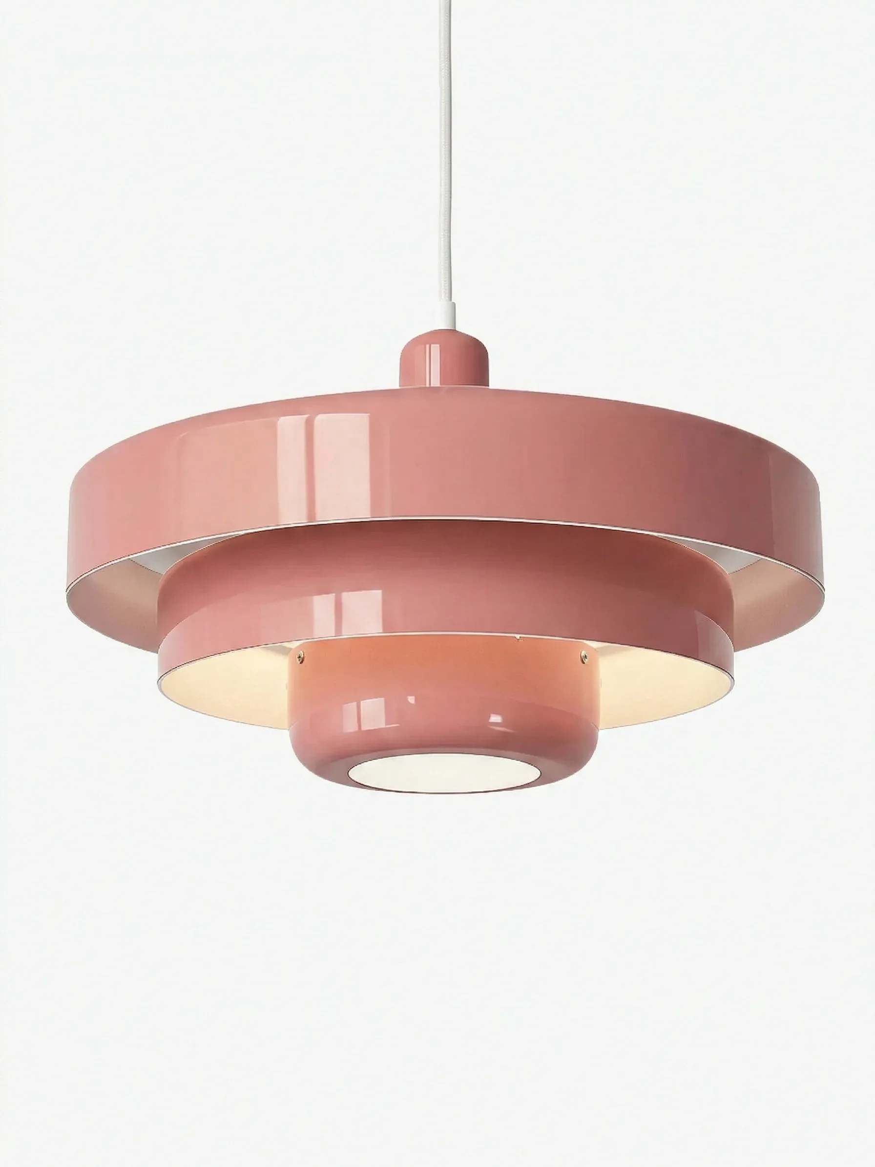
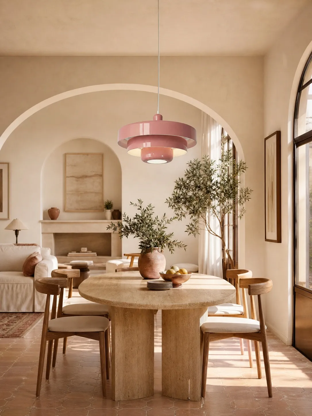
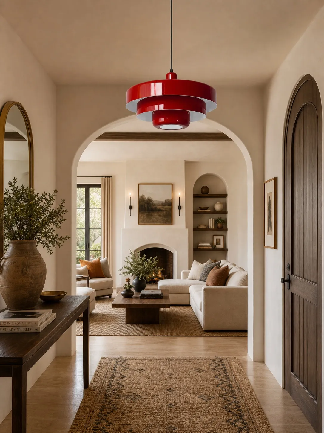
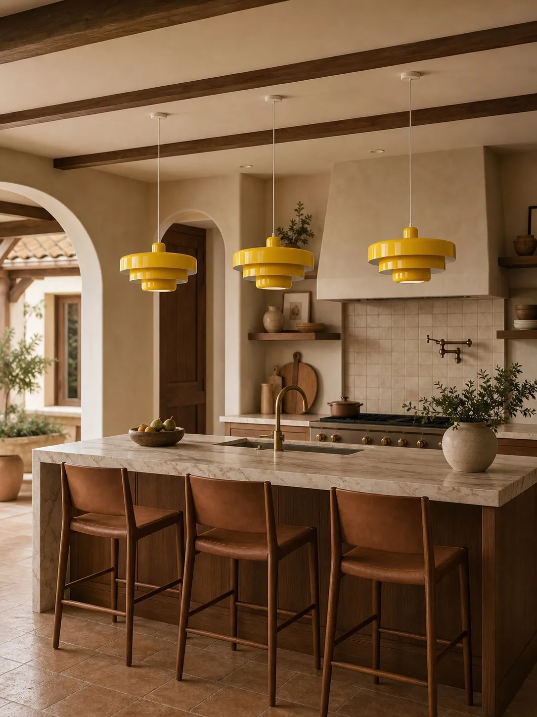
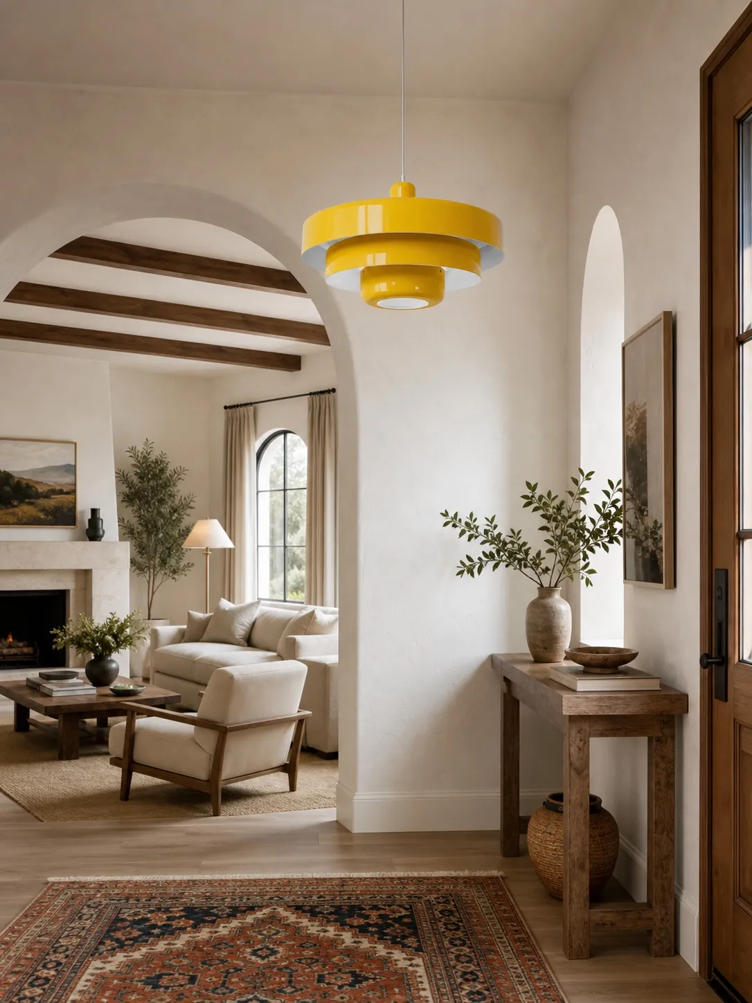
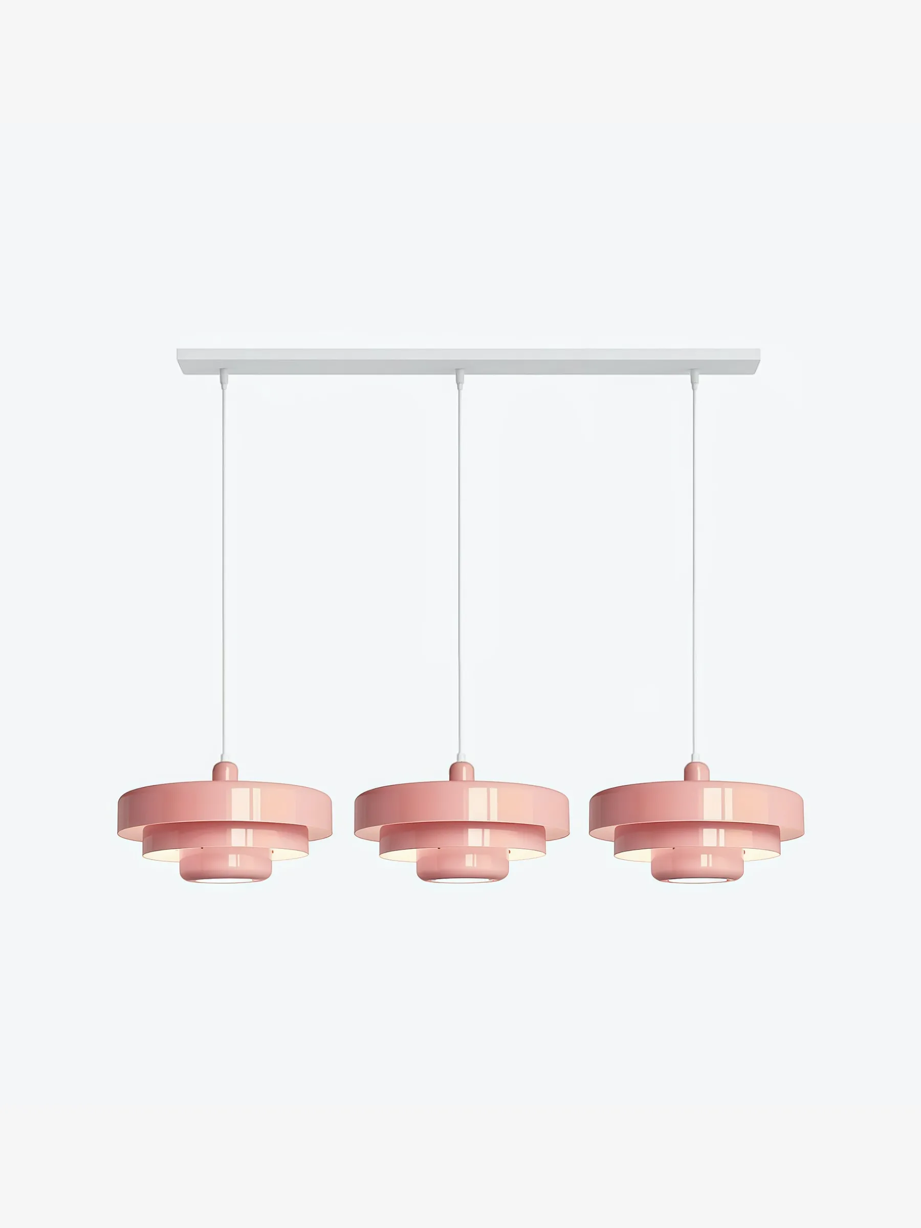
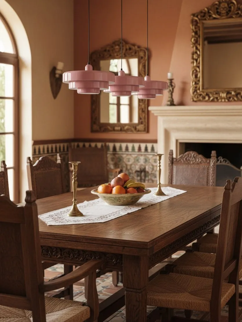
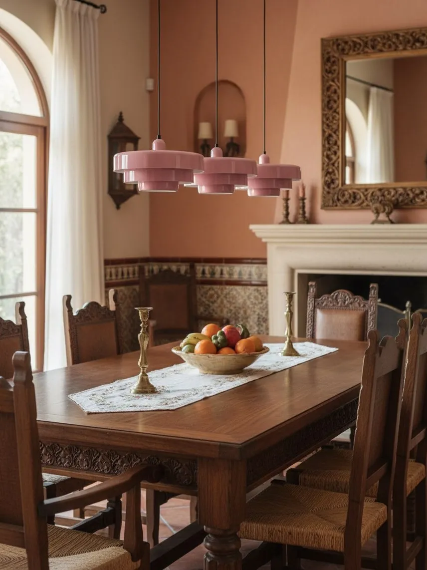
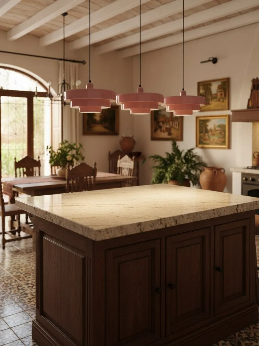
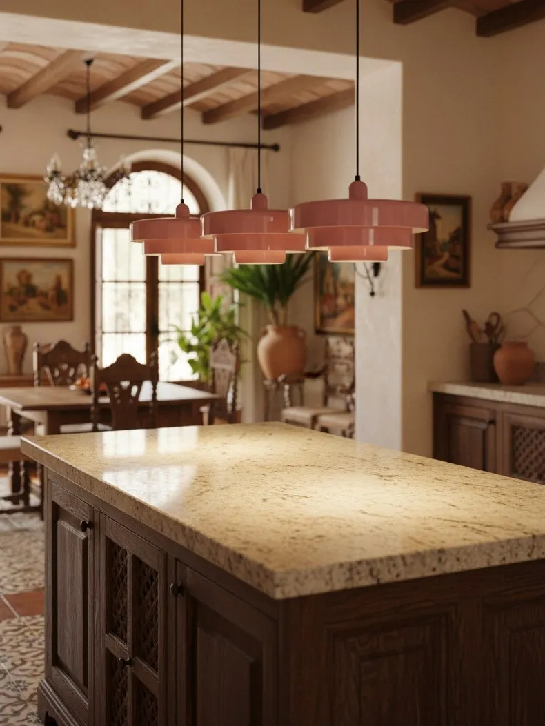
A coloured fitting creates a fast visual hierarchy: ceiling, pendant, table. This is useful in an open-plan home where the dining area otherwise dissolves into the kitchen or living room. The colour acts like a marker visible from several approaches. It can also make a simple table feel intentional without adding a rug, feature wall or large artwork.
The trade-off is commitment. New chairs, curtains and artwork must either harmonise with the pendant or create a carefully controlled contrast. That does not mean exact matching. It means recognising that the light remains part of the palette even when switched off.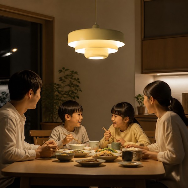
What a Neutral Pendant Actually Does
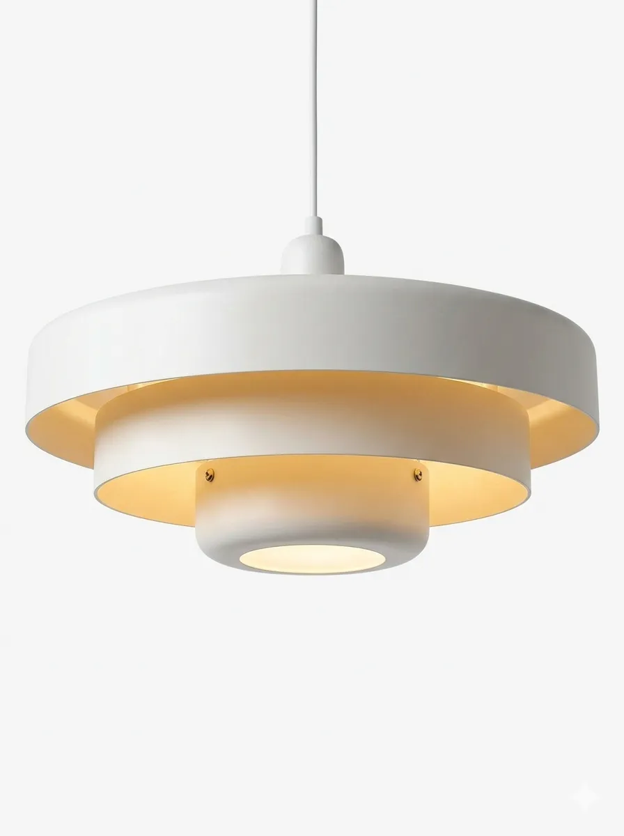
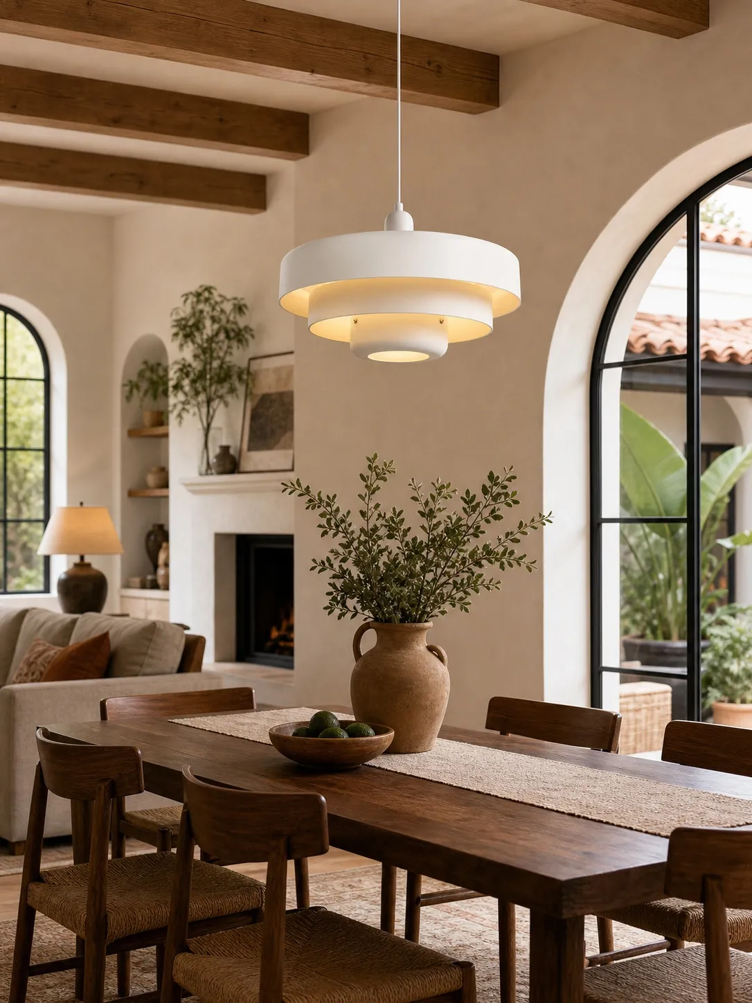
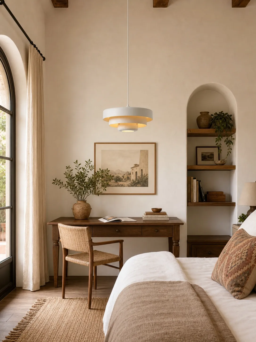
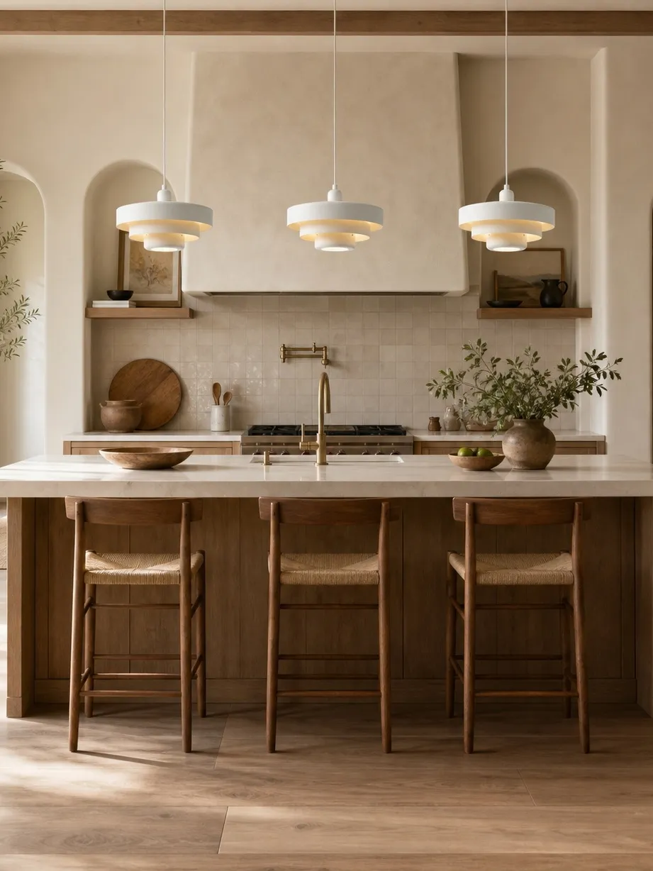
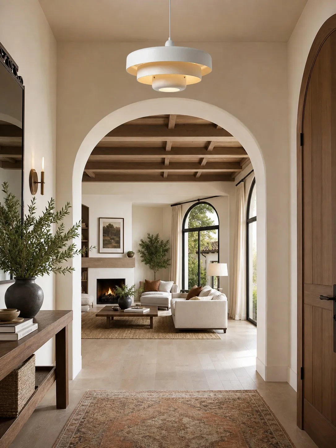
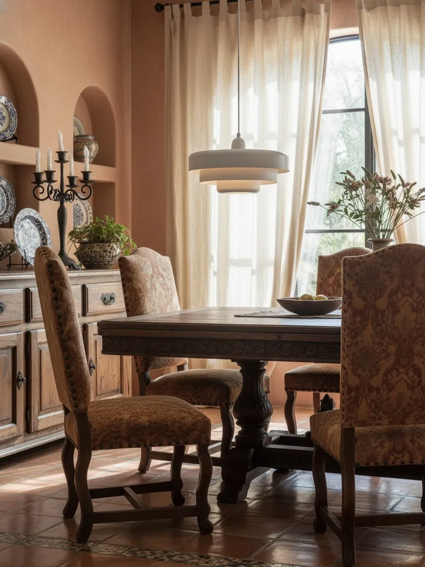
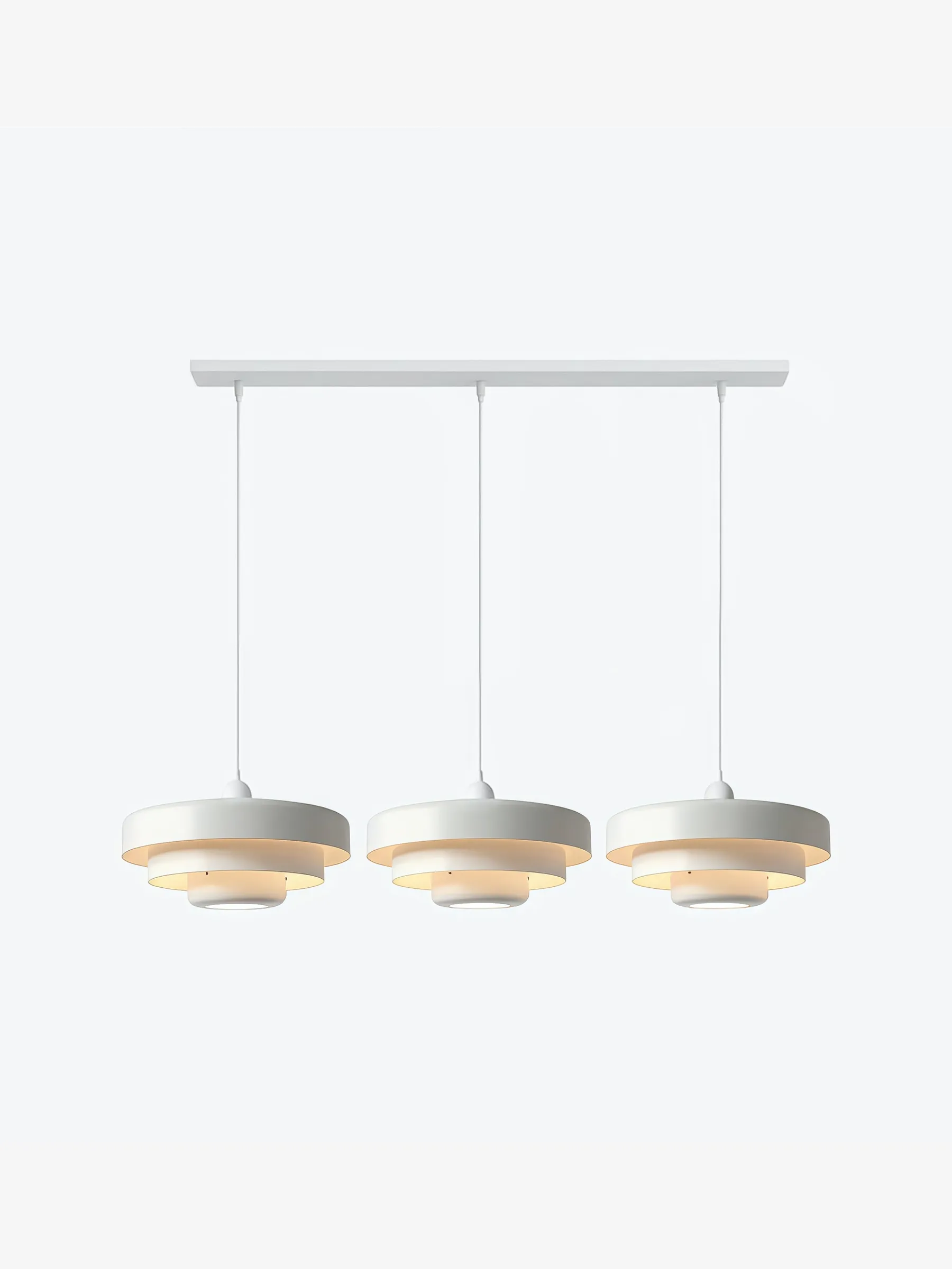
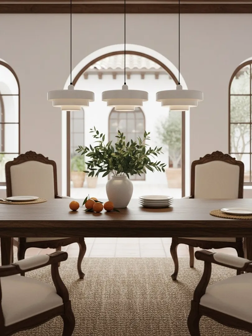
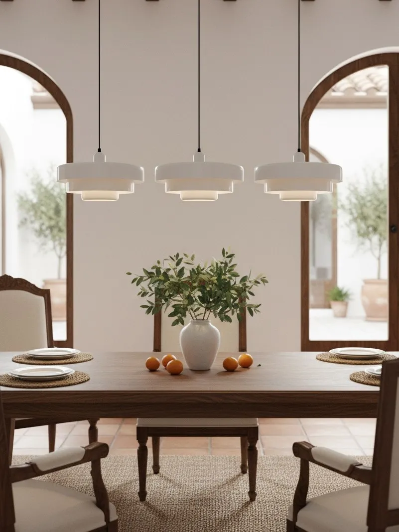
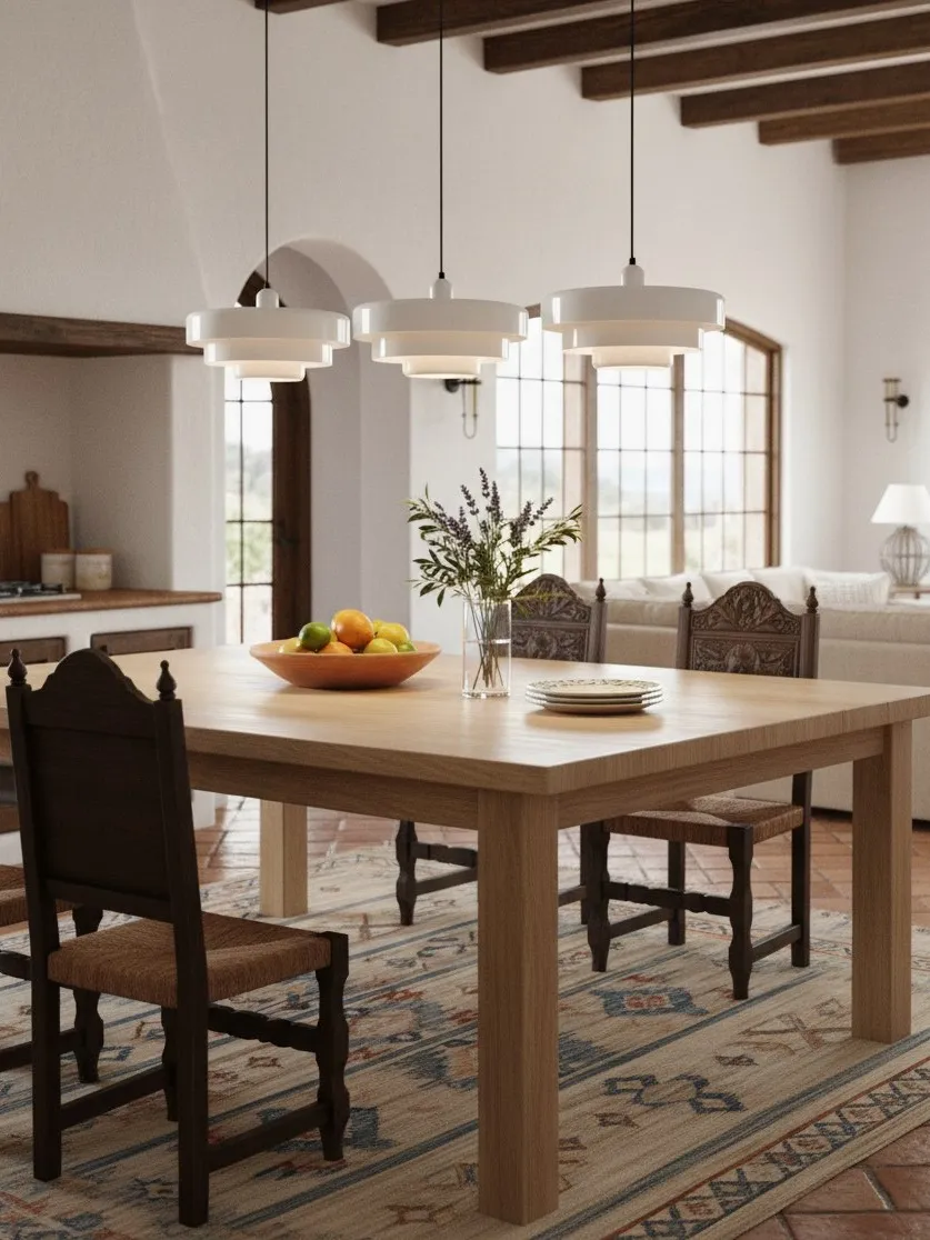
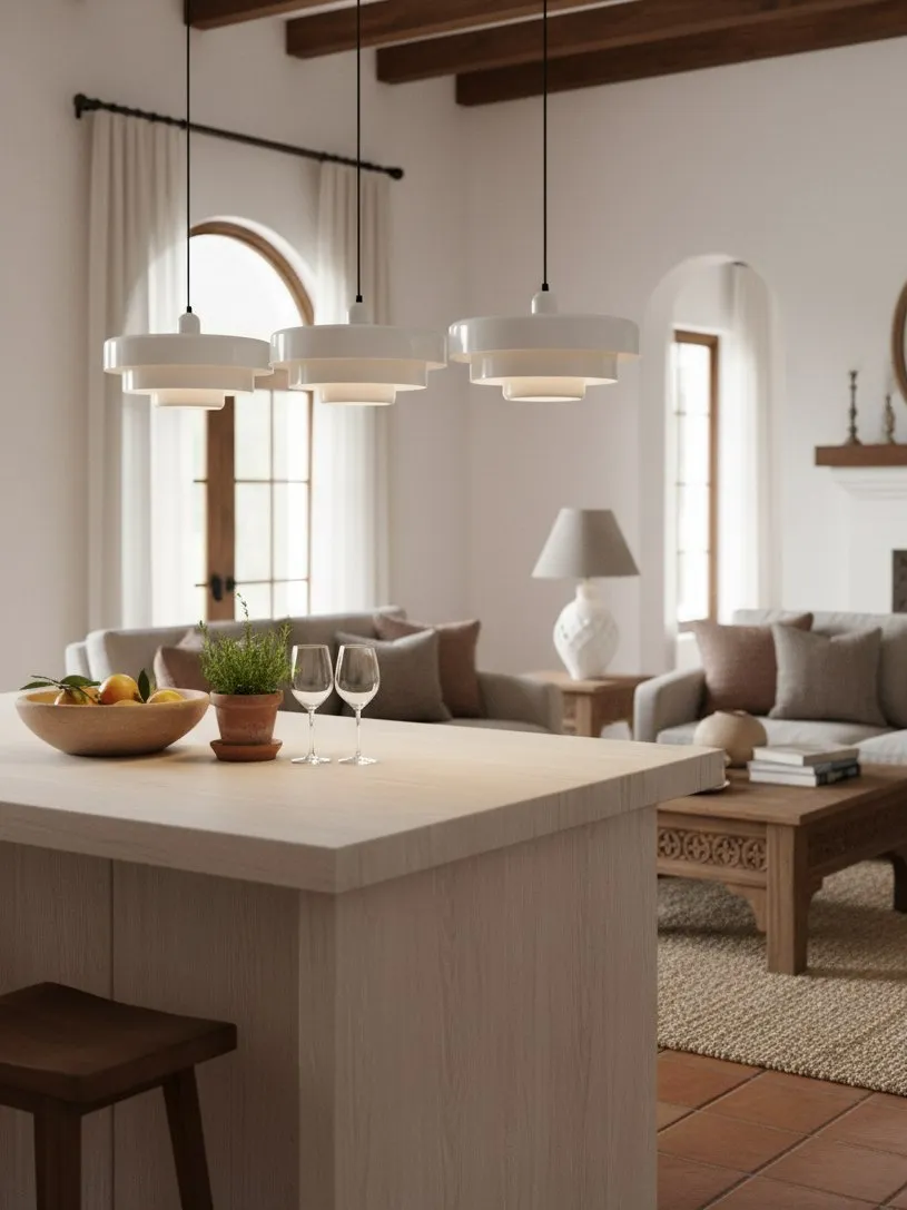
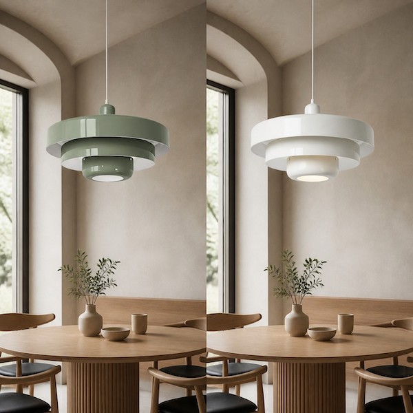
A neutral pendant is not invisible. In white, cream or another low-contrast finish, a layered shade creates interest through profile, negative space and changing shadow. It supports a room where the main focus is a view, artwork, antique table or patterned upholstery. It is also easier to live with when seasonal table linen and decorations change regularly.
The risk is under-scaling. Because low contrast reduces visual weight, buyers sometimes choose a neutral shade that is too small and then wonder why the dining zone lacks presence. Increase confidence in the silhouette and placement rather than adding random decorative objects around it.
For help making the exact colour choice in a neutral backdrop, How to Choose the Best Pendant Light Color for a Neutral Kitchen offers an undertone and sample-testing method that also applies to dining rooms.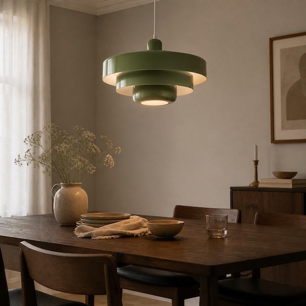
The Differences That Change the Decision
Open plan versus enclosed room
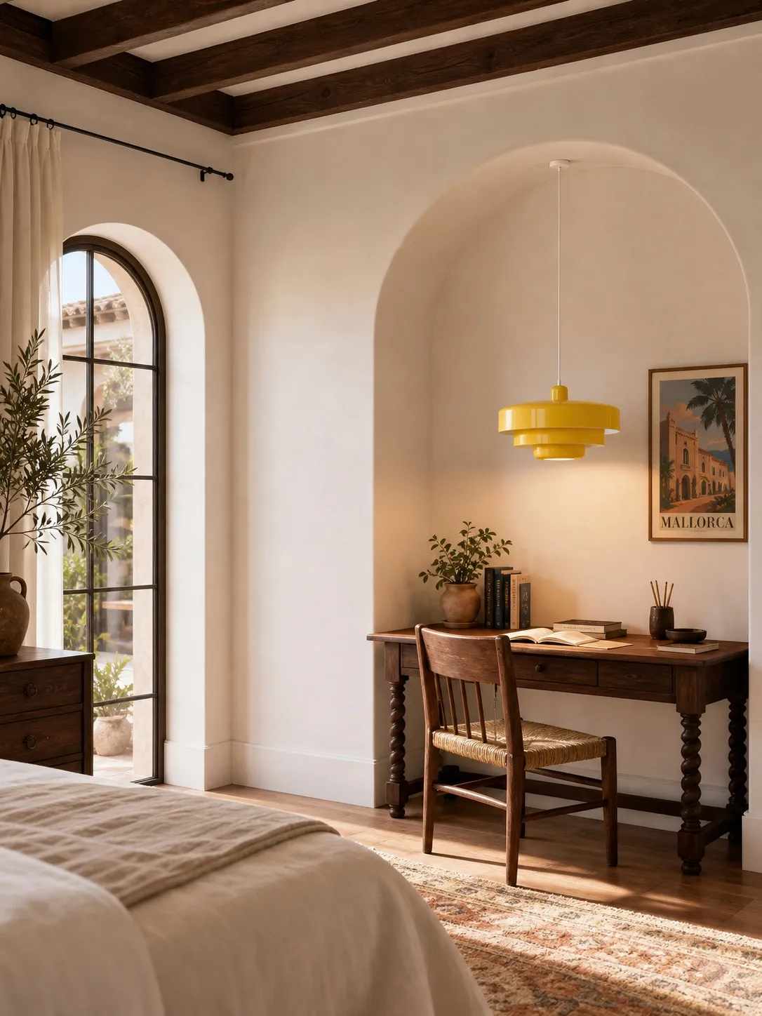
In an open plan, a colourful pendant is visible from many positions and can organise the layout. In an enclosed dining room, it is experienced at closer range, so its shape, finish quality and light pattern become more important. Strong colour in a small enclosed room can be effective, but it needs quieter walls and fewer competing objects.
Daily focal point versus flexible backdrop
If the dining table is used every day, a colourful fitting gives that routine a stable centre. If the room hosts changing displays, work, crafts or seasonal events, neutral may adapt more easily. Think about the room’s behaviour, not only its staged photograph.
Daytime object versus evening atmosphere
Metal pendants remain visible as objects in daylight. At night, bulb appearance and the shade’s downward or reflected light influence the mood. Use lumens to judge brightness and kelvin to judge warmer or cooler appearance, following the information on the bulb packaging and the fixture’s requirements. Neither colour option compensates for inadequate background lighting.
Visual weight versus physical size
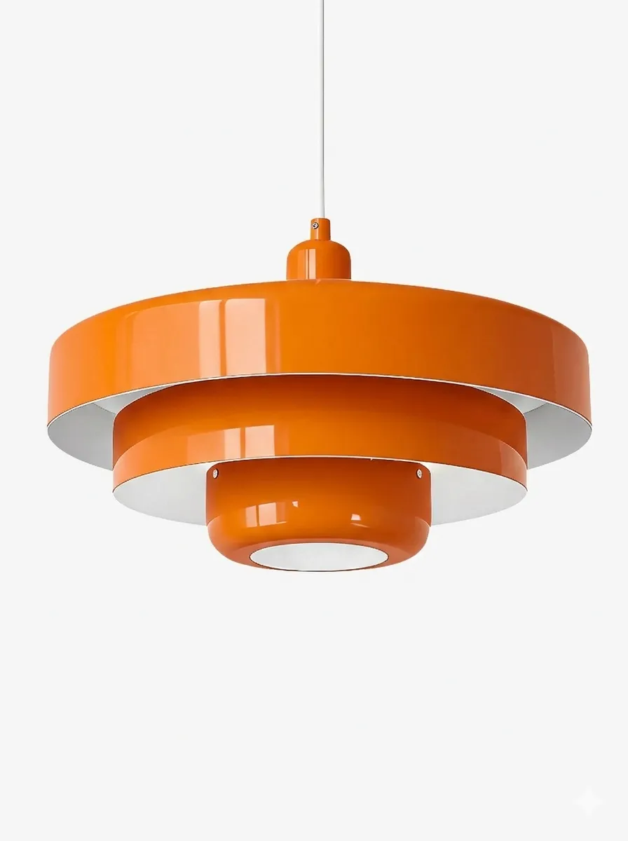
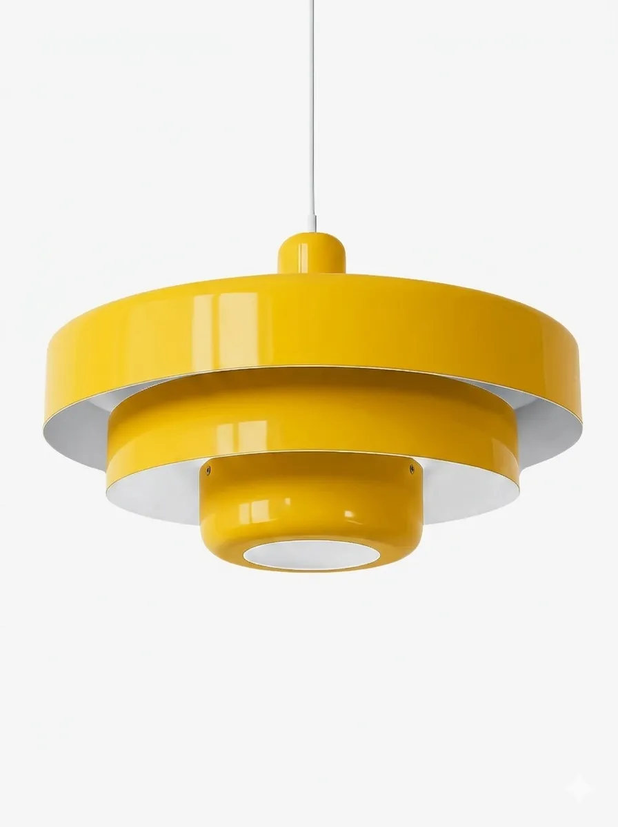
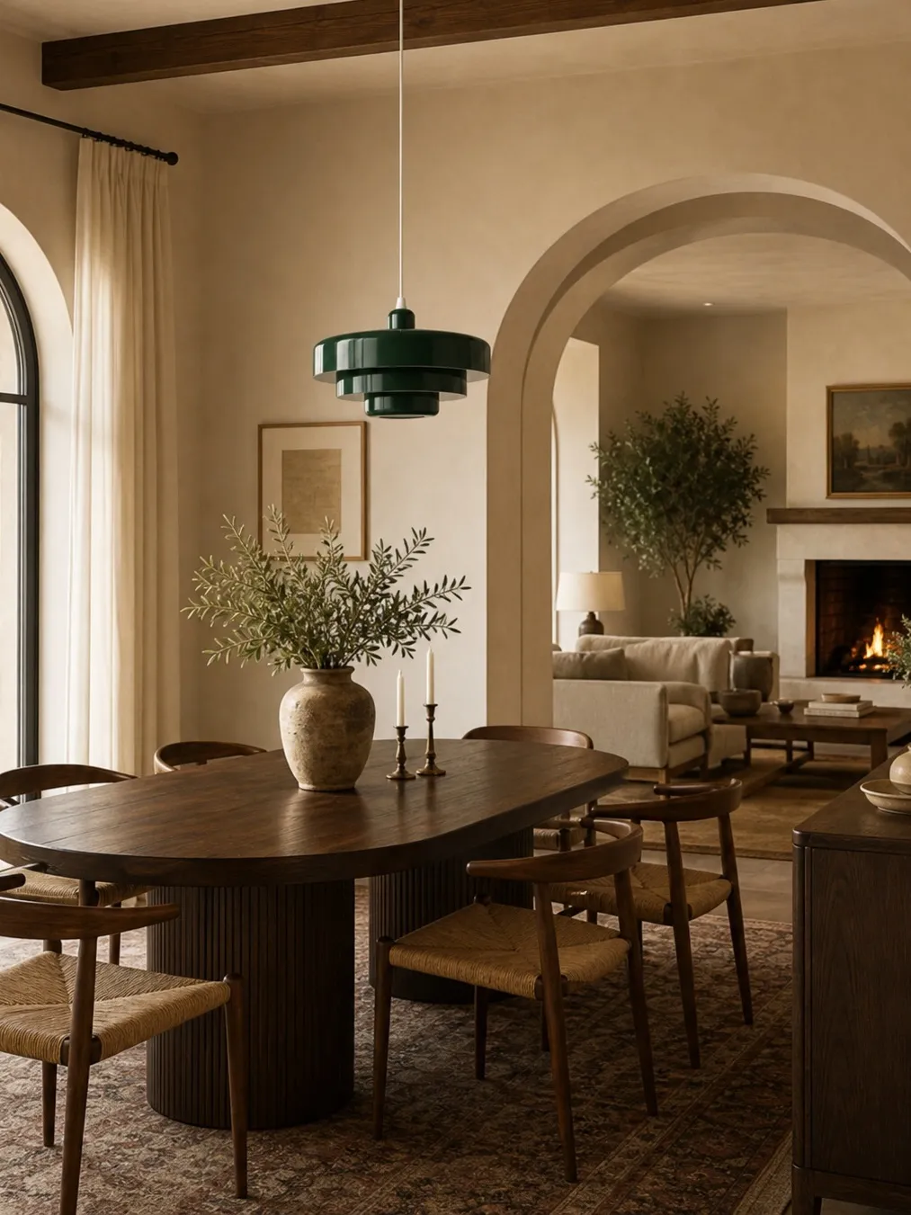
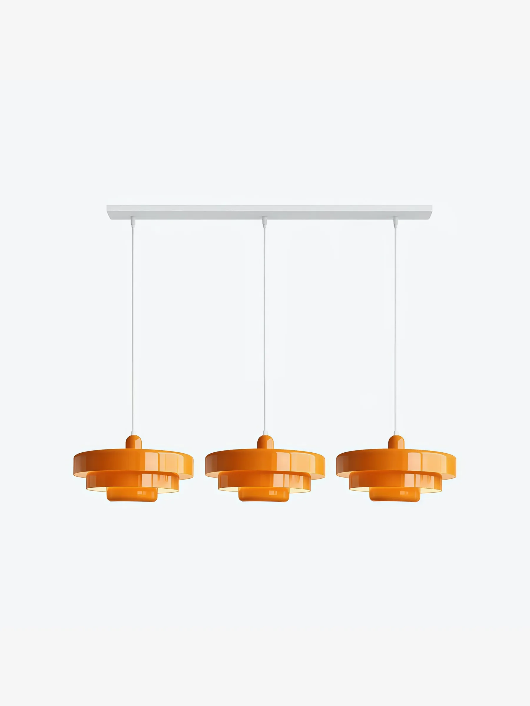
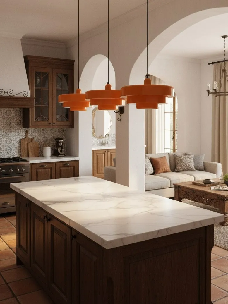
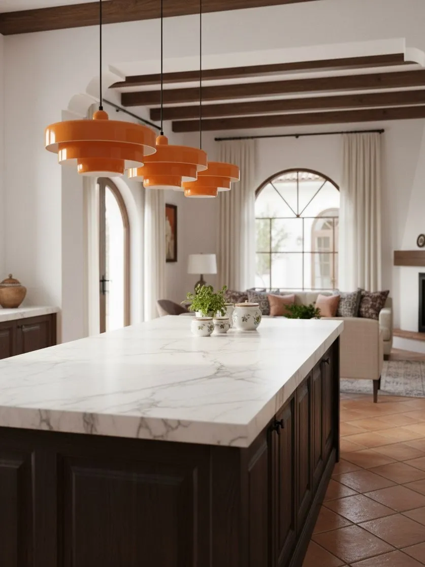
A deep green or orange shade can feel larger than an identical white shade because contrast sharpens its edge. When comparing options, use the same silhouette in the same room. This is why a finish-only visual test is more useful than comparing unrelated product photos.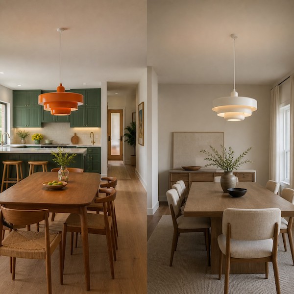
Choose Colourful If…
- The dining zone lacks a clear boundary in an open plan.
- The walls, table and chairs are mostly plain or low contrast.
- You are comfortable carrying one hue through future decorative changes.
- You want the light to remain a visible object during the day.
- You can repeat the colour once or twice without building a theme.
For a complete styling framework, Statement Pendant Lighting in 2026: How to Style a Colorful Metal Pendant in a Neutral Kitchen or Dining Room explains how to build that restrained colour bridge.
Choose Neutral If…
- Artwork, upholstery or a view already provides the dominant focal point.
- You redecorate seasonally and do not want to work around a fixed hue.
- The room already contains several patterns or high-contrast edges.
- You prefer the shade’s geometry and shadow to lead.
- The fitting must feel light against a low ceiling or narrow sightline.
The Clear Recommendation
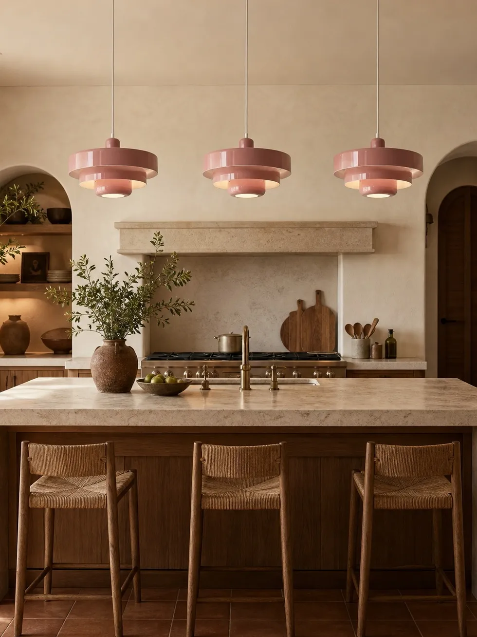
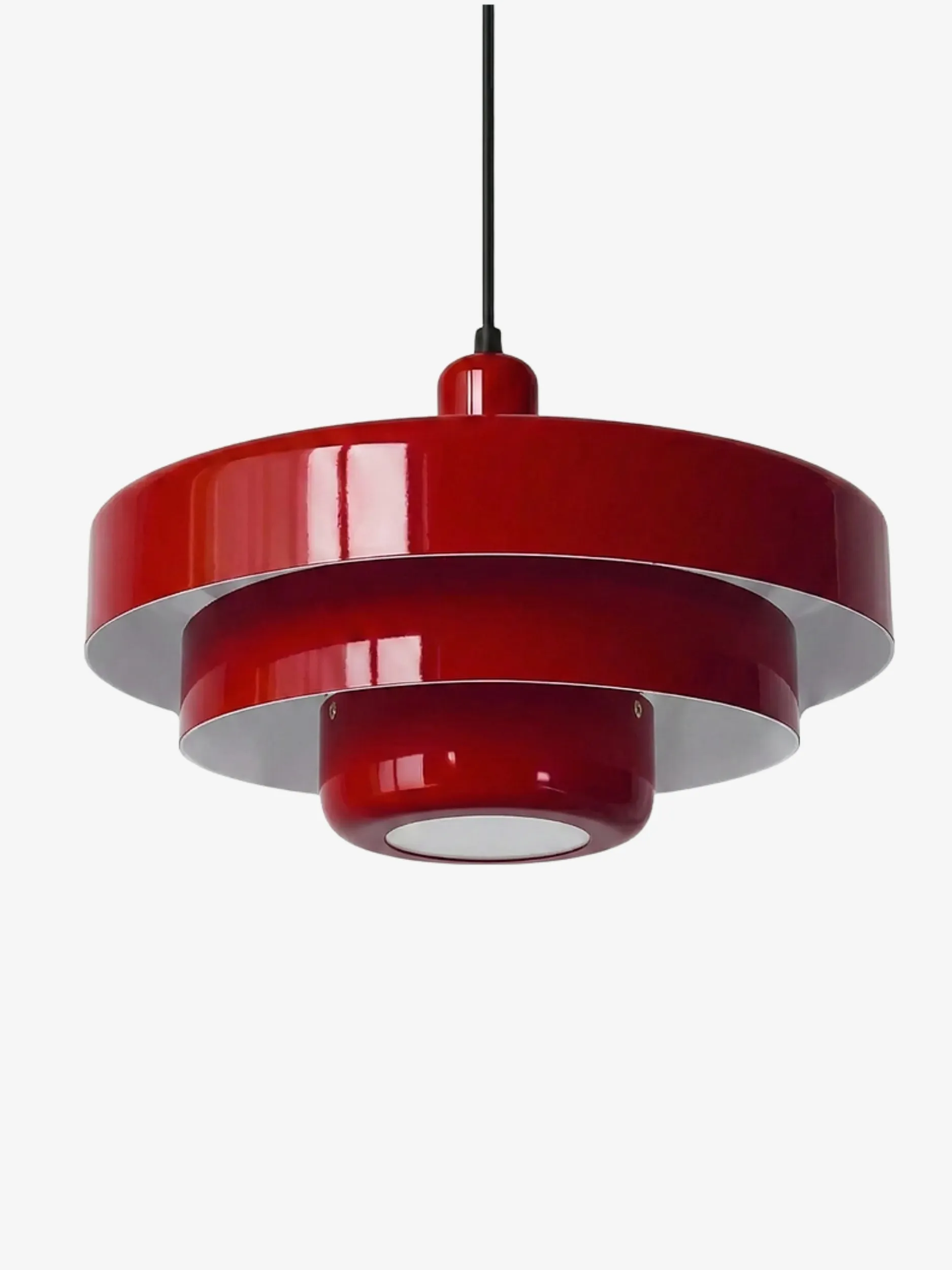
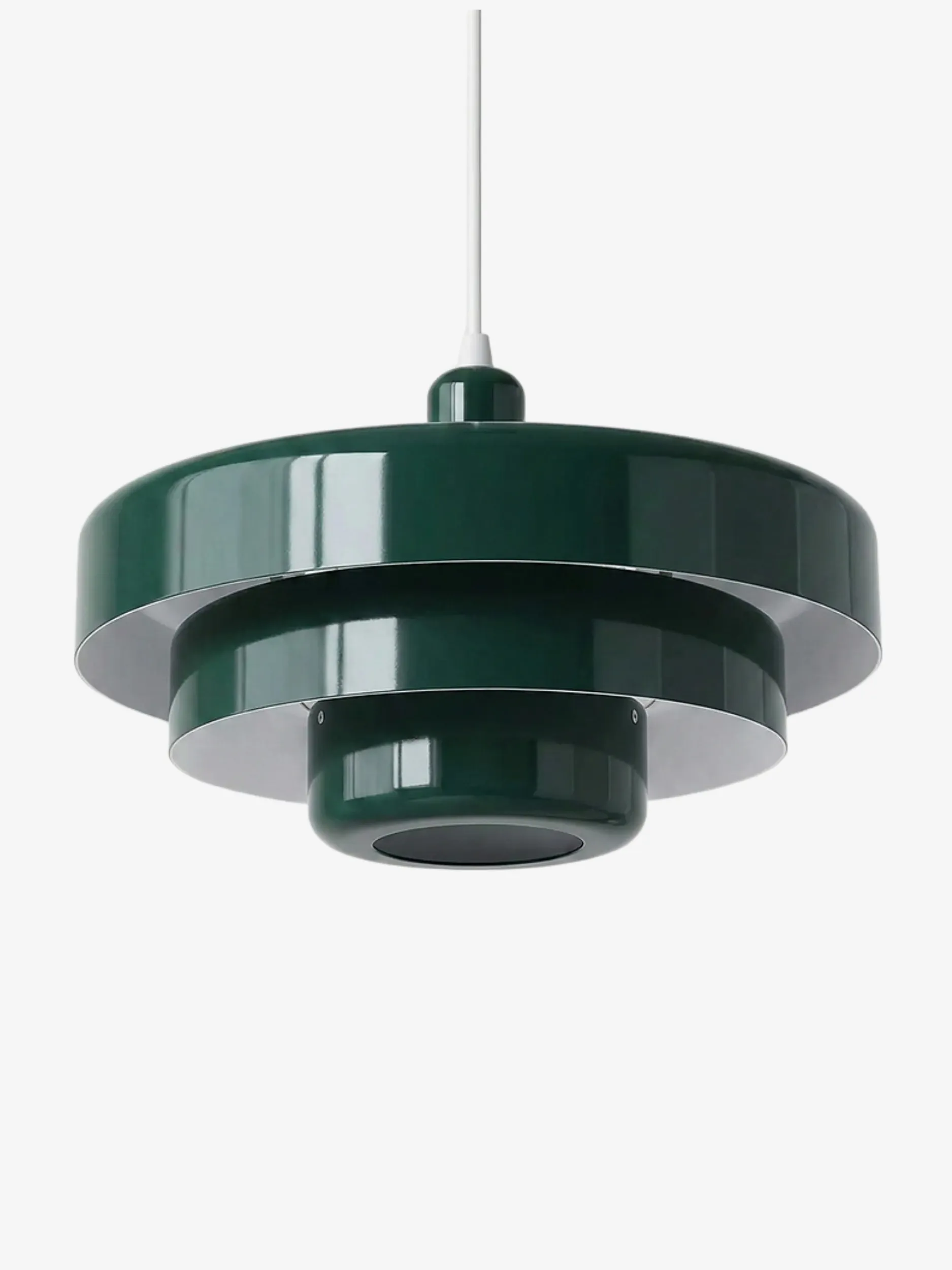
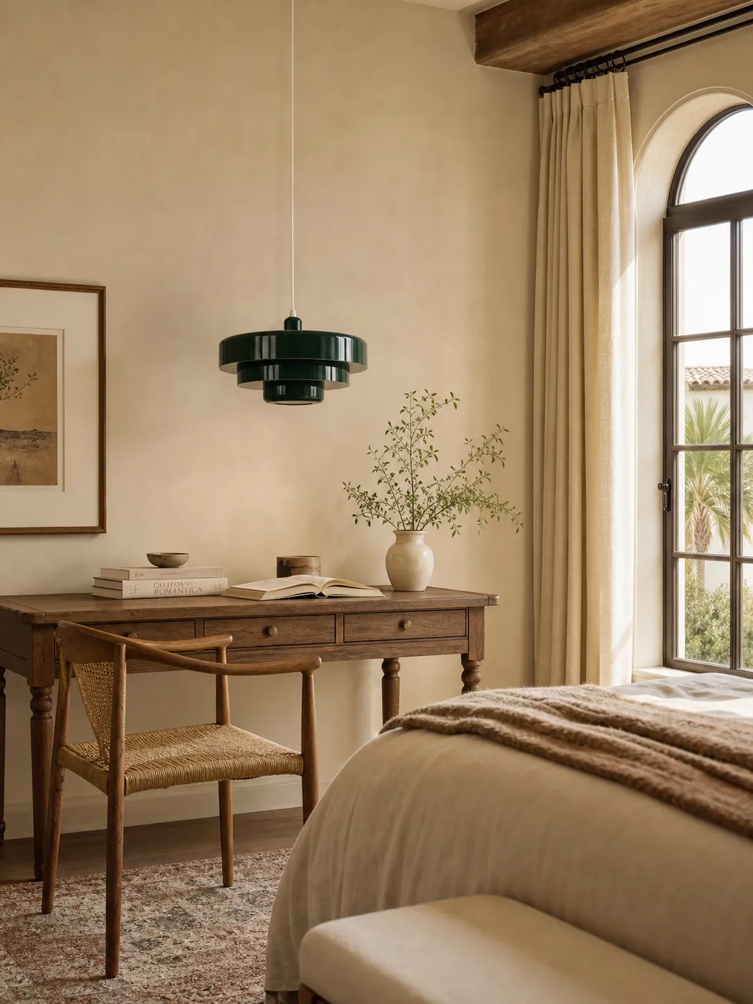
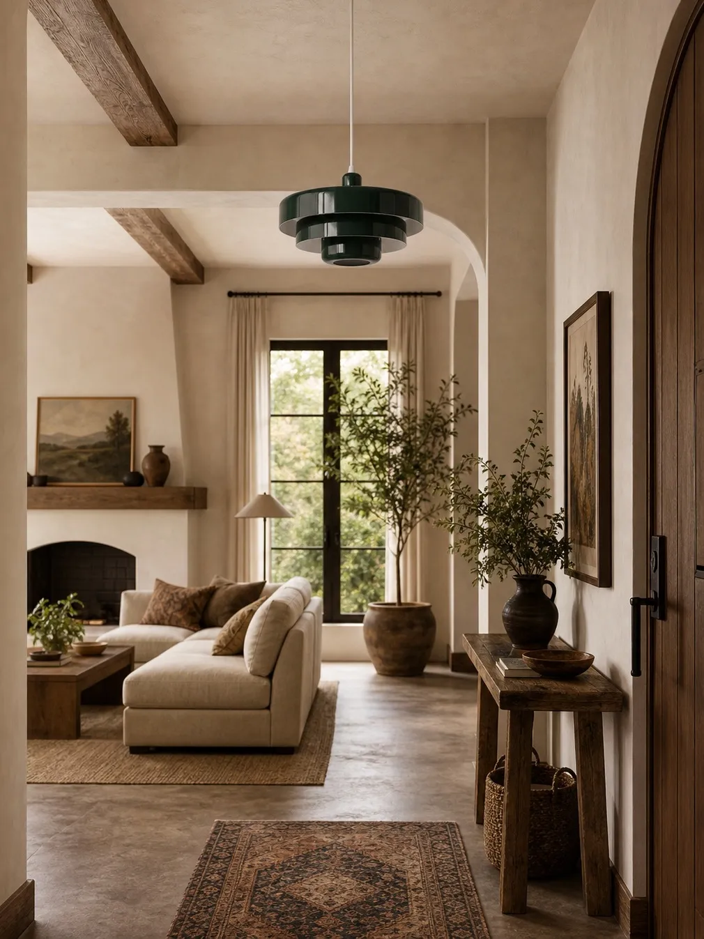
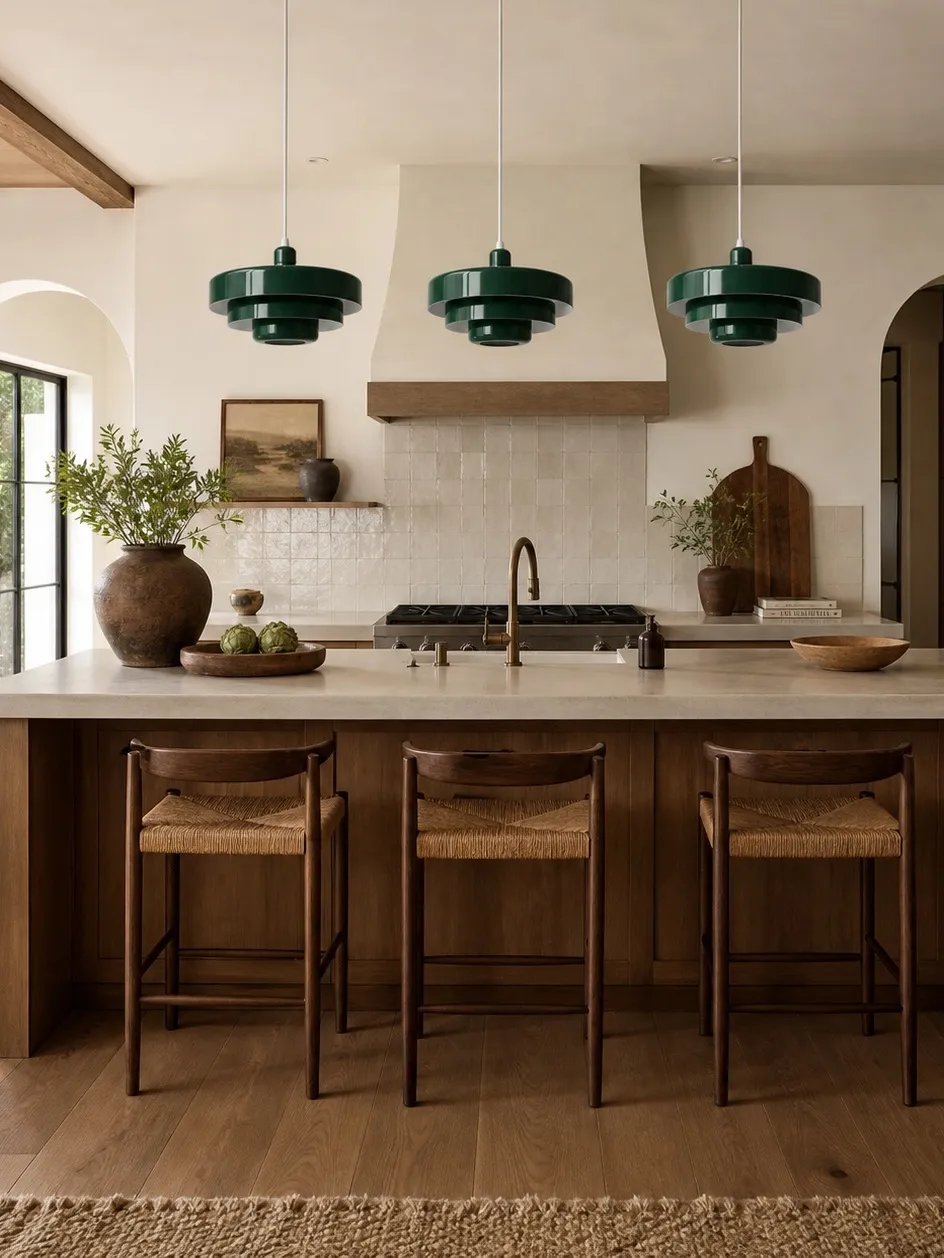
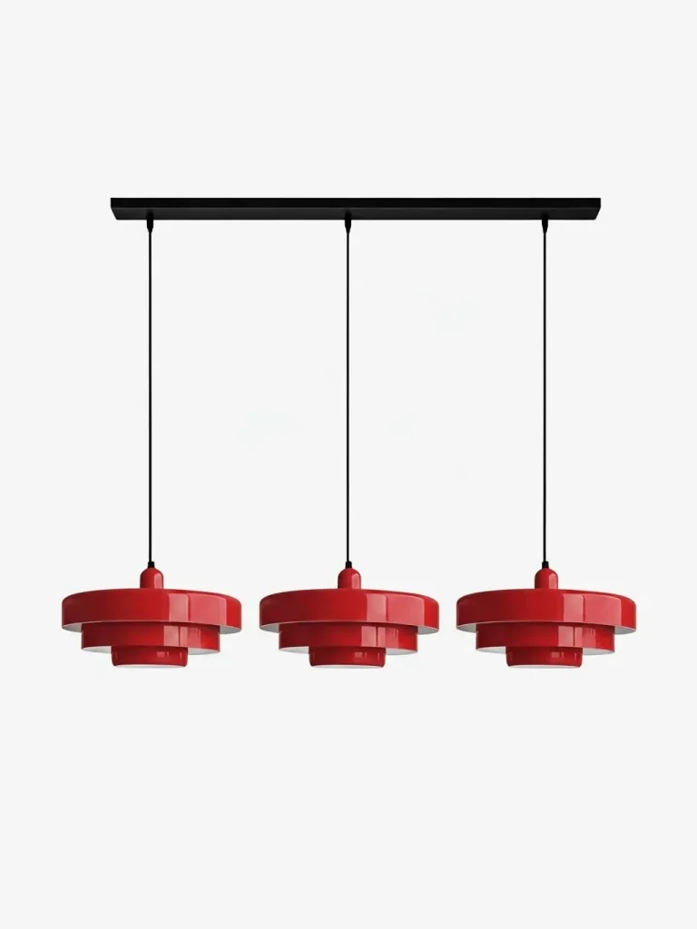
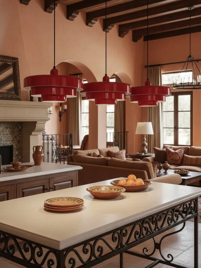
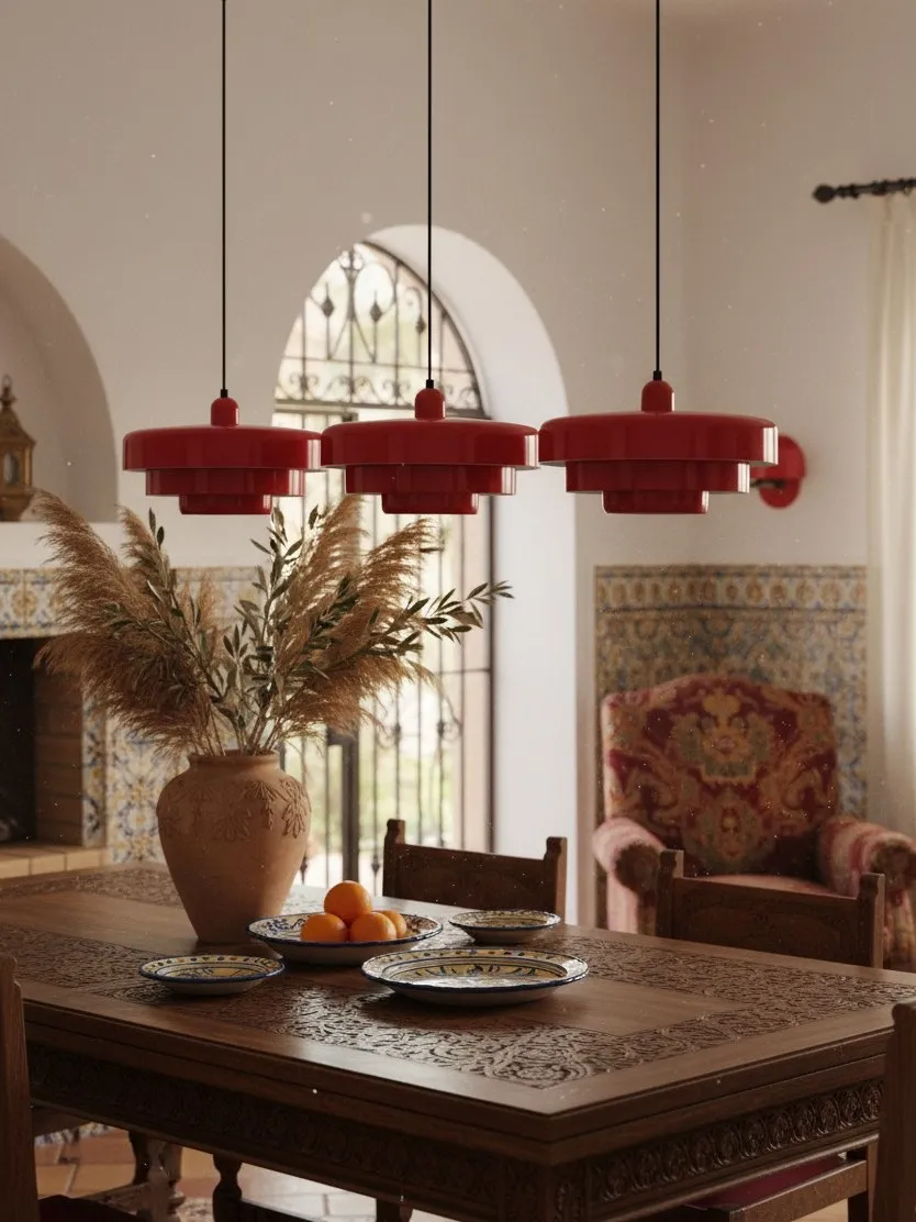
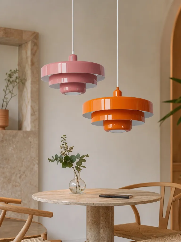
For a neutral dining room with no existing hero element, choose a muted colourful pendant. It provides more value than another beige or white object because it defines the table, gives the room a memorable centre and can be supported with only two small colour echoes. Deep green suits timber-rich rooms; muted orange or clay tones warm pale stone and cream; a softer red can add energy when the rest of the palette is disciplined.
Choose neutral instead when the room already has a strong view, artwork or patterned textiles, or when flexibility is your highest priority. In that case, make the silhouette generous enough to register and use lighting layers to create depth around it.
A small kitchen has different constraints from a dining room. If circulation and ceiling height are the concern, Can a Colorful Pendant Light Work in a Small Neutral Kitchen? provides the more relevant volume-view-visibility test.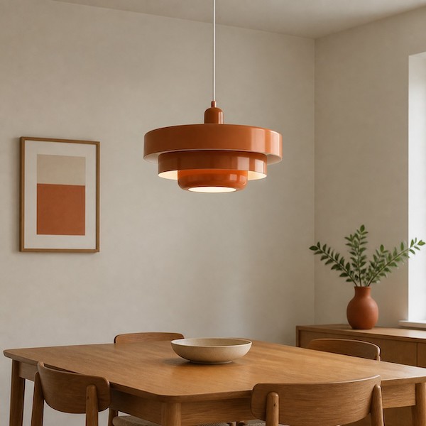
FAQ
Which option is more timeless?
Neutral is more flexible; a muted colour tied to fixed materials can be equally durable.
Does a colourful pendant make the room look smaller?
Strong contrast can increase visual weight, but correct scale and clear surroundings prevent crowding.
Should dining chairs match the pendant?
No. One or two smaller related accents are enough.
Is a white pendant boring?
Not when its silhouette, scale and shadow pattern are distinctive.
What matters more: colour or hanging height?
Placement and proportion come first; colour works only after the fitting belongs to the table.